28th November 2024 • 19 min read
Figma wishlist 2025

Francesco Impellizzeri
At Tinloof, we use Figma for everything - from quick wireframes to complex design systems, from early prototypes to developer handoff.
While it's undoubtedly our tool of choice, there are certain features that would make our daily workflows significantly more efficient.
For this reason, we've put together a comprehensive wishlist, divided into two categories: must-have features that address fundamental workflow limitations, and nice-to-have enhancements that would add extra polish to an already excellent tool.
Native z-axis and 3D transforms: A missing fundamental

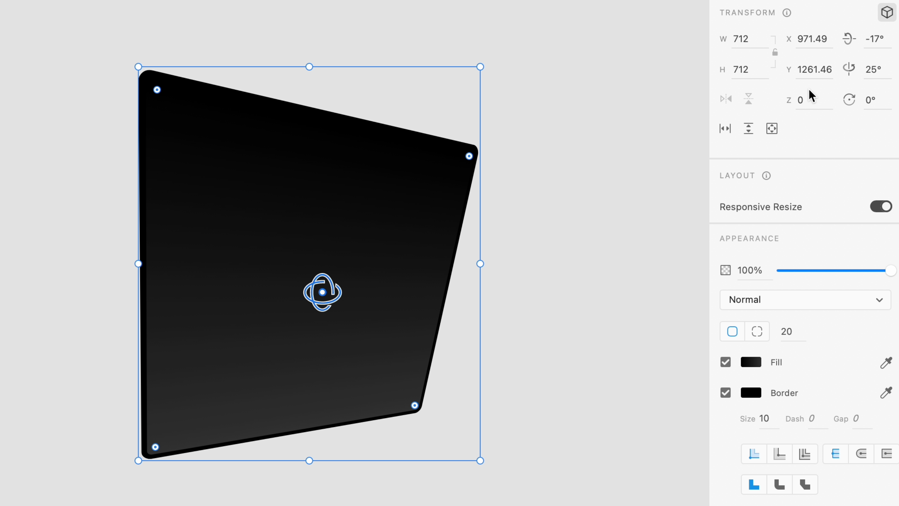
Example showing 3D transforms in Adobe XD
The absence of native z-axis and 3D transforms in Figma is a peculiar limitation, especially considering it's a basic CSS capability. While not a daily necessity, the lack of this fundamental feature forces us to rely on (often paid) plugins or switch tools entirely when working with 3D and perspective effects.
What's particularly frustrating is the simplicity of z-axis transforms in CSS. When developers can easily implement effects with straightforward properties like transform: rotate3d() or scaleZ(), designers shouldn't need workarounds to visualize them during the design phase. The beauty of z-axis transforms is that they unlock new creative possibilities for designers while requiring zero additional knowledge from developers - they're just standard transform properties they're already familiar with.
Adding native z-axis transform controls to Figma would fill this gap in our toolkit. It's not necessarily about creating complex 3D interfaces - it's about having access to the same basic spatial tools that CSS provides out of the box.
Variable collections: Let's talk about that mode order

The 'XS' mode cannot be dragged to the left of the 'Small' mode
If you've worked with Figma variables, you've probably encountered this frustrating limitation: once you create modes in a variable collection, you're stuck with their order forever. This might seem like a minor inconvenience at first, but it can quickly become a real headache when managing design systems at scale.
Here's a scenario every design system team has faced: you've thoughtfully set up your variables collection with Small, Medium, and Large modes, everything is working smoothly, and the system is being actively used across projects. Then, three months later, the need for an even more compact version emerges. No problem - we'll just add an 'XS' mode. But here's where things get messy: the new mode gets tacked on at the end of our list, giving us a completely illogical order: Small, Medium, Large, XS.
The only way to fix this? Recreate the entire collection from scratch - a time-consuming process that no one wants to undertake, especially when working with dozens of variables. This isn't just about satisfying our organizational OCD - it affects documentation clarity, developer handoff, and the overall maintainability of our design system.
A simple drag-and-drop interface for reordering modes would solve this problem instantly. It's the kind of quality-of-life improvement that would make design system maintenance significantly more manageable and prevent those awkward "why is it ordered like this?" conversations during design reviews.
Horizontally scrollable layers: A simple fix for a daily frustration

A horizontal scrollbar in Figma's sidebar would make it easier to scan through deeply nested layers
Sometimes the simplest features can have the biggest impact on daily workflows. The inability to horizontally scroll in Figma's layers panel is one of those small but constant frustrations that adds unnecessary friction to our work.
Anyone who's built a complex component knows the drill: you're working on a navigation menu with multiple states, dropdowns within dropdowns, and various interactive elements. Your carefully named layers - essential for maintaining order in complex hierarchies - get cut off into an endless series of ellipses. The only solution? Constantly dragging the sidebar wider (and inevitably grabbing the ruler by mistake), then dragging it back when you need the space for your canvas.
This isn't just about aesthetics - it's about maintaining efficiency and context while working with complex components. A simple horizontal scroll would let us keep our sidebar at a reasonable width while still accessing those full layer names when needed. It's the kind of straightforward solution that makes us wonder why it wasn't there from the start.
True aspect ratio lock: Consistency where it matters

When locked, aspect ratio should be preserved everywhere, including inside auto-layout groups
Here's a daily frustration that makes no sense: Figma's aspect ratio lock seems to have a split personality. When you're working in the properties panel, it behaves perfectly - your 16:9 frame stays 16:9 no matter what. But start making the locked component fill its auto-layout parent, and all bets are off.
We encounter this constantly when working with image placeholders or video components. You set up the perfect proportions in the properties panel, but the moment you need to quickly resize something on the canvas - which is, let's be honest, most of the time - you're playing a guessing game with proportions. The result? You either stick to the properties panel for every single adjustment (goodbye, workflow efficiency) or spend time fixing distorted ratios after every resize.
What we need is a true aspect ratio lock that works consistently everywhere. If we've locked the ratio, it should stay locked whether we're typing numbers, dragging handles with the ‘shift’ key pressed, or having the element fill its auto-layout parent. It's one of those features that should just work without us having to think about it.
Customizable text styles: Breaking free from all-or-nothing

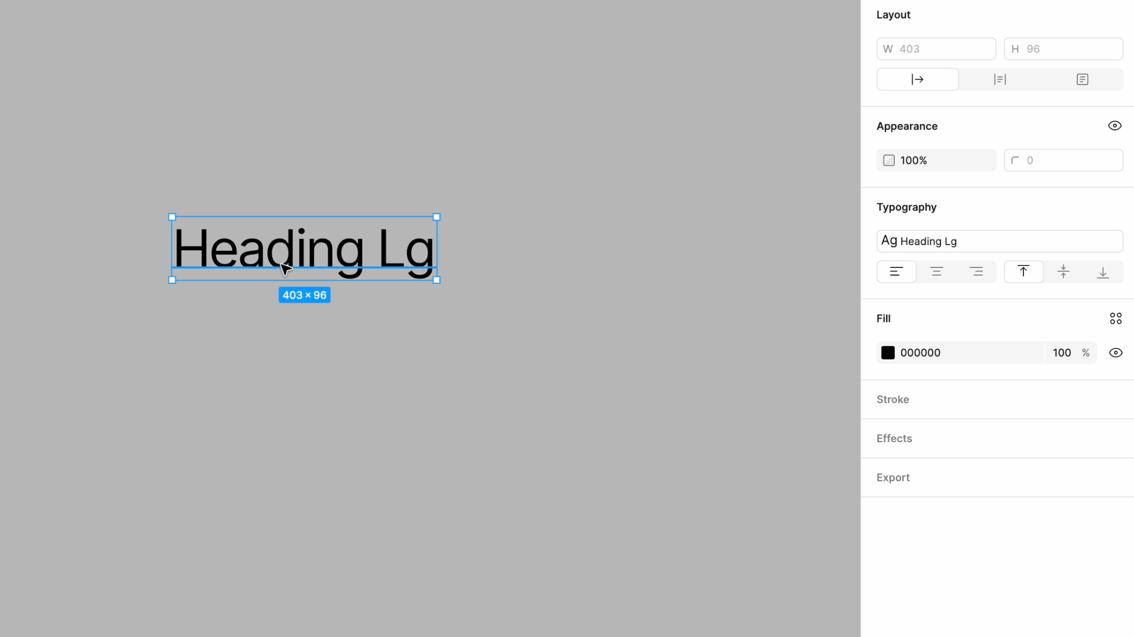
Individual properties of a text style should be overridable without the need to detach it completely
Text styles in Figma currently present us with a frustrating dilemma: either maintain perfect consistency with your design system or completely detach from it. There's no middle ground, and that's a problem for real-world design work.
Consider this common scenario: you have a perfectly crafted heading style that defines everything - font family, size, weight, line height, the works. Then you need that exact same heading, just with a different line height to accommodate a tight space. Your options? Either create a whole new text style (hello, style sprawl) or detach from the text style entirely - losing all connection to your design system in the process. When that heading style later gets updated with a new font, guess which texts will miss the update? All those detached instances.
What we need is the ability to selectively override individual text properties while maintaining the connection to our design system for everything else. Think of how CSS handles property inheritance - you can override one property without losing the cascade of other styles. This would give us the flexibility we need for edge cases while keeping our design system intact.
This isn't just about convenience - it's about maintaining a scalable and manageable design system that can handle real-world design needs without forcing us to choose between rigidity and chaos.
Project organization with folders: Beyond the endless page list

Nested pages and folders of pages would help keeping the Figma file organized and easy to navigate
Let's talk about something that becomes painfully obvious the moment your project grows beyond a handful of pages: Figma's flat page structure just doesn't scale.
At Tinloof, we maintain meticulous page organization with clear naming conventions and logical ordering. But even with the most disciplined approach, a flat list is still a flat list. When your project includes design system documentation, component libraries, platform-specific designs, user flows, and client presentations, you need proper structural hierarchy - not just a well-maintained list.
Sure, there are plugins that try to address this, but file organization is such a fundamental need that it shouldn't require third-party solutions. Native folder support with a collapsible tree structure would transform how we organize and navigate our projects. New team members could instantly understand project structure, and everyone would spend less time scanning through pages trying to find what they need. Sometimes the simplest solutions are the most impactful.
Text selection with missing fonts: Let us copy that text

The infamous 'you shall not pass' font modal
Here's a scenario that makes us want to pull our hair out: A client shares their design file, and we just need to quickly grab some copy from their homepage design. But because they're using some custom font we don't have installed, Figma completely blocks us from even selecting the text. Instead, we're bombarded with font replacement dialogs that we have to dismiss just to access basic text functionality.
Look, we understand the importance of font consistency. But there's a massive difference between preserving typographic fidelity and blocking fundamental operations like copy-paste. Sometimes we just need to extract content for documentation, share copy with the content team, or quickly reference text - the font itself is irrelevant in these scenarios.
What we need is a more nuanced approach: keep the font warnings (they're important!), but make them non-intrusive and don't let them prevent basic text operations.
Filtered property exposure: Decluttering component controls

All properties from sub-components are exposed to the parent component

Only user-selected properties from sub-components are exposed to the parent component
Component properties in Figma are incredibly powerful, but when it comes to nested components, we're currently faced with an all-or-nothing situation that creates unnecessary complexity.
Here's a typical scenario from our component library: we have a card component that includes an avatar, some text fields, and a button - all of which are instances of their own components. When building this card, we want to expose only the essential properties: the avatar image, the text content, and maybe the button variant. But currently, if we expose these nested components' properties, we get everything - including all the minute styling controls, spacing options, and state variations that should really stay locked at this level.
The result? Our properties panel becomes a maze of controls, most of which shouldn't be touched at the card component level. This not only clutters the interface but also increases the risk of accidental changes that could break component consistency.
What we need is simple: the ability to cherry-pick which properties from nested components should be exposed at the parent level. A straightforward checkbox interface would let us maintain clean, focused component controls while keeping the power of property customization where it actually matters.
Enhanced status flags: Beyond "ready for dev”

Custom status flags that you can create based on your workflow
Figma's "Ready for Dev" flag was a great first step, but real-world design and development workflows are far more nuanced than a simple binary state. In large projects, components and screens flow through multiple stages, each requiring clear status communication across teams.
Currently, you’re forced to cobble together a makeshift status system using a combination of naming conventions ("[IN REVIEW] Navigation"), separate pages for different stages, external tracking tools, and endless comments. It works... sort of. But it's messy, prone to inconsistencies, and requires constant manual updating across multiple places.
What we need is a flexible, native status system that reflects how design teams actually work. Imagine being able to:
Set custom status flags that match your team's workflow
Filter and sort components by status
Receive notifications when status changes
Aspect ratio presets: Common ratios at your fingertips

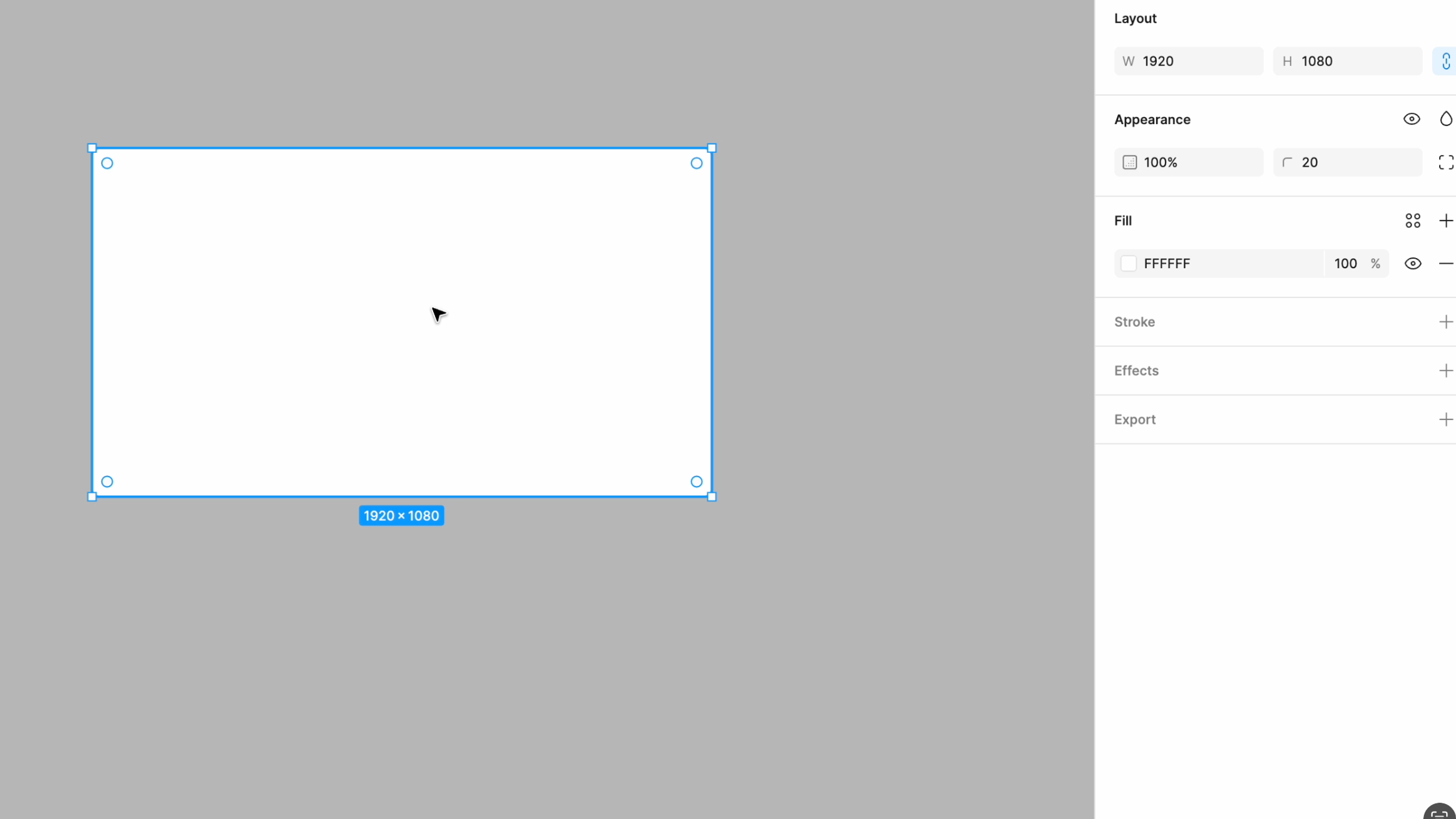
Imagine being able to pick common aspect ratios quickly and easily
Here's a small feature request that would save us countless tiny calculations throughout the day: built-in aspect ratio presets. While it might seem minor, the ability to quickly create frames with standard ratios would streamline one of our most frequent design tasks.
Currently, when we need a 16:9 frame for a video thumbnail or a 4:3 container for a presentation slide, we're doing mental math or, let's be honest, typing dimensions into a calculator. Sure, we could memorize that 1920x1080 equals 16:9, but why should we have to?
What we envision is a dropdown of common aspect ratios (16:9, 4:3, 1:1, etc.) that can be applied to any frame or shape, plus the ability to save custom ratios for project-specific needs. No more calculations, no more eyeballing - just quick access to the exact proportions we need.
It's one of those small quality-of-life improvements that would add up to significant time savings across our daily workflow.
Selective page sharing: Keeping work-in-progress private

Share single pages (or folders of pages if nesting was possible) with your client or collaborators
Here's a feature that would transform how we manage client projects: the ability to selectively share pages or folders within a Figma file. Currently, sharing is all-or-nothing, which forces us to maintain separate files just to control what our clients can access.
Think about a typical client project: we have our polished designs ready for review, but also pages full of rough explorations, internal notes, and work-in-progress iterations. Right now, we're forced to either create a separate "client-facing" file (hello, version control nightmare) or expose our entire design process. It's like having to clean your entire house just to invite someone into the living room.
What we need is granular sharing control - the ability to share specific pages or folders while keeping others private, all within the same file. This would let us maintain a single source of truth for our projects while still controlling what different stakeholders can access. No more duplicate files, no more manual syncing between "internal" and "client" versions, just clean, controlled sharing that respects both our workflow and our clients' needs.
AI integration: Empowering design workflows

Figma AI is still in beta but has a lot of potential if developed with designers in mind
With AI becoming increasingly prevalent in design tools, we have a clear vision of how we'd like to see it implemented in Figma: as an intelligent assistant that enhances our existing workflows while opening new creative possibilities.
While AI's ability to generate complete UIs is impressive and certainly has its place in early explorations or rapid prototyping, we believe the real game-changer lies in how AI can empower designers during their active design process. Think about those moments after a productive design sprint: you've quickly prototyped a complex interface that works visually, but the file needs some serious cleanup. Inconsistent spacing is scattered throughout, similar styles have somehow multiplied into slightly different variants, and your layer structure looks like a nested Russian doll. This is where AI could truly shine.
We envision AI as a smart assistant that could:
Intelligently rename and organize layers based on content and hierarchy
Identify and suggest consolidation of similar styles
Detect inconsistent spacing and suggest variable-based alternatives
Clean up unnecessary nesting while preserving layouts
Generate contextually appropriate placeholder content
Convert manual spacing to auto-layout where it makes sense
The key is that AI should enhance rather than replace the design process. While it's exciting to see AI generate entire interfaces, its real value lies in empowering designers to work more efficiently and maintain consistency at scale. By handling the mechanical aspects of design work, AI can give us more time to focus on strategic thinking, user experience, and creative exploration - the areas where human insight truly shines.
Looking back at our wishlist, a pattern emerges: most of these features aren't revolutionary - they're thoughtful refinements that would significantly enhance our daily workflow. From simple additions like horizontal scrolling to more sophisticated features like selective property exposure, each request stems from real-world design challenges we face every day.
As Figma continues to evolve, we hope to see these kinds of practical, workflow-focused improvements alongside bigger feature releases. After all, it's often the small, thoughtful enhancements that make the biggest difference in our daily work.
