LAK Gallery Guidelines
LAK Gallery is an international art gallery that displays limited edition contemporary work in furniture, ceramics, and sculpture. We created its brand and design, and developed it from scratch.
Tone of Voice
The tone of voice of LAK Gallery is likely to be refined, sophisticated, and precise. The language used would be formal and professional, demonstrating an expert understanding of the artwork and the industry.
The gallery may use descriptive and technical language to explain the features and characteristics of each piece, while highlighting the unique qualities and artistic value of the artwork. The tone should be understated and elegant, emphasizing the simplicity and purity of the design.
The gallery's tone would reflect the exclusivity and rarity of the limited edition pieces, creating a sense of luxury and sophistication.
Overall, the tone of voice should be polished, refined, and expertly crafted, designed to appeal to a discerning and sophisticated audience.
Logo
The logotype is a bold and simple textual adaptation of the app's name.
Considering how the main recognition indicator is the favicon, we opted out of having a separate icon logo.

Logo spacing
The exclusion zone ensures the legibility and impact of the logo by isolating it from competing visual elements such as text and supporting graphics.
This zone is considered as the absolute minimum safe distance, to give the logo room to breath.
The exclusion zone is equal to half the height of the letter "C" (marked as "x" in the diagram).

Minimum sizes
Establishing a minimum size ensures that the impact and legibility of the logo is not compromised in application.
Due to the higher resolution available in print vs that of screen based media (300dpi vs 72dpi respectively), we are able to reproduce the logo at a fractionally smaller size in print without any graphic deterioration.
Digital
To ensure legibility and impact, the logo should never be reproduced smaller than 70px in any digital communication.
Print
To ensure legibility and impact, the logo should never be reproduced smaller than 20mm in any print communication.

Logo misuse
It is important that the appearance of the logo remains consistent.
The logo should not be misinterpreted, modified, or added to.
No attempt should be made to alter the logo in any way. Its orientation, colour and composition should remain as indicated in this document — there are no exceptions.
To illustrate this point, some of the more likely mistakes are shown on this page.

Logo placement
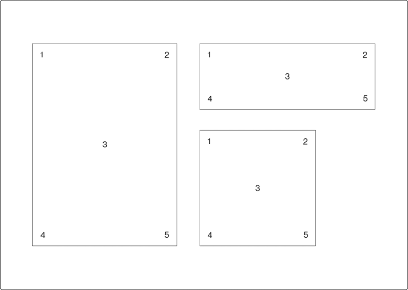
Regardless of communication size or dimension, the logo can only ever be placed in five locations.
This keeps logo placement simple and consistent, while allowing enough flexibility to accommodate our dynamic graphic system.
Please keep in mind the logo exclusion zone when placing the logo in a corner.
The placement options are:
1. Top left corner
2. Top right corner
3. Centered
4. Bottom left corner
5. Bottom right corner

Logo colour options
The brand guidelines reflect our commitment to simplicity and reflect the values of our brand.
We have chosen to stick to only black and white because it is simple and timeless, and it allows our brand to remain recognisable and consistent across all platforms.
Our logo is the face of our brand, and it is essential to maintain its integrity. Therefore, we strictly prohibit the use of the logo with any other colors, regardless of the situation or event.
This is because we want our brand to be immediately recognisable and not diluted by using colors that do not fit our brand's personality.

Colors
Eerie Black
Soft black tone. Used for texts and primary design elements.
HEX: #1A1A1A
RGB: 26, 26, 26
CMYK: 0, 0, 0, 90

New House White
One of our main image background colours which works perfectly to contrast all the content.
HEX: #F1EDE8
RGB: 241, 237, 232
CMYK: 0, 2, 4, 5

Porcelain
Our second main image background colour which works perfectly to contrast all the content.
HEX: #EEF2F3
RGB: 238, 242, 243
CMYK: 2, 0, 0, 5

White
Our primary background colour which works perfectly to contrast all the content.
HEX: #FFFFFF
RGB: 255, 255, 255
CMYK: 0, 0, 0, 0

Color use
The color palette is likely to be minimal, elegant, and sophisticated. The use of black, white, and gray creates a neutral and timeless aesthetic that highlights the artwork and allows it to speak for itself.

Typography
Neue Haas Grotesk
This monospace font is easy to read and offers a playful tone when animated or used in combination with colors.


Visual

UI Interface


