Match Cards Guidelines
Match Cards is a PWA (Progressive Web App) designed by following a set of brand guidelines outlined in this document. You can access the game here.
Tone of Voice
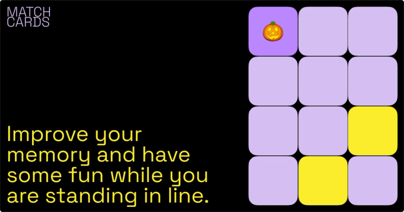
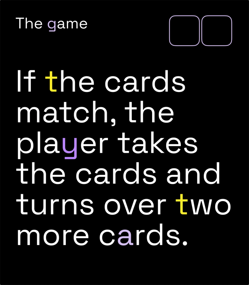
The tone of voice is upbeat and enthusiastic. It use friendly language and humor to engage with its users and create a sense of excitement and enjoyment. The tone should be welcoming and inclusive, making users feel like they are part of a community of players. It may also use clear and concise instructions and feedback to help users understand how to play and improve their skills. Overall, the tone of voice is designed to create a positive and enjoyable experience for its users.
Logo
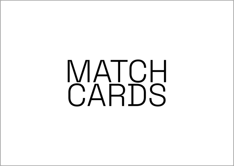
The logotype is a bold and simple textual adaptation of the app's name.
Considering how the main recognition indicator is the favicon, we opted out of having a separate icon logo.
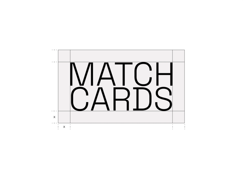
Logo spacing
The exclusion zone ensures the legibility and impact of the logo by isolating it from competing visual elements such as text and supporting graphics.
This zone is considered as the absolute minimum safe distance, to give the logo room to breath.
The exclusion zone is equal to half the height of the letter "C" (marked as "x" in the diagram).
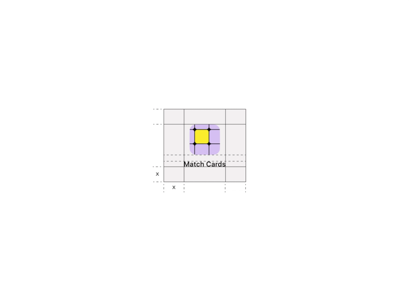
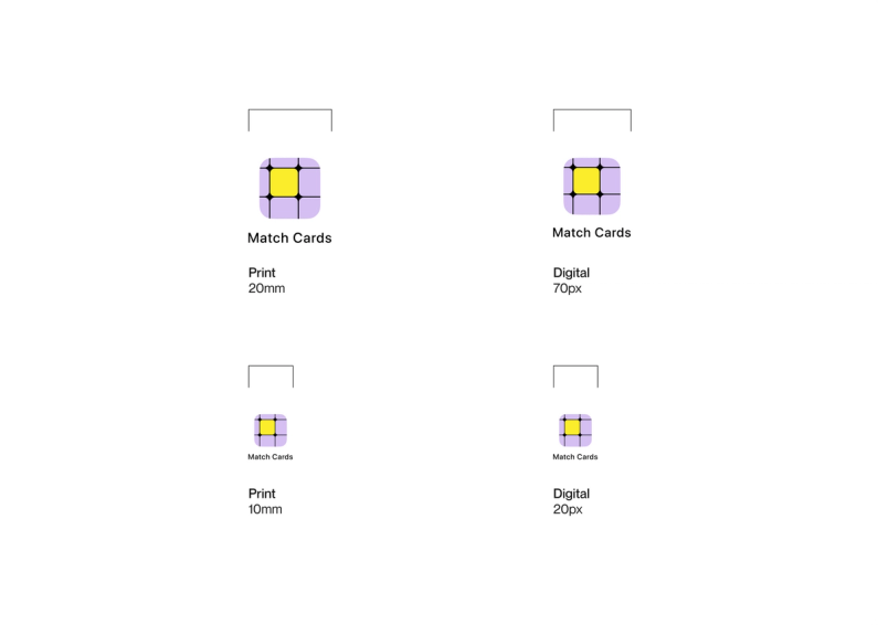
App Icon spacing
If you are using the app icon instead of the logo, the same exclusion rules apply.
The icon’s exclusion zone is equal to half the height of the app icon (marked as "x" in the diagram).
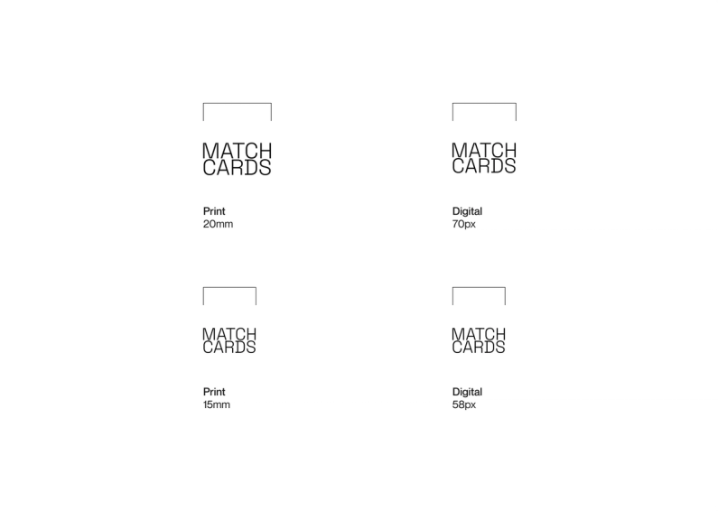
Minimum sizes
Establishing a minimum size ensures that the impact and legibility of the logo is not compromised in application.
Due to the higher resolution available in print vs that of screen based media (300dpi vs 72dpi respectively), we are able to reproduce the logo at a fractionally smaller size in print without any graphic deterioration.
Digital
To ensure legibility and impact, the logo should never be reproduced smaller than 70px in any digital communication.
Print
To ensure legibility and impact, the logo should never be reproduced smaller than 20mm in any print communication.
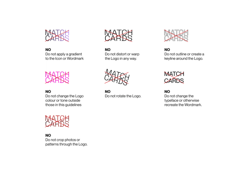
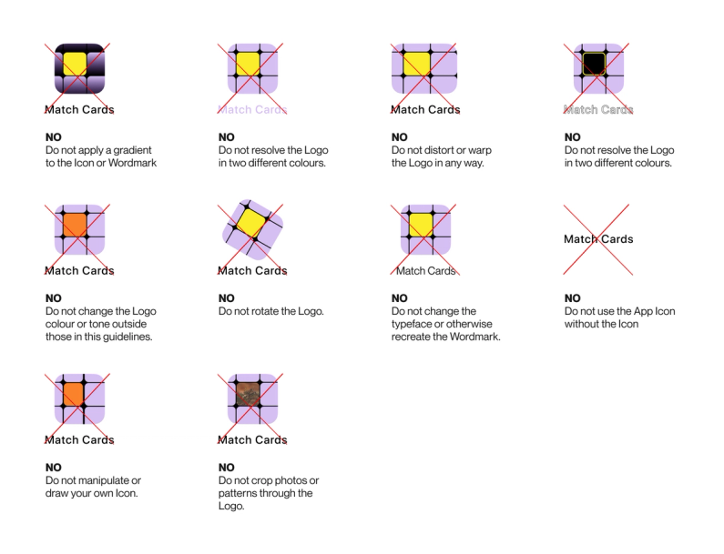
Logo misuse
It is important that the appearance of the logo remains consistent.
The logo should not be misinterpreted, modified, or added to.
No attempt should be made to alter the logo in any way. Its orientation, colour and composition should remain as indicated in this document — there are no exceptions.
To illustrate this point, some of the more likely mistakes are shown on this page.
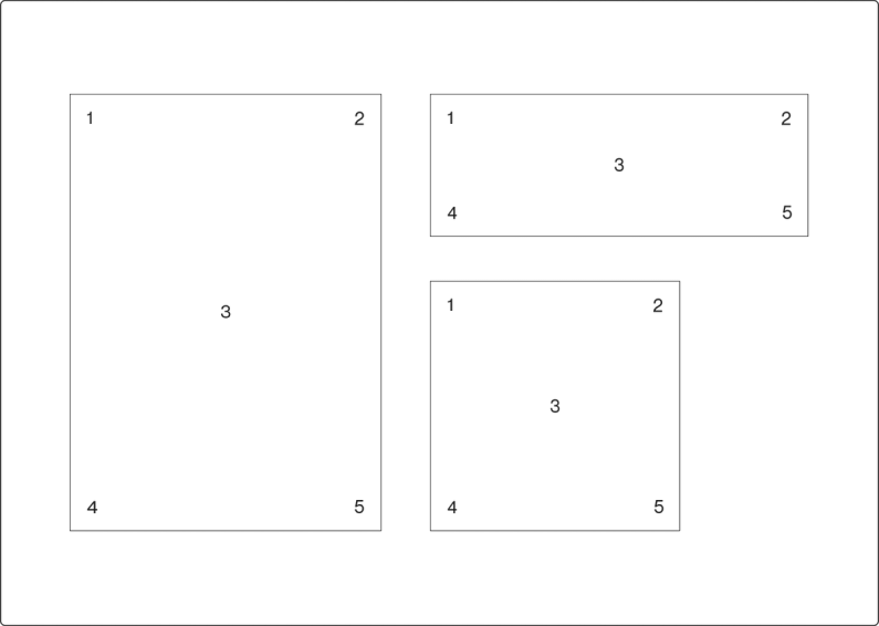
Logo placement
Regardless of communication size or dimension, the logo can only ever be placed in five locations.
This keeps logo placement simple and consistent, while allowing enough flexibility to accommodate our dynamic graphic system.
Please keep in mind the logo exclusion zone when placing the logo in a corner.
The placement options are:
1. Top left corner
2. Top right corner
3. Centered
4. Bottom left corner
5. Bottom right corner
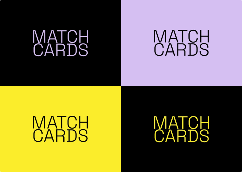
Logo colour options
The brand guidelines reflect our commitment to simplicity and reflect the values of our brand.
We have chosen to stick to only black and white because it is simple and timeless, and it allows our brand to remain recognisable and consistent across all platforms.
Our logo is the face of our brand, and it is essential to maintain its integrity. Therefore, we strictly prohibit the use of the logo with any other colors, regardless of the situation or event.
This is because we want our brand to be immediately recognisable and not diluted by using colors that do not fit our brand's personality.
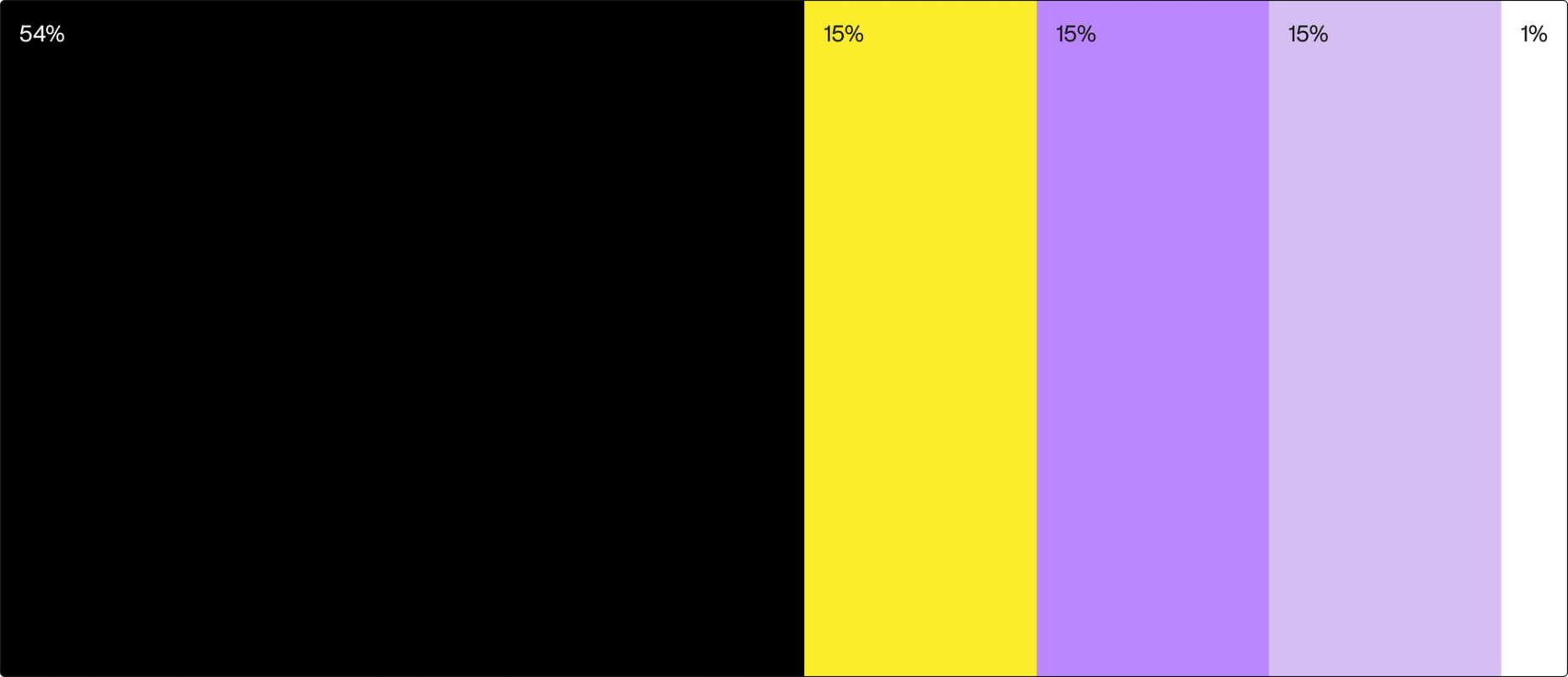
Colors
Black
HEX: #000000
RGB: 0, 0, 0
CMYK: 0, 0, 0, 100

Yellow Sun
HEX: #FBED2B
RGB: 251, 237, 43
CMYK: 0, 6, 83, 2

Pale Violet
HEX: #BB87FF
RGB: 187, 135, 255
CMYK: 27, 47, 0, 0

Soap
HEX: #D5BFF2
RGB: 213, 191, 242
CMYK: 12, 21, 0, 5

White
HEX: #FFFFFF
RGB: 255, 255, 255
CMYK: 0, 0, 0, 0

Color use
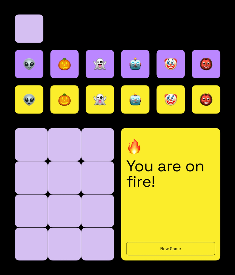
To keep the focus on the game, black is used as the main background, while expressive colors like yellow and purple are the key colors for the cards.
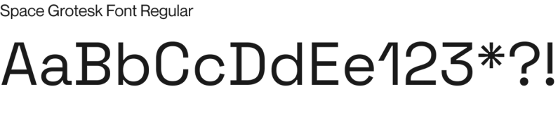
Typography
Space Grotesk Font
This monospace font is easy to read and offers a playful tone when animated or used in combination with colors.
Brand Animation
This animated splash homepage is based on the flipping cards mechanism. The letters would only highlight if they match.
UI Kit
To ensure consistency across the game, we created this UI kit. This comes in very handy as well in development, to avoid duplicated code and different styles.