Match Cards Brand Guidelines
Match Cards is a PWA (Progressive Web App) designed by following a set of brand guidelines outlined in this document. You can access the game here.
Logotype & App Icon
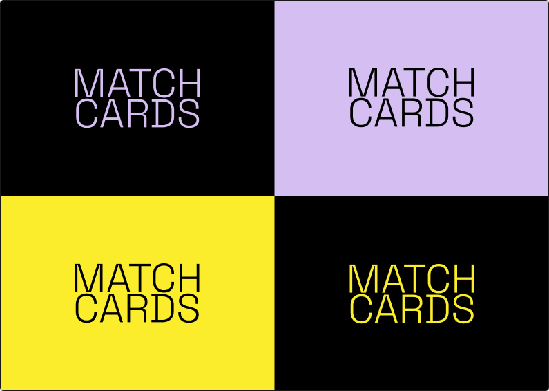
The logotype is a bold and simple textual adaptation of the app's name. Considering how the main recognition indicator is the favicon, we opted out of having a separate icon logo.
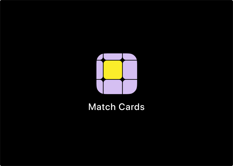
The favicon is a representation of one of the cards being flipped. It is simple, yet distinguishable from other favicons.
Typography
Space Grotesk Font
This monospace font is easy to read and offers a playful tone when animated or used in combination with colors.
Colors
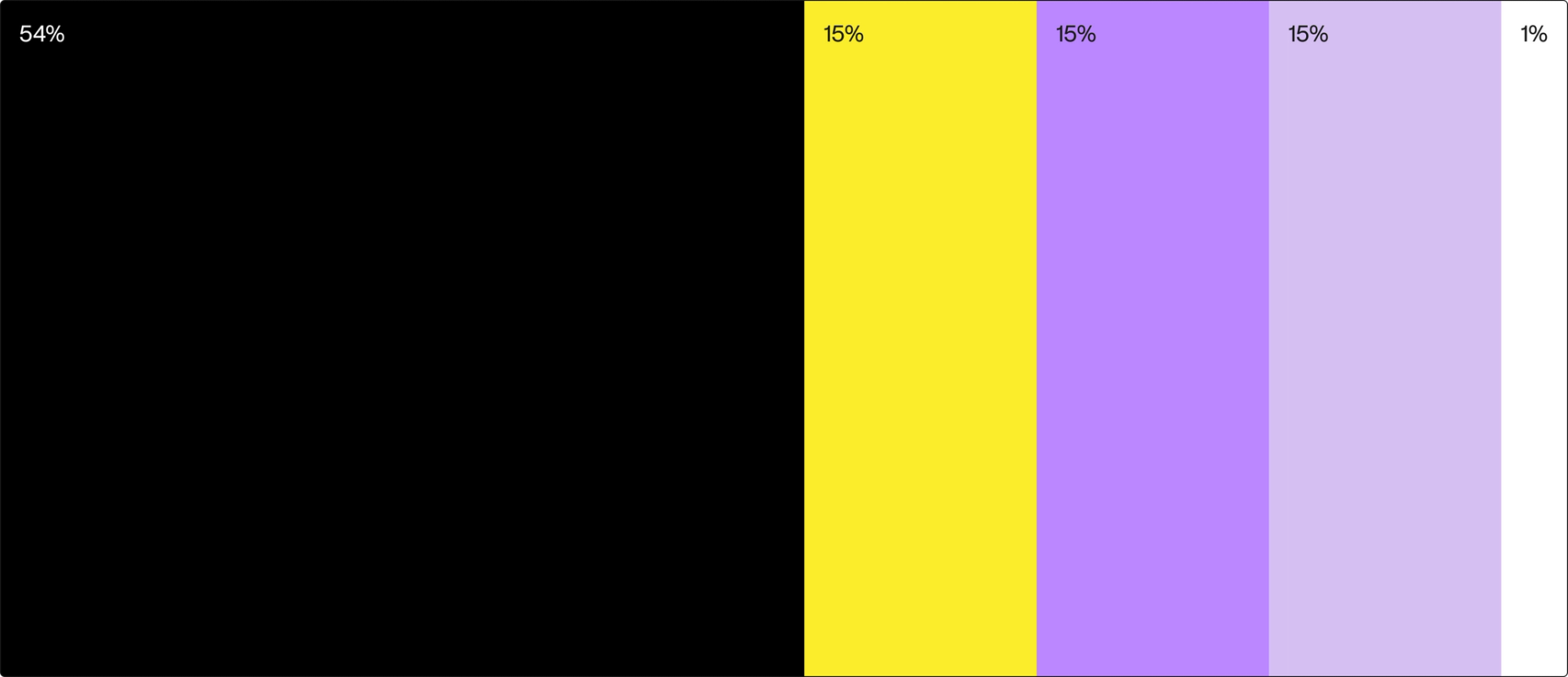
Black
HEX: #000000
RGB: 0, 0, 0
CMYK: 0, 0, 0, 100

Yellow Sun
HEX: #FBED2B
RGB: 251, 237, 43
CMYK: 0, 6, 83, 2

Pale Violet
HEX: #BB87FF
RGB: 187, 135, 255
CMYK: 27, 47, 0, 0

Soap
HEX: #D5BFF2
RGB: 213, 191, 242
CMYK: 12, 21, 0, 5

White
HEX: #FFFFFF
RGB: 255, 255, 255
CMYK: 0, 0, 0, 0

Color use
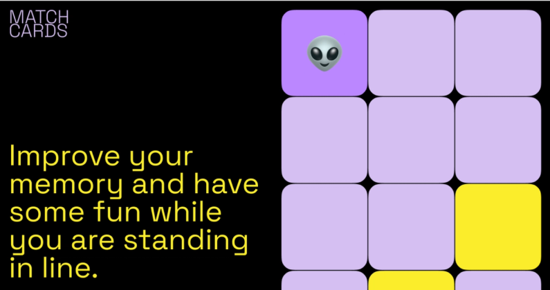
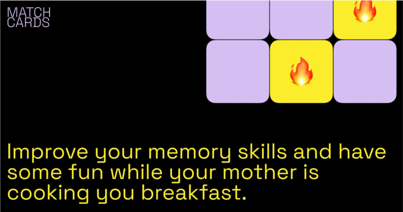
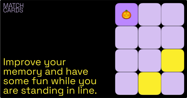
To keep the focus on the game, black is used as the main background, while expressive colors like yellow and purple are the key colors for the cards.
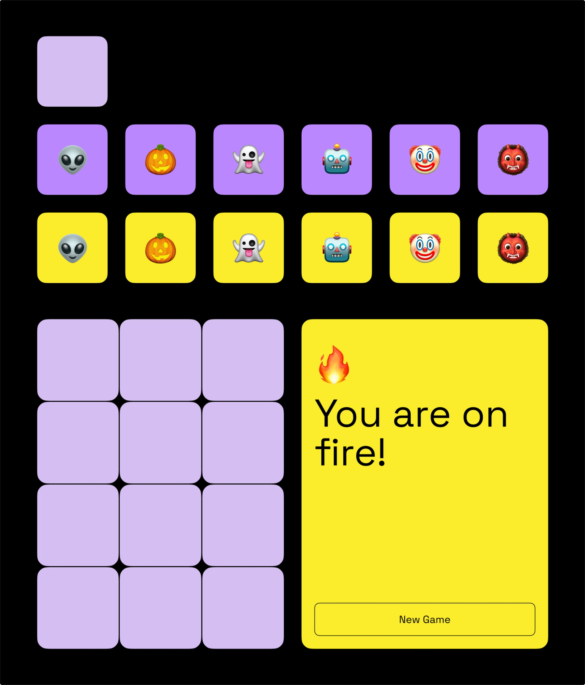
UI kit
To ensure consistency across the game, we created this UI kit. This comes in very handy as well in development, to avoid duplicated code and different styles.
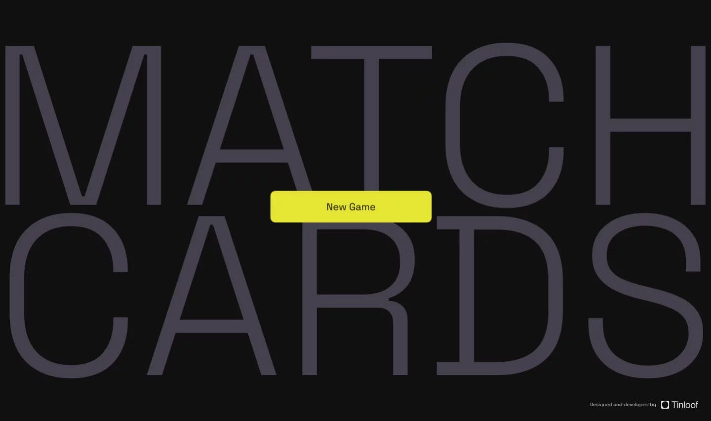
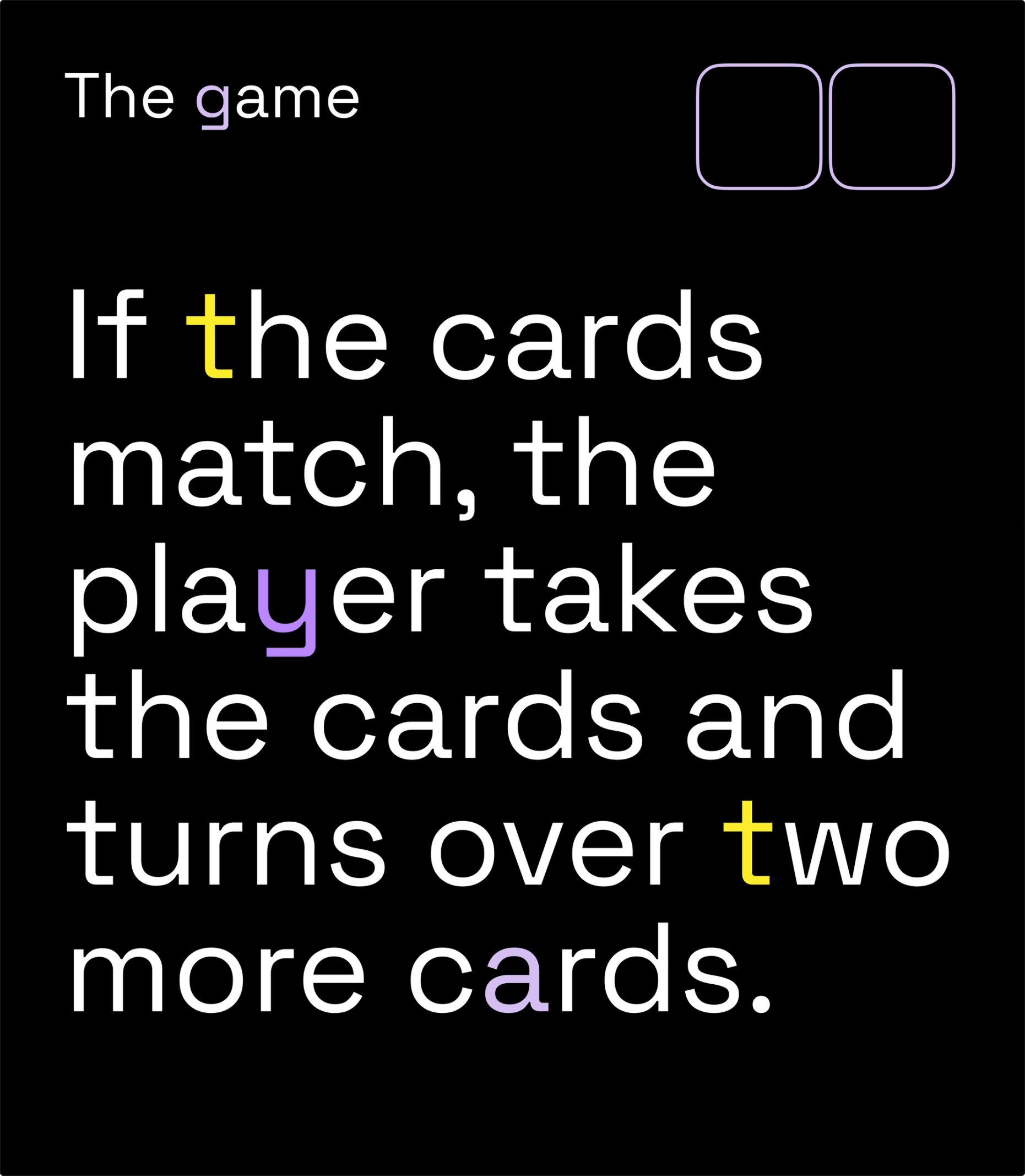
Brand Animation
This animated splash homepage is based on the flipping cards mechanism. The letters would only highlight if they match.