Tinloof Guidelines
Tinloof brand guidelines, encompassing key elements such as the logotype, colors, typography, and visuals, are consolidated on this page.
Tone of Voice
We communicate clearly and concisely, using precise language to highlight the benefits of our products and services. Our tone is confident, professional, and focused on delivering value to our customers.
Logo
The logo is an instantly recognisable symbol of the brand.
It is important to use the logo exactly as specified in these guidelines.
Our logo is the combination of a simple and modern wordmark with the icon. The icon stands for two main principles: simplicity and functionality.
We created a minimalist icon with the highest functionality possible.
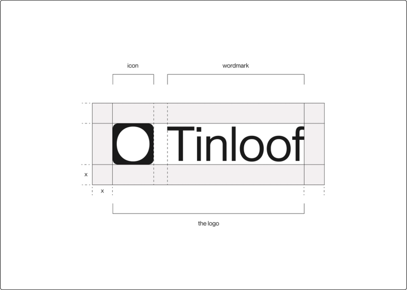
Logo spacing
The exclusion zone ensures the legibility and impact of the logo by isolating it from competing visual elements such as text and supporting graphics.
This zone is considered as the absolute minimum safe distance, to give the logo room to breath.
The exclusion zone is equal to half the height of the icon (marked as "x" in the diagram).
Icon spacing
If you are using the icon instead of the logo, the same exclusion rules apply.
The icon’s exclusion zone is equal to half the height of the icon (marked as "x" in the diagram).

Minimum sizes
Establishing a minimum size ensures that the impact and legibility of the logo is not compromised in application.
Due to the higher resolution available in print vs that of screen based media (300dpi vs 72dpi respectively), we are able to reproduce the logo at a fractionally smaller size in print without any graphic deterioration.
Digital
To ensure legibility and impact, the logo should never be reproduced smaller than 70px in any digital communication.
Print
To ensure legibility and impact, the logo should never be reproduced smaller than 20mm in any print communication.

Logo misuse
It is important that the appearance of the logo remains consistent.
The logo should not be misinterpreted, modified, or added to.
No attempt should be made to alter the logo in any way. Its orientation, colour and composition should remain as indicated in this document — there are no exceptions.
To illustrate this point, some of the more likely mistakes are shown on this page.

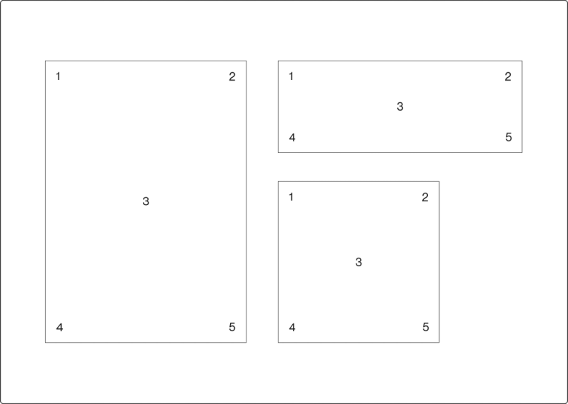
Logo placement
Regardless of communication size or dimension, the logo can only ever be placed in five locations.
This keeps logo placement simple and consistent, while allowing enough flexibility to accommodate our dynamic graphic system.
Please keep in mind the logo exclusion zone when placing the logo in a corner.
The placement options are:
1. Top left corner
2. Top right corner
3. Centered
4. Bottom left corner
5. Bottom right corner
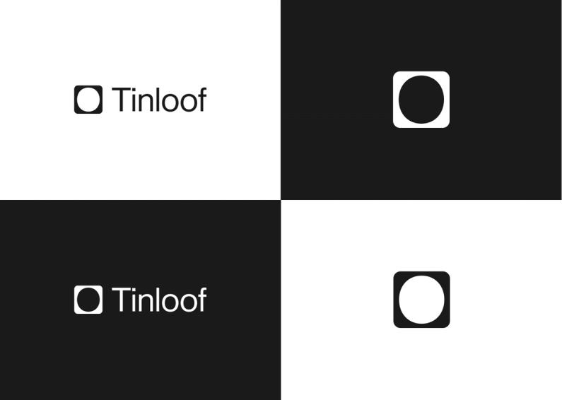
Logo colour options
Our brand guidelines reflect our commitment to simplicity and reflect the values of our brand.
We have chosen to stick to only black and white because it is simple and timeless, and it allows our brand to remain recognisable and consistent across all platforms.
Our logo is the face of our brand, and it is essential to maintain its integrity. Therefore, we strictly prohibit the use of the logo with any other colors, regardless of the situation or event.
This is because we want our brand to be immediately recognisable and not diluted by using colors that do not fit our brand's personality.
Colors
Eerie Black
Soft black tone. Used for texts and primary design elements.
HEX: #1A1A1A
RGB: 26, 26, 26
CMYK: 0, 0, 0, 90

White
Our primary background colour which works perfectly to contrast all the content.
HEX: #FFFFFF
RGB: 255, 255, 255
CMYK: 0, 0, 0, 0
Gray (X11)
Gray (X11) is used when no other eerie black or white option is available. It is mainly used in Tinloof Store.
HEX: #BABABA
RGB: 186, 186, 186
CMYK: 0, 0, 0, 27

Color use
While we do incorporate black and gray into our branding palette, black is mainly used for text while gray is sparingly and serve as complementary shade.
Our predominant color is white.
It's important to note that we do not incorporate any other colors into our brand guidelines unless they are present in assets such as images or videos.
This approach allows us to maintain a cohesive and consistent brand image across all of our materials and platforms, while also conveying a sense of elegance and simplicity that aligns with our overall brand values.

Typography
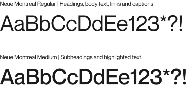
PP Neue Montreal Font
When it comes to communications design, Neue Montreal is a font that we utilize in two distinct weights: Regular and Medium.
In general, we adhere to a set of guidelines that govern which weight we use for specific design elements.
For example, Regular is typically employed for body copy and headlines, whereas Medium is reserved for sub-headers.
By maintaining consistency in our use of these weights, we ensure that our design language is clear, cohesive, and visually impactful, no matter what the specific application may be.

Illustrative graphics
We keep our illustrative graphics simple and to-the-point to deliver value.
Guidelines help us maintain consistency, which reinforces our brand identity and enhances the user experience.


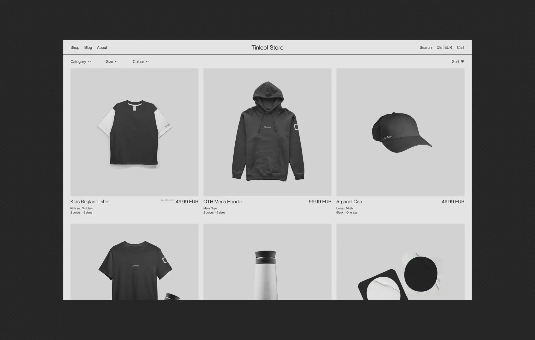
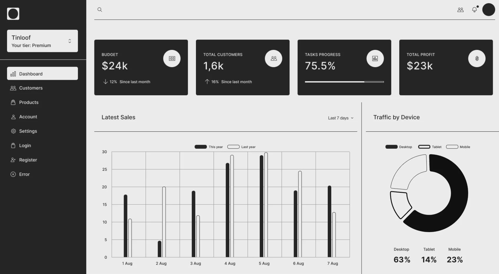
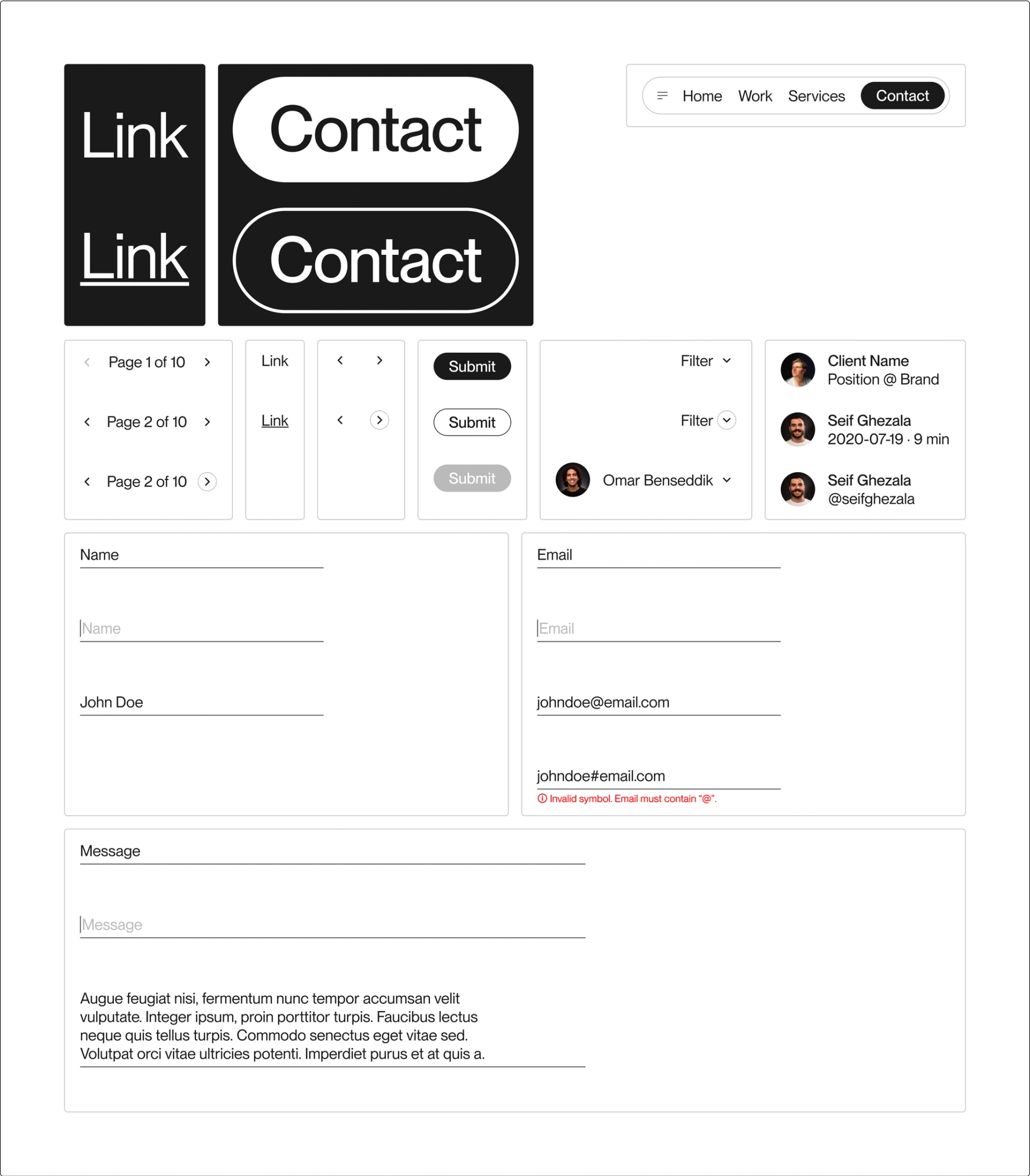
UI Kit
Our UI kit comprises a range of reusable elements, such as buttons, forms, and links, designed to promote consistency across the entire site.
By leveraging these components, we streamline development and ensure that all UI elements are documented and available for reuse.
This approach not only saves time and resources but also helps us maintain a cohesive brand identity and deliver a seamless user experience.