Tinloof Store Brand Guidelines
This page hosts Tinloof Store's brand guidelines, including details about the logotype, colors, typography, and visuals.
Access the store here.
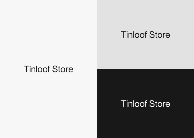
Logotype
The store follows a minimalist design to optimize the user experience and highlight merchandise photography.
In the same spirit, the logotype is a simple extension of Tinloof's logo.
Typography
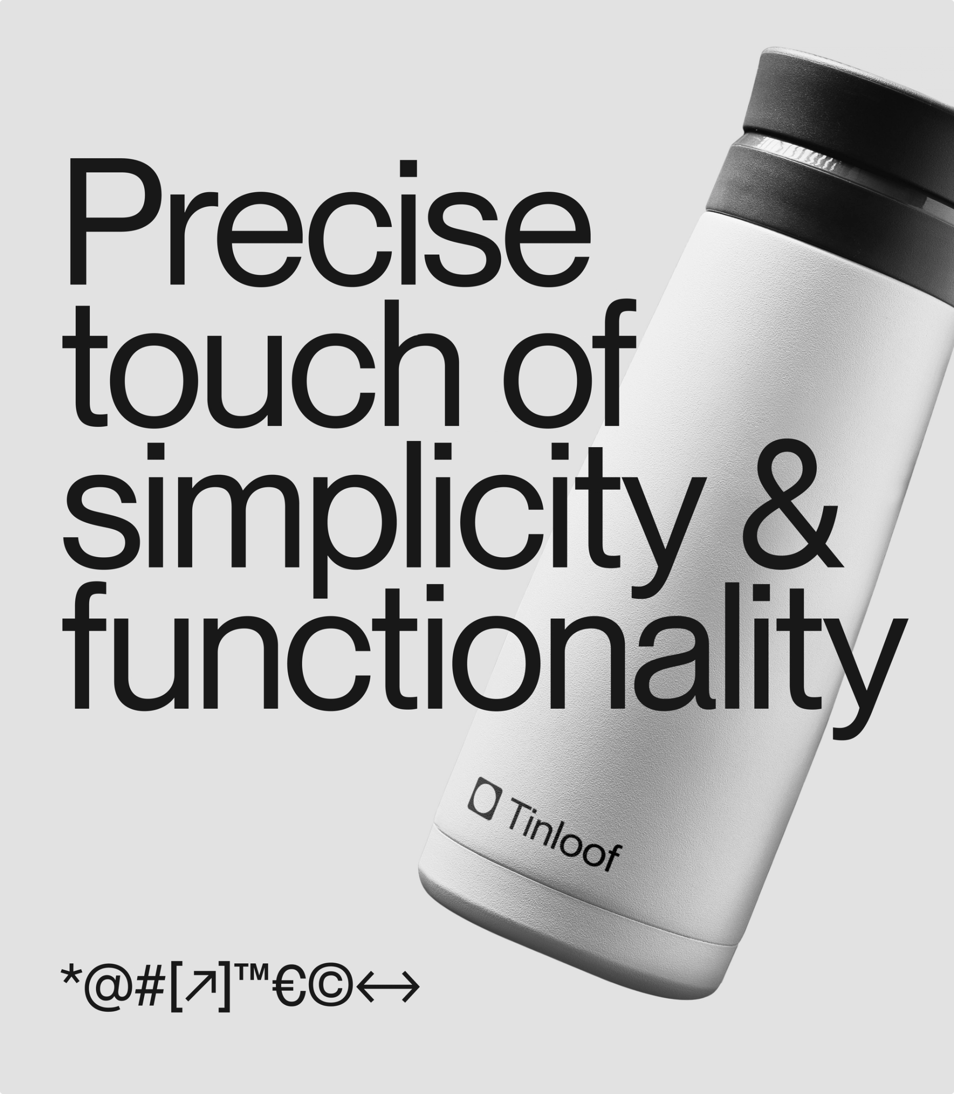
PP Neue Montreal Font
Similarly to Tinloof's website, the store uses PP Neue Montreal font.
The Sans font is easy to read, simple and looks great as a display font for headings.
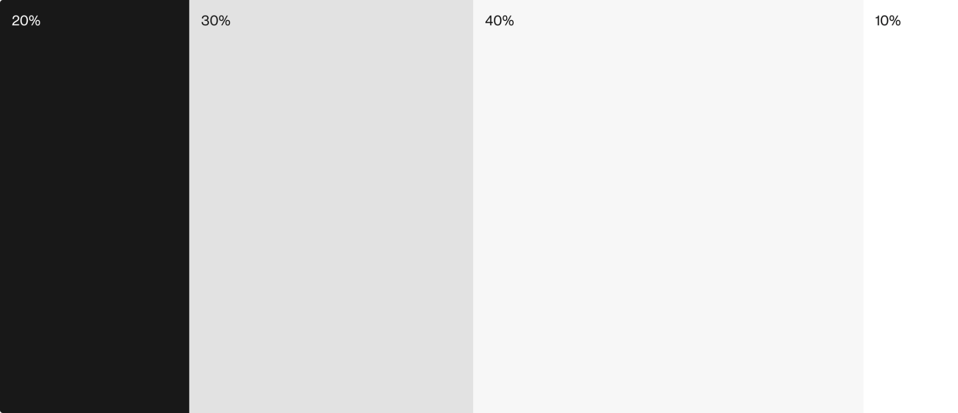
Colors
Eerie Black
HEX: #1A1A1A
RGB: 26, 26, 26
CMYK: 0, 0, 0, 90

Platinum
HEX: #E2E2E2
RGB: 226, 226, 226
CMYK: 0, 0, 0, 11

Cultured
HEX: #F7F7F7
RGB: 247, 247, 247
CMYK: 0, 0, 0, 3

White
HEX: #FFFFFF
RGB: 255, 255, 255
CMYK: 0, 0, 0, 0

Color use
The store mostly uses light colors, including white and light shades of grey.
Black is mainly used for text and primary elements of the website.
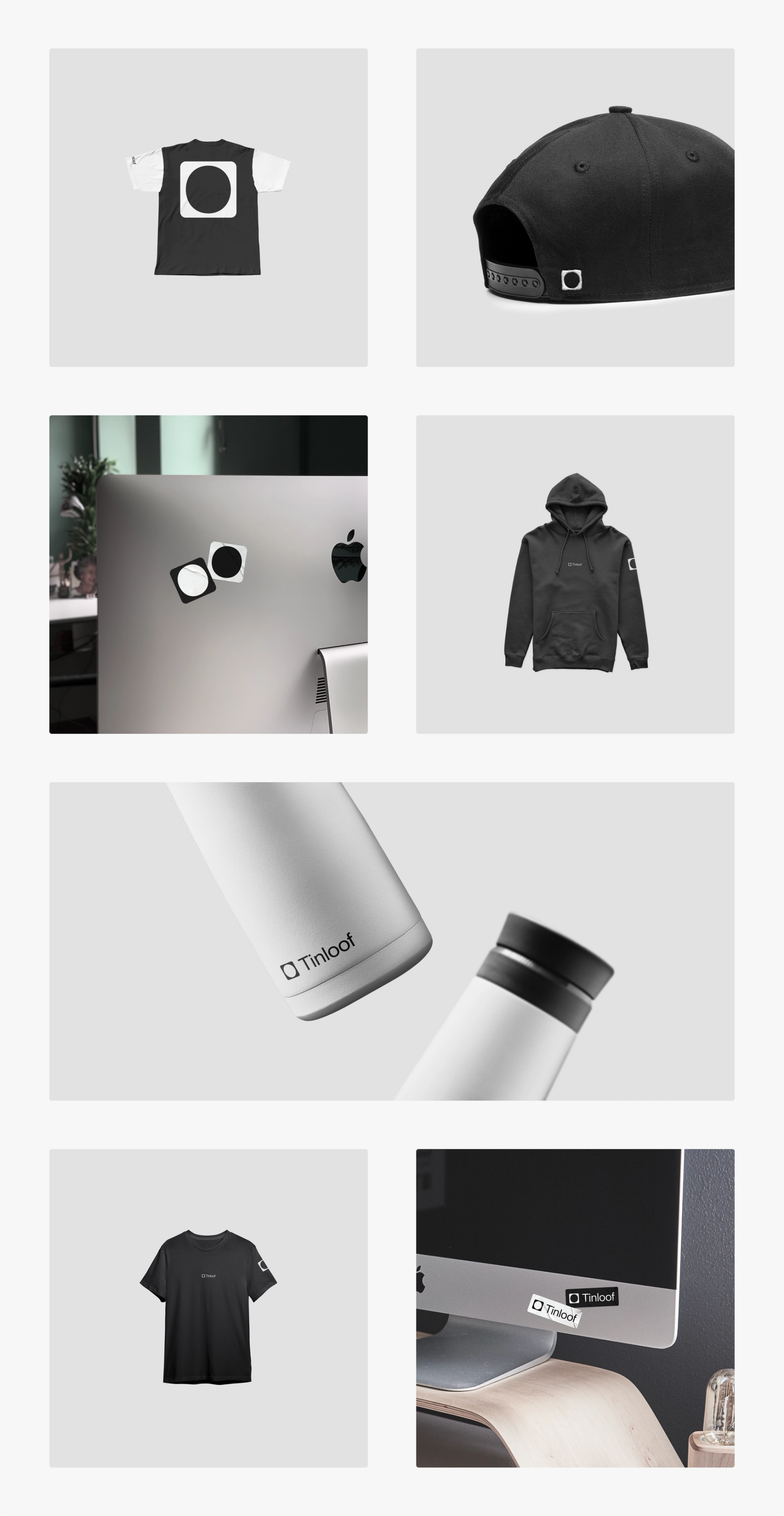
Visuals
The store's visuals consist of photography of the various merchandise products.
The photography matches Tinloof's brand guidelines and uses Platinum as a background to highlight items.
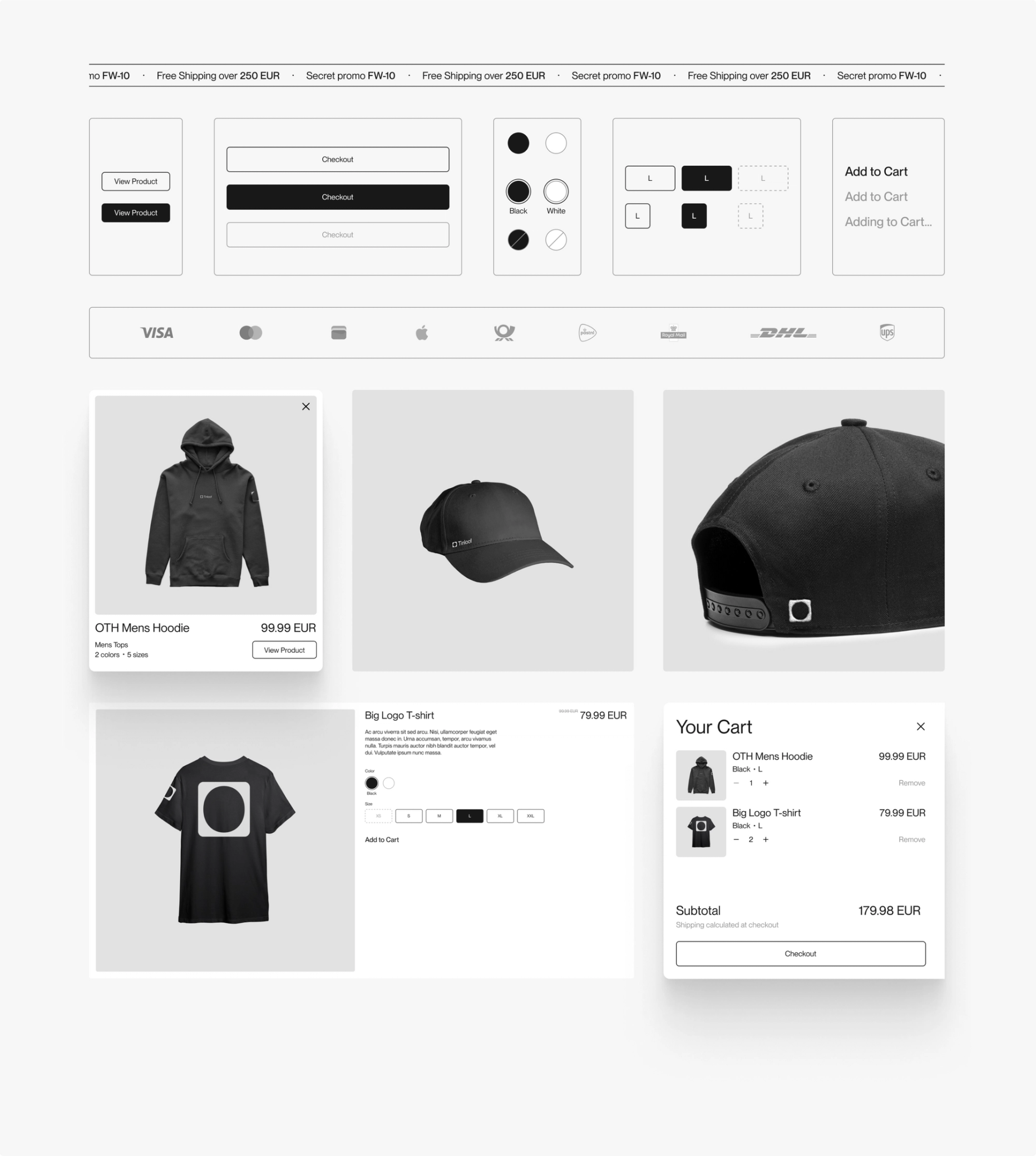
UI Kit
The UI kit consists of reusable UI elements, including components such as the buttons, the cart, and the various displays of products.
The goal of the kit is to ensure consistency across the store, facilitate the development by having reusable elements, and document the different states of the elements.