Three months sounds impossible until you're in it. New strategy, new voice, new logo, new colors, new shop—no shortcuts. To be honest, the brief was ambitious bordering on masochistic: a complete rebrand in just three months. What followed was redesigning a fashion label from the ground up, distilling its mythologies and giving Pritch the tools to own its space in luxury fashion.
The biggest challenges—aside from the earth orbiting the sun—were navigating the complex layers of creative, strategic, and human challenges that come with rebuilding a brand from the ground up in three months and translating spiritual feminist mystique into high fashion without drowning in surface-level clichés proved to be just the beginning.
Finding the strategy
Pritch is a London fashion brand founded in 2012, known for its leather corset belts and bold positioning in the luxury segment. Despite bestselling products and distinct aesthetics, the brand lacked clear positioning in the packed luxury landscape. Quality was never the question—identity was.
The brand's message was unclear and too closely tied to the founder's personal identity, which limited broader interpretation and connection with a wider audience. The brand's values seemed overshadowed by loud headlines and a caricatured portrayal of its feminist stance—more slogan than substance.
The dream? Full strategic team, then seamless creative execution. What we got? Five days with a talented but overbooked strategist. Suddenly, art direction was doing strategy too—which is basically the unspoken reality of agency life when budgets get tight. Creative roles wear multiple hats, and when strategic support gets cut, someone has to step up.
No deep dives—just us figuring out what PRIPritchTCH actually stood for beyond sexy leather work and big words. Our breakthrough? Late nights, doing the most, and leaning into our collective years of brand experience to fill the strategic gap.
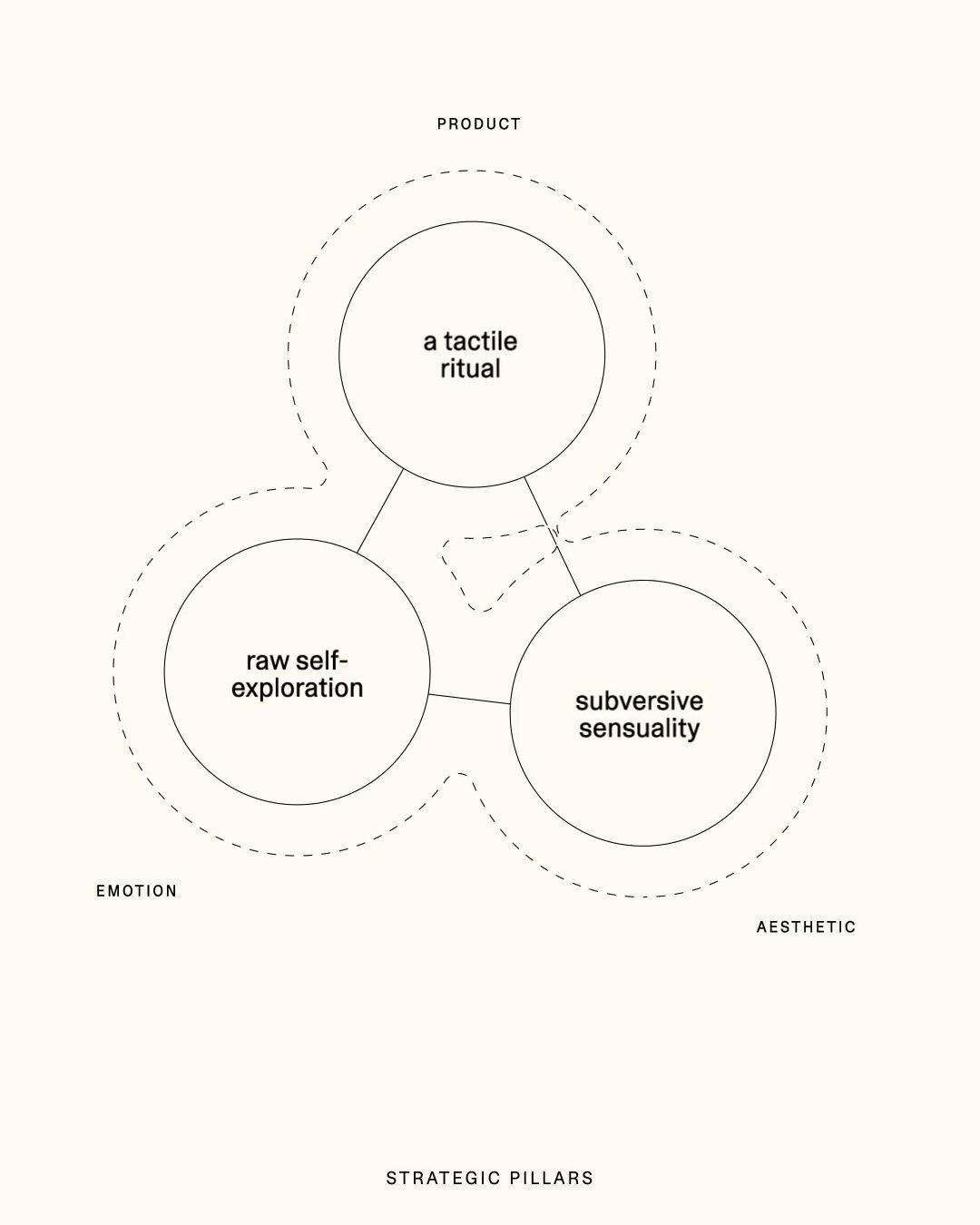
Out of that slightly unhinged process, three pillars emerged from what we actually understood about the brand—good job, if we do say so ourselves:
Product as tactile ritual, garments designed to anchor the wearer in embodied experience.
Aesthetic as subversive sensuality, elegant, structured, and intentionally disruptive.
Emotion as raw self-exploration, positioning clothing as a medium for personal depth rather than social performance.
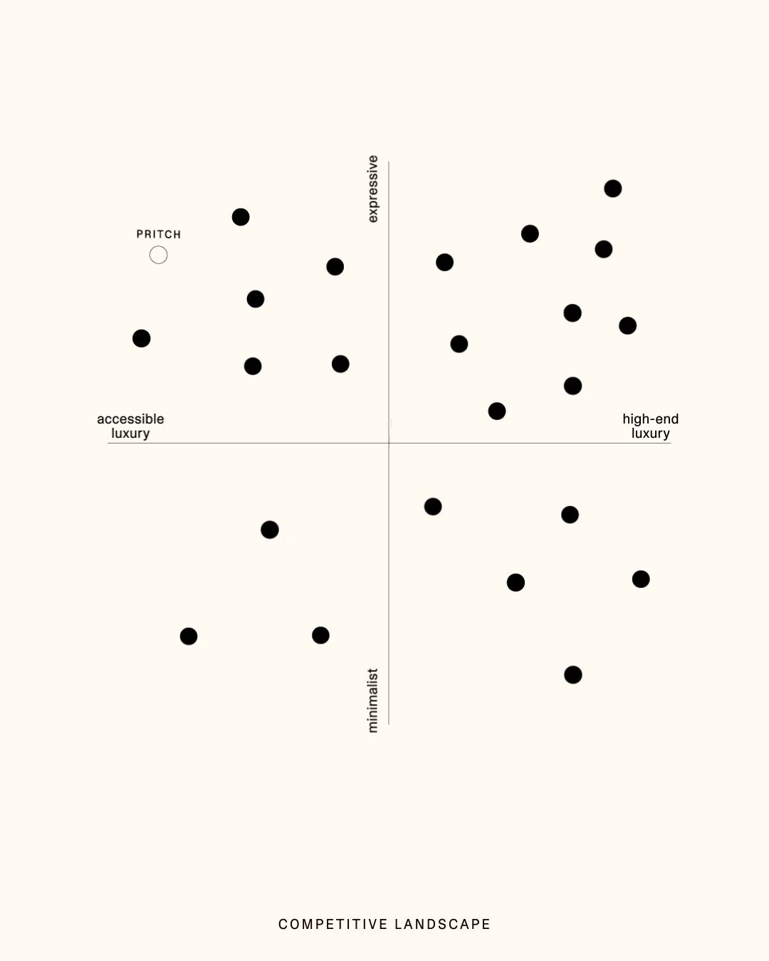
These strategic pillars became the foundation, accompanied by competitive landscape analysis, cultural context research, and a positioning graph that helped us figure out where the client positioned themselves between sexy and sensual, loud and restrained, luxurious and accessible.
From slogan to narrative
The strategic foundation informed our approach to tone of voice. Our goal was to move as far as possible from the previous "practice what you Pritch" messaging—somewhat clever, but ultimately limiting and too commercial for a high-end product.
We looked to the muses that Pritch naturally embodied, focusing not on the brand as protagonist but as enabler. From this groundwork emerged our key insight: "The Mythology of You." Every person carries their own origin story and perspective. Pritch’s role isn't to define that story, but to provide the leather-bound tools to express it with strength and individuality.
This crystallized into our manifesto: "Bare Your Bold." Not just a new tagline, but an incantation. An invitation to shed whatever doesn't serve you and step into your full, unedited complexity. Because true luxury isn't about having more—it's about needing less pretense.
Convincing the founder to let go of messaging she was personally attached to? Rationally it makes sense, but emotionally it's brutal. When your brand is tied to your identity, objectivity goes out the window. Thankfully, having that strategic foundation meant we could point to actual positioning principles instead of just 'trust us.'
The witchcraft of type
Typographic research and conception can be done in many ways. We made the conscious choice to work with a skilled type designer, optimizing what the original Pritch logo already carried in its DNA rather than starting from scratch. Better practice what you preach.
The challenge? Translating a gothic ideal into contemporary culture without drifting into caricature— "witchiness" and sexiness can quickly become costume party territory. But what could sex appeal in the typographic realm mean?
Real sexy typography isn't about decorative excess but restraint that makes you lean in closer. We focused on micro-typographical seduction: adjusting serif shapes for confident curves, rebalancing horizontal weights, fine-tuning punch sizes and overall spacing. Pritch’s letters needed to feel like they could cut glass or caress skin.
We achieved this through subtle contrast adjustments and carefully orchestrated spacing that creates tension without aggression—like a whispered spell rather than a shouted demand. The chosen logo typeface became our primary headline font, paired with a deliberately clinical yet functional sans serif. Mystique balanced by clarity, emotion grounded by precision.
Symbol as sigil
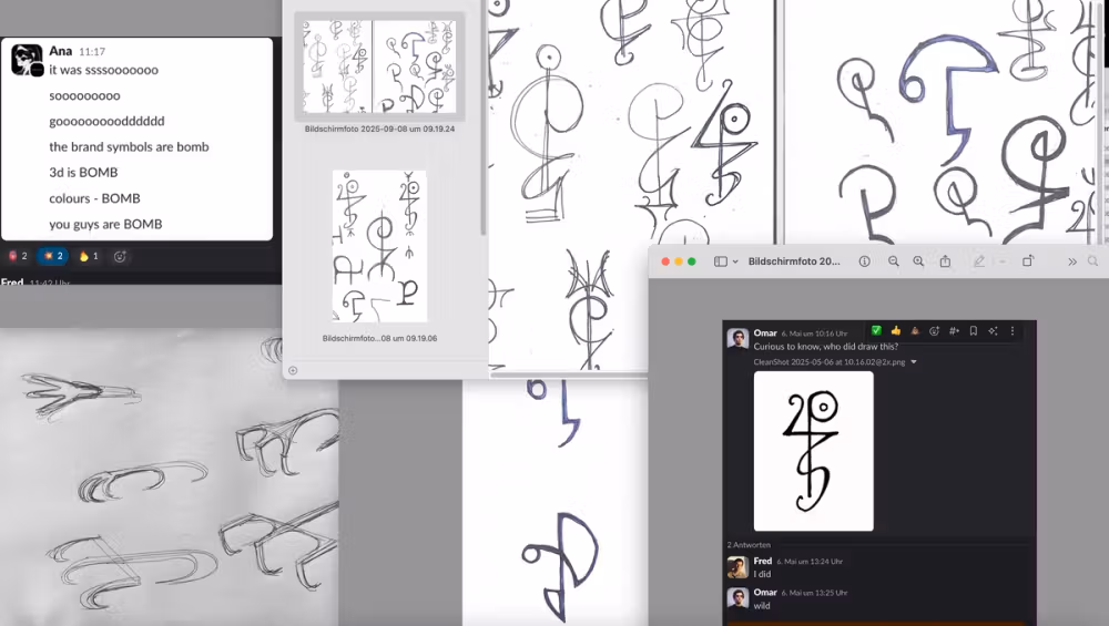
For the brand mark, rather than simply "facelifting" the existing raven, we focused on deconstructing it to explore new possibilities. Sometimes what you don't show carries more power than what you do.
The raven's absence became its own presence, subtly suggested through a claw formed by extending the "P" curve. This created a visually refined symbol that emerged seamlessly from the brand's typographic soul—discovered rather than designed.
This development took three rounds to perfect—and honestly, we nearly lost ourselves in the magic. We produced so many sigils that it bordered on spiritual awakening (don't tell the client). The final symbol worked because it fused typographic logic with Pritch’s ethos, creating something that felt like an ancient claw sigil that had always belonged to the brand. In an oversaturated visual landscape, restraint becomes rebellion.
Guidance
Creating guidelines is often a paradox: it's tempting to build elaborate systems that showcase design thinking, but brands need simplicity to actually function. Not every company has an art director on staff or budget for senior creatives who can decode a 200-page brand bible that nobody will ever read anyway.
We solved this by taking a centrist approach. Our guidelines for Pritch: the logo is always centered. That's it. This central axis became the backbone of every format, making the branding both striking and instantly recognizable while being nearly impossible to mess up.
Color and command
Color is where everyone becomes an expert. Your founder has opinions, the team has opinions, even the accountant has opinions about that shade of grey.
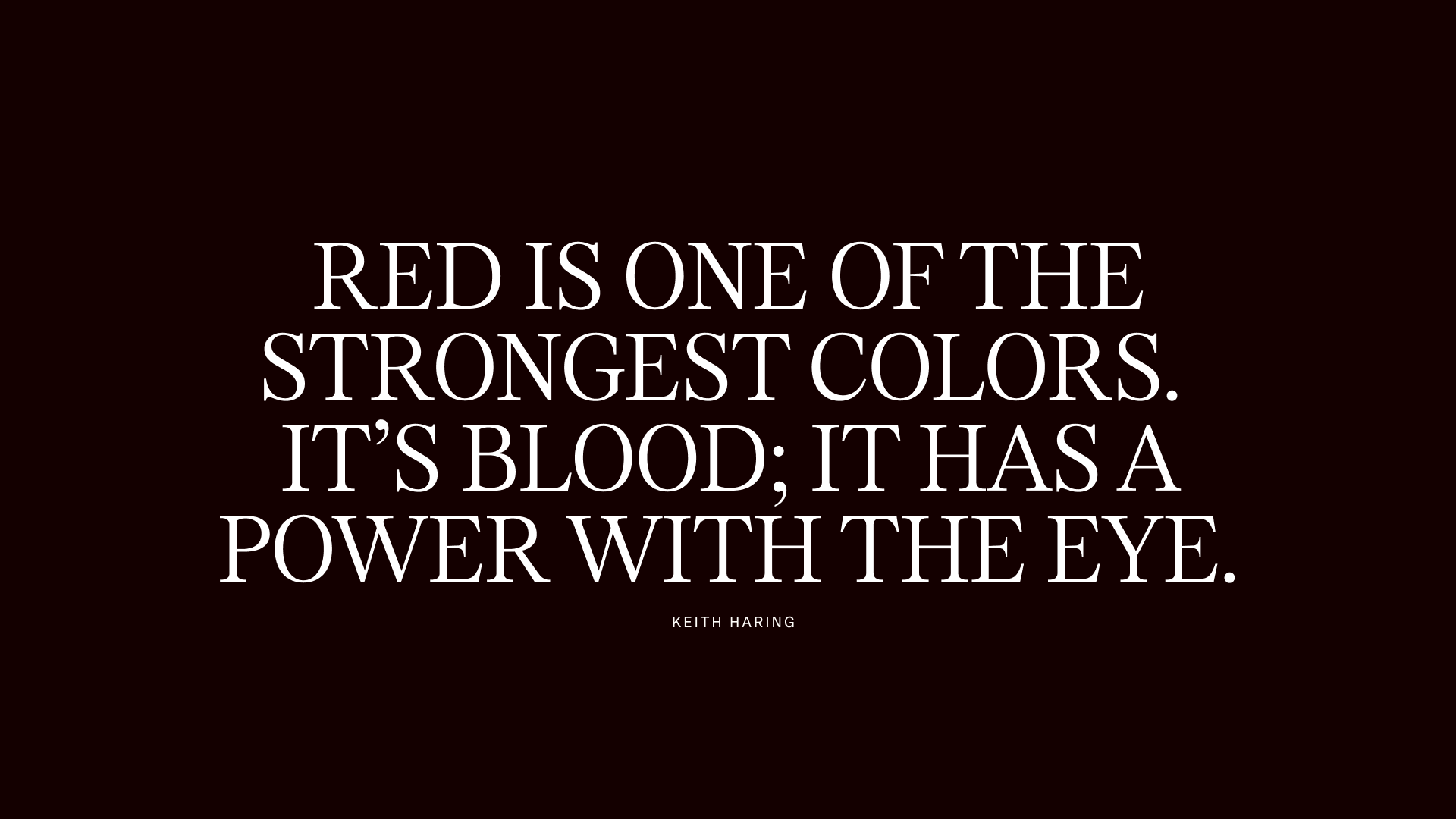
We had our strategic groundwork to guide every decision, grounding color choices in meaning rather than preference. We landed on a lush, intimate red that embodies both power and vulnerability, directly reflecting Pritch’s subversive sensuality pillar. The key insight: red works as a contrasting accent, not a dominant force. Our palette became black, bone white, refined silver grey as the foundation—then that red creates maximum impact when it appears.
When 75% of your palette stays neutral, that pop of red commands attention. We also developed a deeper blood red for moments requiring subtle luxury, giving Pritch flexibility without compromising impact.
Beyond the visual
Most agencies stop at pretty pictures. We wanted to push further. We saw Pritch as our chance to explore multi-sensorial branding—showing what happens when you refuse to do the minimum or work within budget constraints. Especially in fashion, brands have to make the transition from the digital realm into the physical. A logo that only works on screens is missing half the conversation.
Blind embossing turns the logo into something your fingers want to trace. Typography that feels as sharp as it looks. A symbol transforms into a zipper pull or even a table. This is actually where you get excited as a creative, having a playground to explore and stretch the boundaries of the imaginable.
We have even dove into scent development as an experiment. What you smell is often the first thing you notice when unwrapping a new product, yet it's rarely considered in the budget. Not every agency gets to play in that territory, but we pushed ourselves to see how far we could take the sensorial approach.
The brand grimoire
A brand book had to function as a rational toolkit to summarize all the brand elements in a PDF to make them accessible. But we thought of it as something more—not only a brand book but a kind of spellbook or grimoire. We wanted to create something that manifested all the work we'd been doing—appreciating the quality of our efforts and the team's investment.
Working with traditional bookbinders pulled us out of our office chairs to witness processes that can't be hurried or optimized with a Slack bot. We collaborated with Buchbinderei Künder to craft a leather-wrapped guide, embossed with silver foil on textured, uncoated paper. If you think about it, we gave the brand the ultimate facelift—real skin stretched over the book's spine, encapsulating Pritch’s new identity in the most literal way possible.
The book opens with: 'Pritch does not follow fashion's noise, but listens beneath it'—defining the principles and details that would guide every future decision.
When deadlines spark magic
Sometimes the best creative decisions happen when you don't have time to overthink them. The compressed timeline forced us to trust our instincts and move with the kind of conviction that second-guessing destroys.
The Pritch team was genuinely excited to work with us, and that energy was infectious from day one. One of the biggest lessons—as it always shows—is that what we created in such a short timeframe was only possible because of the trust, sensitivity, energy and support from all sides.
What emerged was a clearer expression of Pritch—the direction the brand had been moving toward all along. A rebrand succeeds not when it wins awards, but when the brand can grow into its new identity like it was always meant to fit. Pritch didn't just get a makeover—it found its voice. And in finding that voice, it gave everyone else permission to find theirs too.