1st April 2019 • 7 min read
How to create an accessible React modal

Seif Ghezala
A modal dialog is a window overlaid on top of the main application. It’s an inert window where the user can’t interact with the rest of the application.
Creating a modal in React is fairly easy. There are dozens of resources that explain how to do so, including the React documentation. This article provides an in-depth step-by-step guide to building a modal component that is accessible and reusable. We will follow the official W3C requirements for building an accessible modal dialog with a reusable API.
Let’s approach our task with a few iterations and try to meet the following requirements:
A reusable component API: we should be able to easily use our accessible modal anywhere and populate it with content.
Accessible markup.
We should be able to open & close the modal just using the keyboard.
Trap the focus in the modal: since the modal is an inert component, the keyboard navigation should be trapped inside of it once it’s open.
For the sake of this demo, let’s create a simple parent component, App.js, that will contain our modal component and a button to trigger it:
In this iteration, we want to make the simplest possible version of a modal and get it open when clicking on the open modal button.
The Modal component
Our component has two div elements:
The modal root: it covers the entire page and has a blurry effect. It has the role of dialog .
The modal content: it hosts the content of the modal. To be reusable, it receives children as a prop and renders them.
The component uses the createPortal function from react-dom . This allows us to render the modal directly in the body of the document. This makes sense for screen readers as well, since the modal should be considered outside of the main application content.
Showing the modal
To show/hide the modal, we simply render it conditionally based on the isModalVisible boolean. When we click on the open modal button, we just set the boolean to true which will show the modal.
In this iteration, we want to make it possible to close the modal. The W3 design pattern for the dialog recommends having at least one button to do so. We want to have the following 2 buttons to do that:
A cross button in the header of the modal.
A “Close” button in the footer of the modal.
To do so, we have to refactor a bit our modal so that it exposes:
A header component that contains the cross closing button and any elements we wish to render in the header of the modal.
A body component that contains any elements we wish to render in the body of the modal.
A footer component that will contain the second closing button and any elements we wish to render in the footer of the modal.
By doing so, we make the Modal component very easily reusable throughout the app, since we can quickly have a working modal just by using the components it exposes.
Closing the modal
Let’s first look at the App component. To close the modal, we pass to the modal component the onModalClose function, which sets the isModalVisible boolean to false in the parent component of the modal. Since the modal is conditionally rendered based on this boolean, setting it to false will close the modal dialog.
Now let’s look at the Modal component. Since the close buttons can be in any sub-component of the modal (header, body, or footer), we create a modal context that exposes that function. Any component that needs the function can just consume it through a context consumer. In this case, both the header and footer of the modal subscribe to the context to consume the function.
W3 recommends adding at least one keyboard shortcut to close the modal. The shortcut is the ESCAPE key.
To do so, we use the useEffect hook in order to register a keydown listener on the ESCAPE key (which has a code of 27). The listener invokes the onModalClose prop function, which closes the modal. To clean up the effect, we remove the key listener.
So far we have a relatively accessible and functional modal. However, an important part of the accessibility of the modal is trapping the user focus inside of it. Once the modal is opened, we should focus the first focusable element in it. From then, pressing the TAB or SHIFT + TAB keys will only allow the user to navigate inside the modal. Let’s go back to the Modal component and implement that.
Refactoring the Modal component
We have to add a new key listener for the TAB key. This is a good opportunity to refactor our logic for adding keyboard listeners and make it very easy to add more listeners in the future. To do so, we create a map of key codes and listeners. Each key is the keyboard key we listen to and the value is the function listener that gets called whenever that key is pressed. Whenever a key is pressed, we look for its corresponding listener from the map and call it if it exists:
1// map of keyboard listeners2const keyListenersMap = new Map([3 [27, onModalClose],4 [9, handleTabKey],5]);67function keyListener(e) {8 // get the listener corresponding to the pressed key9 const listener = keyListenersMap.get(e.keyCode);1011 // call the listener if it exists12 return listener && listener(e);13}1415document.addEventListener("keydown", keyListener);
Implementing the focus trap
Trapping the focus is basically creating a circle that has two ends: the first and last focusable elements in the Modal.
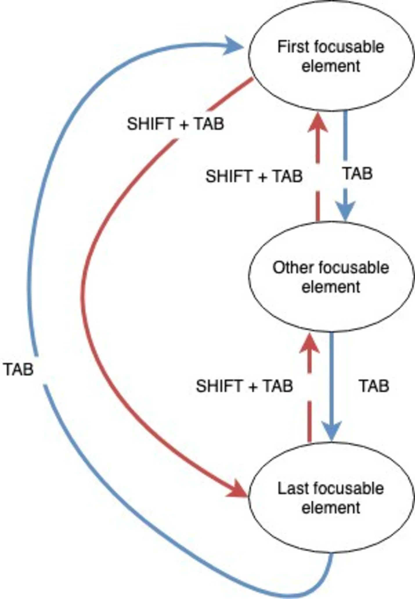
Focus trap behavior
The diagram logic can be summarized in 3 conditions. When a TAB key is pressed:
If there was no SHIFT key pressed (i.e. only the TAB key was pressed) and the current focused/active element is the last focusable element in the modal, then we shift the focus to the first focusable element.
If there was a SHIFT key pressed (i.e. SHIFT + TAB was pressed) and the current focused/active element is the first focusable element in the modal, then we shift the focus to the last focusable element.
In all other cases (i.e. in between the first and last focusable elements), we don’t do anything.