19th October 2020 • 7 min read
How to create React Notifications/Toasts with 0 dependencies

Seif Ghezala
In this article, we will demonstrate how to build React Notifications (toasts) from scratch, without using any third-party library (except React).
The notification component has the following requirements:
Four color variations: info (blue), success (green), warning (orange), and error (red).
It's positioned on the top right of the screen.
It's animated to slide in when it's added and slide out when it's removed. The other notifications should slide vertically when a notification is removed.
I can create notifications that close automatically after 10 seconds.
I can create notifications declaratively in JSX (e.g <Notification color="success" />).
I can create notifications imperatively by calling a function (e.g. success()).
The final source code can be found here and a demo can be viewed here.
I used create-react-app to generate the boilerplate for this project and CSS modules to style it.
You're free to use any other tools to generate the boilerplate and style the component.
Here's our directory structure, we'll go through every single file in it:
1├── App.css2├── App.js3├── index.css4├── index.js5└── notify6 ├── Notification7 | ├── Notification.module.css8 | ├── index.js9 | └── times.svg10 ├── createContainer11 | ├── container.module.css12 | └── index.js13 └── index.js
The Notification component
1// notify/Notification/index.js23import React from "react";4import PropTypes from "prop-types";5import cn from "classnames";67import { ReactComponent as Times } from "./times.svg";8import styles from "./Notification.module.css";910export default function Notification({ color = Color.info, children }) {11 return (12 <div className={cn([styles.notification, styles[color]])}>13 {children}14 <button className={styles.closeButton}>15 <Times height={16} />16 </button>17 </div>18 );19}2021export const Color = {22 info: "info",23 success: "success",24 warning: "warning",25 error: "error",26};2728Notification.propTypes = {29 notificationType: PropTypes.oneOf(Object.keys(Color)),30 children: PropTypes.element,31};32
The Notification component so far has 2 props:
color: a string value that determines the background color of the notification and can be either info, success, warning, or error.
children: any React elements we want to render inside the notification.
And here are its styles:
1/* notify/Notification/Notification.module.css */23.notification {4 max-width: 430px;5 max-height: 200px;6 overflow: hidden;7 padding: 12px 48px 12px 12px;8 z-index: 99;9 font-weight: bold;10 position: relative;11}1213.notification:not(:last-child) {14 margin-bottom: 8px;15}1617.notification.info {18 background-color: #2196f3;19}2021.notification.success {22 background-color: #4caf50;23}2425.notification.warning {26 background-color: #ff9800;27}2829.notification.error {30 background-color: #f44336;31}3233.notification .closeButton {34 position: absolute;35 top: 12px;36 right: 12px;37 background: transparent;38 padding: 0;39 border: none;40 cursor: pointer;41}4243.notification,44.notification .closeButton {45 color: #fff;46}47
Our notifications should be rendered separately from the DOM structure of the application using them.
createContainer is a helper function that creates a container element for the notifications (if it doesn't exist already) and append it directly to the document's body:
1// notify/createContainer/index.js2import styles from "./container.module.css";34export default function createContainer() {5 const portalId = "notifyContainer";6 let element = document.getElementById(portalId);78 if (element) {9 return element;10 }1112 element = document.createElement("div");13 element.setAttribute("id", portalId);14 element.className = styles.container;15 document.body.appendChild(element);16 return element;17}
It has a fixed position and is placed on the top right as per our requirements:
1/* notify/createContainer/container.module.css */23.container {4 position: fixed;5 top: 16px;6 right: 16px;7}
We can then use ReactDOM.createPortal to render the notification in the container we create:
1// notify/Notification/index.js23const container = createContainer();45export default function Notification({ color = Color.info, children }) {6 return createPortal(7 <div className={cn([styles.notification, styles[color]])}>8 {children}9 <button className={styles.closeButton}>10 <Times height={16} />11 </button>12 </div>,13 container14 );15}
First demo
Before writing a demo, let's expose Notification and its Color object in notify/index.js so that they can be imported and used:
1// notify/index.js23export { default as Notification, Color } from "./Notification";
Now let's write a demo to showcase the different notifications:
1// App.js23import React from "react";4import "./App.css";5import { Notification, Color } from "./notify";67function App() {8 const [notifications, setNotifications] = React.useState([]);910 const createNotification = (color) =>11 setNotifications([...notifications, { color, id: notifications.length }]);1213 return (14 <div className="App">15 <h1>Notification Demo</h1>16 <button onClick={() => createNotification(Color.info)}>Info</button>17 <button onClick={() => createNotification(Color.success)}>Success</button>18 <button onClick={() => createNotification(Color.warning)}>Warning</button>19 <button onClick={() => createNotification(Color.error)}>Error</button>20 {notifications.map(({ id, color }) => (21 <Notification key={id} color={color}>22 This is a notification!23 </Notification>24 ))}25 </div>26 );27}2829export default App;
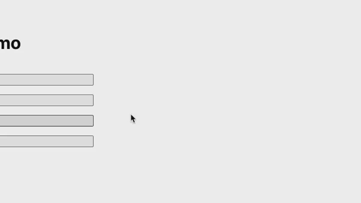
Our demo simply renders a list of notifications and has 4 different buttons to add colored notifications to our list.
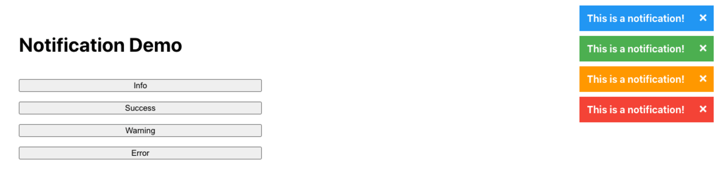
First demo: showing basic colored notifications
Let's make it possible to close notifications by adding an onDelete prop to Notification and making the close button invoke that function on click:
1// notify/Notification/index.js23export default function Notification({4 color = Color.info,5 onDelete,6 children,7}) {8 return createPortal(9 <div className={cn([styles.notification, styles[color]])}>10 {children}11 <button onClick={onDelete} className={styles.closeButton}>12 <Times height={16} />13 </button>14 </div>,15 container16 );17}
Now, in App.js, we pass an onDelete prop function that deletes the corresponding notification from the list:
1// App.js23function App() {4 const [notifications, setNotifications] = React.useState([]);56 const createNotification = (color) =>7 setNotifications([...notifications, { color, id: notifications.length }]);89 const deleteNotification = (id) =>10 setNotifications(11 notifications.filter((notification) => notification.id !== id)12 );1314 return (15 <div className="App">16 <h1>Notification Demo</h1>17 <button onClick={() => createNotification(Color.info)}>Info</button>18 <button onClick={() => createNotification(Color.success)}>Success</button>19 <button onClick={() => createNotification(Color.warning)}>Warning</button>20 <button onClick={() => createNotification(Color.error)}>Error</button>21 {notifications.map(({ id, color }) => (22 <Notification23 key={id}24 onDelete={() => deleteNotification(id)}25 color={color}26 >27 This is a notification!28 </Notification>29 ))}30 </div>31 );32}
Notifications are added and deleted too fast, which might confuse users. By adding "slide-in" and "slide-out" animations, we make notifications behave more naturally and improve the user experience.
To slide the notification in, we simply use the translateX CSS transform and translate it from 100% to 0. Here's the corresponding animation created with keyframes:
1/* notify/Notification/Notification.module.css */23@keyframes slideIn {4 from {5 transform: translateX(100%);6 }78 to {9 transform: translateX(0%);10 }11}1213.notification.slideIn {14 animation-name: slideIn;15 animation-duration: 0.3s;16 animation-timing-function: ease-in-out;17}18
"slide-out" is a bit more tricky. When hitting the close button, we need to have a "closing" phase before calling the onDelete prop function. During the closing phase, we can slide the notification out using translateX(150%) and add a transition to notification to smoothen the "slide-out".
Here are the styles corresponding to the "slide-out" animation:
1/* notify/Notification/Notification.module.css */23.notification {4 ...5 transition: transform 0.3s ease-out;6}78.notification.slideOut {9 transform: translateX(150%);10 flex: 0;11}
To achieve the closing phase in Notification, we can use a boolean state variable isClosing (set to false by default) . When we hit the close button, we set isClosing to true , wait for a the transition duration (300ms here), and then call the onDelete function.
We only use the slideIn animation styles when we're not in the closing phase (i.e. isClosing=false) and slideOut animation styles when we're in the closing phase (i.e. isCloseing=true).
1// notify/Notification/index.js23let timeToDelete = 300;45export default function Notification({6 color = Color.info,7 onDelete,8 children,9}) {10 const [isClosing, setIsClosing] = React.useState(false);1112 React.useEffect(() => {13 if (isClosing) {14 const timeoutId = setTimeout(onDelete, timeToDelete);1516 return () => {17 clearTimeout(timeoutId);18 };19 }20 }, [isClosing, onDelete]);2122 return createPortal(23 <div24 className={cn([25 styles.notification,26 styles[color],27 { [styles.slideIn]: !isClosing },28 { [styles.slideOut]: isClosing },29 ])}30 >31 {children}32 <button onClick={() => setIsClosing(true)} className={styles.closeButton}>33 <Times height={16} />34 </button>35 </div>,36 container37 );38}
When a notification is deleted, the ones below it shift suddenly to the top to fill up its position.
To make this shift more natural, let's add a container around the notification that shrinks smoothly during the closing phase:
1// notify/Notification/index.js23let timeToDelete = 300;45export default function Notification({6 color = Color.info,7 onDelete,8 children,9}) {10 const [isClosing, setIsClosing] = React.useState(false);1112 React.useEffect(() => {13 if (isClosing) {14 const timeoutId = setTimeout(onDelete, timeToDelete);1516 return () => {17 clearTimeout(timeoutId);18 };19 }20 }, [isClosing, onDelete]);2122 return createPortal(23 <div className={cn([styles.container, { [styles.shrink]: isClosing }])}>24 <div25 className={cn([26 styles.notification,27 styles[color],28 { [styles.slideIn]: !isClosing },29 { [styles.slideOut]: isClosing },30 ])}31 >32 {children}33 <button34 onClick={() => setIsClosing(true)}35 className={styles.closeButton}36 >37 <Times height={16} />38 </button>39 </div>40 </div>,41 container42 )
The container has a max-height of 200px by default and shrinks to 0 during the closing phase. We should also move the margin definition to the container:
1/* notify/Notification/Notification.module.css */23.container {4 overflow: hidden;5 max-height: 200px;6 transition: max-height 0.3s ease-out;7}89.container:not(:last-child) {10 margin-bottom: 8px;11}1213.container.shrink {14 max-height: 0;15}
Let's add an autoClose boolean prop to the Notification component and use useEffect to close the notification after 10 seconds if the prop is set to true.
1// notify/Notification/index.js23export default function Notification({4 color = Color.info,5 autoClose = false,6 onDelete,7 children,8}) {9 const [isClosing, setIsClosing] = React.useState(false);1011 React.useEffect(() => {12 if (autoClose) {13 const timeoutId = setTimeout(() => setIsClosing(true), timeToClose);1415 return () => {16 clearTimeout(timeoutId);17 };18 }19 }, [autoClose]);20
Now let's modify our demo to pass autoClose=true to the notifications:
1// App.js23function App() {4 const [notifications, setNotifications] = React.useState([]);56 const createNotification = (color) =>7 setNotifications([...notifications, { color, id: notifications.length }]);89 const deleteNotification = (id) =>10 setNotifications(11 notifications.filter((notification) => notification.id !== id)12 );1314 return (15 <div className="App">16 <h1>Notification Demo</h1>17 <button onClick={() => createNotification(Color.info)}>Info</button>18 <button onClick={() => createNotification(Color.success)}>Success</button>19 <button onClick={() => createNotification(Color.warning)}>Warning</button>20 <button onClick={() => createNotification(Color.error)}>Error</button>21 {notifications.map(({ id, color }) => (22 <Notification23 key={id}24 onDelete={() => deleteNotification(id)}25 color={color}26 autoClose={true}27 >28 This is a notification!29 </Notification>30 ))}31 </div>32 );33}34
Now notifications close automatically after 10 seconds of their creation:
We want to be able to create notifications imperatively, by calling functions such as success() or error().
The trick is to create a component similar to our App one that is rendered by default and provides us a function to create notifications.
Let's create NotificationsManager to serve that purpose:
1// notify/NotificationsManager23import React from "react";4import PropTypes from "prop-types";56import Notification from "./Notification";78export default function NotificationsManager({ setNotify }) {9 let [notifications, setNotifications] = React.useState([]);1011 let createNotification = ({ color, autoClose, children }) => {12 setNotifications((prevNotifications) => {13 return [14 ...prevNotifications,15 {16 children,17 color,18 autoClose,19 id: prevNotifications.length,20 },21 ];22 });23 };2425 React.useEffect(() => {26 setNotify(({ color, autoClose, children }) =>27 createNotification({ color, autoClose, children })28 );29 }, [setNotify]);3031 let deleteNotification = (id) => {32 const filteredNotifications = notifications.filter(33 (_, index) => id !== index,34 []35 );36 setNotifications(filteredNotifications);37 };3839 return notifications.map(({ id, ...props }, index) => (40 <Notification41 key={id}42 onDelete={() => deleteNotification(index)}43 {...props}44 />45 ));46}4748NotificationsManager.propTypes = {49 setNotify: PropTypes.func.isRequired,50};
NotificationsManager receives one prop setNotify , which is used to give access to the createNotification function to create notifications imperatively.
Now let's render NotificationsManager in the same container as Notfication and create our notification creation functions. We access createNotification function through the setNotify prop and use it to create our notification creation functions:
1// notify/index.js23import React from "react";4import ReactDOM from "react-dom";56import NotificationsManager from "./NotificationsManager";7import Notification, { Color } from "./Notification";8import createContainer from "./createContainer";910const containerElement = createContainer();11let notify;1213ReactDOM.render(14 <NotificationsManager15 setNotify={(notifyFn) => {16 notify = notifyFn;17 }}18 />,19 containerElement20);2122export { Notification, Color };2324export function info(children, autoClose) {25 return notify({26 color: Color.info,27 children,28 autoClose,29 });30}3132export function success(children, autoClose) {33 return notify({34 color: Color.success,35 children,36 autoClose,37 });38}3940export function warning(children, autoClose) {41 return notify({42 color: Color.warning,43 children,44 autoClose,45 });46}4748export function error(children, autoClose) {49 return notify({50 color: Color.error,51 children,52 autoClose,53 });54}
Now let's test these functions out in App.js . Let's also make 2 changes to improve our demo:
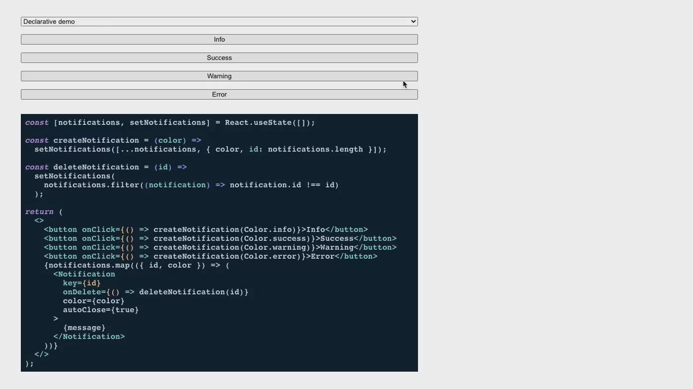
Make it possible to show both declarative and imperative approaches.
Use react-highlight to show a code snippet for each approach.
1// App.js23import React from "react";4import Highlight from "react-highlight";56import "./App.css";7import "./highlight-js-night-owl.css";89import { Notification, Color, info, success, warning, error } from "./notify";1011const message = "This is a notification!";1213function DeclarativeDemo() {14 const [notifications, setNotifications] = React.useState([]);1516 const createNotification = (color) =>17 setNotifications([...notifications, { color, id: notifications.length }]);1819 const deleteNotification = (id) =>20 setNotifications(21 notifications.filter((notification) => notification.id !== id)22 );2324 return (25 <>26 <Highlight>27 {`const [notifications, setNotifications] = React.useState([]);2829const createNotification = (color) =>30 setNotifications([...notifications, { color, id: notifications.length }]);3132const deleteNotification = (id) =>33 setNotifications(34 notifications.filter((notification) => notification.id !== id)35 );3637return (38 <>39 <button onClick={() => createNotification(Color.info)}>Info</button>40 <button onClick={() => createNotification(Color.success)}>Success</button>41 <button onClick={() => createNotification(Color.warning)}>Warning</button>42 <button onClick={() => createNotification(Color.error)}>Error</button>43 {notifications.map(({ id, color }) => (44 <Notification45 key={id}46 onDelete={() => deleteNotification(id)}47 color={color}48 autoClose={true}49 >50 {message}51 </Notification>52 ))}53 </>54);`}55 </Highlight>56 <button onClick={() => createNotification(Color.info)}>Info</button>57 <button onClick={() => createNotification(Color.success)}>Success</button>58 <button onClick={() => createNotification(Color.warning)}>Warning</button>59 <button onClick={() => createNotification(Color.error)}>Error</button>60 {notifications.map(({ id, color }) => (61 <Notification62 key={id}63 onDelete={() => deleteNotification(id)}64 color={color}65 autoClose={true}66 >67 {message}68 </Notification>69 ))}70 </>71 );72}7374function ImperativeDemo() {75 return (76 <>77 <Highlight>78 {`<>79 <button onClick={() => info(message, true)}>Info</button>80 <button onClick={() => success(message, true)}>Success</button>81 <button onClick={() => warning(message, true)}>Warning</button>82 <button onClick={() => error(message, true)}>Error</button>83</>`}84 </Highlight>85 <button onClick={() => info(message, true)}>Info</button>86 <button onClick={() => success(message, true)}>Success</button>87 <button onClick={() => warning(message, true)}>Warning</button>88 <button onClick={() => error(message, true)}>Error</button>89 </>90 );91}9293function App() {94 const [demo, setDemo] = React.useState("declarative");9596 return (97 <div className="App">98 <select onChange={(e) => setDemo(e.target.value)}>99 <option value="declarative">Declarative demo</option>100 <option value="imperative">Imperative demo</option>101 </select>102 {demo === "declarative" ? <DeclarativeDemo /> : <ImperativeDemo />}103 </div>104 );105}106107export default App;