1st November 2019 • 5 min read
How to create scroll animations with just 1 React hook (Part 1)

Seif Ghezala
This is a series of articles where we learn a few techniques to create scroll animations with just 1 React hook.
In this first part, we will use the scroll event to achieve that.
Here’s a preview of what we will achieve by the end of the article:

This technique can be summarized in 2 steps:
1- Detect when the element we want to animate is in the viewport.
2- Trigger an animation on that element.
Before diving into these steps, let’s first have a basic setup to work with.
Let’s set up a basic React page with 2 elements with Fade Left and Fade Right sections that will animate later:
1// index.js2function AnimatedSection({ children }) {3 return (4 <section>5 <div className="rectangle">6 <h2>{children}</h2>7 </div>8 </section>9 );10}1112function App() {13 return (14 <div className="App">15 <header>16 <h1>Scroll animations - Technique #1</h1>17 </header>18 <AnimatedSection>Fade left</AnimatedSection>19 <AnimatedSection>Fade right</AnimatedSection>20 </div>21 );22}2324ReactDOM.render(<App />, document.getElementById("root"));
1/* index.css */2@import url("https://fonts.googleapis.com/css?family=Indie+Flower&display=swap");34html,5body {6 margin: 0;7 padding: 0;8}910body {11 font-family: "Indie Flower", cursive;12 color: #ffffff;13 background-color: #000000;14 background-image: url(some image pattern);15}1617header {18 width: 100%;19 height: 100vh;20 background-color: #000000;21 display: flex;22 justify-content: center;23 align-items: center;24}2526h1 {27 font-weight: bold;28 margin: 0;29}3031.App {32 text-align: center;33 display: flex;34 flex-direction: column;35}3637section {38 display: flex;39 margin: 200px 50px;40}4142section .rectangle {43 display: flex;44 justify-content: center;45 align-items: center;46 width: 120px;47 height: 200px;48 padding: 10px;49 border: 10px solid rgb(255, 255, 0);50 border-radius: 3px;51 background-color: #000000;52}5354section:nth-child(odd) {55 justify-content: flex-start;56}5758section:nth-child(even) {59 justify-content: flex-end;60}

Now that we have a basic page setup, let’s see how we can animate this 🙅♂️.
The viewport is the portion of the page visible to us in the browser window. Any DOM element has an interesting function: Element.getBoundingClientRect(). According to MDN, the returned object contains various information about the element’s position relative to the viewport.
MDN's Explanation of Element.getBoundingClientRect()
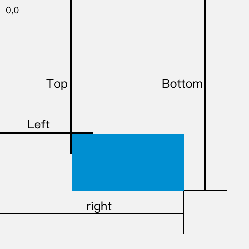
What do we see?
The blue rectangle represents a DOM element.
Top is the distance of element’s top from viewport’s top.
Bottom is the distance of the element’s bottom from the viewport’s top.
Left is the distance of the element’s left side from the viewport’s left side.
Right is the distance of the element’s right side from the viewport’s right side.

Element’s bottom at 20px from the viewport’s bottom
Element’s bottom at 20px from the viewport’s bottom
Since getBoundingClientRect().bottom is the distance between the element’s bottom and the viewport’s top side, we can use this formula to calculate the distance to the bottom of the viewport:
1Distance to bottom = window.innerHeight - getBoundingClientRect().bottomTo make this easy to use, we can create a custom hook, useIsInViewport, that calculates this measure on scroll and returns whether it’s equal to 20px:
1function useIsInViewport(ref) {2 const [isInViewPort, setIsInViewport] = useState(false);34 useEffect(() => {5 function handleScroll() {6 const { bottom } = ref.current.getBoundingClientRect();7 return setIsInViewport(window.innerHeight - bottom > 20);8 }910 window.addEventListener("scroll", handleScroll);1112 return () => window.removeEventListener("scroll", handleScroll);13 }, [ref, isInViewPort]);1415 return isInViewPort;16}
From the names of the 2 elements in our page, you probably guessed what animations we want. The first element will fade in from the right and second element will fade in from the left.
A CSS animation is basically a transition of the styles of an element from phase A to phase B.
To create an animation, we need to define what these phases are, the transition effect, and duration.
The styles of each element should therefore be based on whether it is in the viewport. If the element is not the viewport, we return the styles of phase A. If the element is in the viewport, we return the styles of phase B.
We can achieve that by making AnimatedSection accept a getStyles function and call it with isInViewport to get the element’s styles:
1function AnimatedSection({ getStyles, children }) {2 const elementRef = React.useRef();3 const isInViewport = useIsInViewport(elementRef);45 return (6 <section style={getStyles(isInViewport)}>7 <div className="rectangle" ref={elementRef}>8 <h2>{children}</h2>9 </div>10 </section>11 );12}1314AnimatedSection.propTypes = {15 getStyles: PropTypes.func.isRequired,16 children: PropTypes.element,17};
You can learn about all the possible transition effects here. We will use a 1 second ease-in transition effect. This will make our animation have a slow start.
The opacity CSS property allows to define the visibility of an element on a scale of 1. To make an element fade in, it needs to go from on opacity of 1 to an opacity of 0.
One way of moving element, is to use the CSS property transform. This property allows to set a translate an element by a given percentage or number of pixels. You can check it out in detail here.
To make an element translate from right to left, we make it go from not having a transform applied to a translate(100%) transform.
Similarly, to make an element translate from left to right, we make it go from not having a transform applied at all to a translate(-100%) transform.
What’s left now is to define these animations and pass them to their respective components:
1function App() {2 const getFadeLeftStyles = isfadeLeftInViewPort => ({3 transition: 'all 1s ease-in',4 opacity: isfadeLeftInViewPort ? '1' : '0',5 transform: isfadeLeftInViewPort ? '' : 'translateX(100%)'6 });78 const getFadeRightStyles = isfadeRightInViewPort => ({9 transition: 'all 1s ease-in',10 opacity: isfadeRightInViewPort ? '1' : '0',11 transform: isfadeRightInViewPort ? '' : 'translateX(-100%)'12 });131415 return (16 <div className="App">17 <header>18 <h1>Scroll animations - Technique #1</h1>19 </header>20 <AnimatedSection getStyles={getFadeLeftStyles}>Fade left</AnimatedSection>21 <AnimatedSection getStyles={getFadeRightStyles}>Fade right</AnimatedSection>22 </div>23 )