2nd October 2023 • 10 min read
Perfecting the design handover process

Omar Benseddik
At Tinloof, we aim for seamless and efficient design handoffs, drawing from our experience completing dozens of projects.
Our ultimate goal is a "0 questions asked" handoff, akin to an improved IKEA assembly experience.
In this article, we'll explore the three core sections of our Figma files: Design System, Blocks, and Pages. We'll also discuss our feedback process and highlight useful Figma features.
While this method is broadly applicable, we'll address more complex elements like workflows and animations in a separate guide.
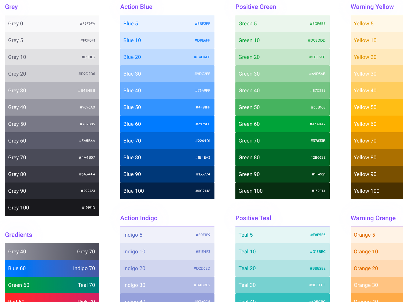
The design system helps keep the design and user interface work smooth and consistent. If it's not done right, the whole project will get messy. To keep our design system organized, we split it multiple areas:
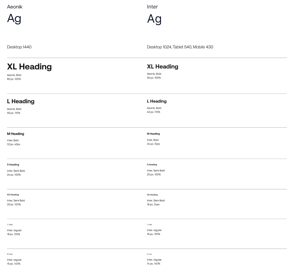
Typography
To make sure our text looks good on all devices, we note how each style appears on desktop, tablet, and mobile. Sometimes a style works well on all three, but other times it might only work for two.
We label these styles in a way that's easy to understand, making it simpler to use them on different pages.
We also focus on getting the heading sizes right, from H1 down to H6, to make sure the layout makes sense. A common mistake is to pick header sizes based only on how big the text looks, like using H2 or H3 for blog titles, which can mess up the text hierarchy.
Colors
When defining color styles, we ensure that they have indicative names based on their function rather than their color name. Whenever possible, and depending on the brand guidelines of the client, we might call a style "Light" rather than "White" to better describe its purpose.
We aim to minimize the number of colors used in a project. We understand the importance of having a consistent and limited color palette, as it helps to create a cohesive and aesthetically pleasing design.
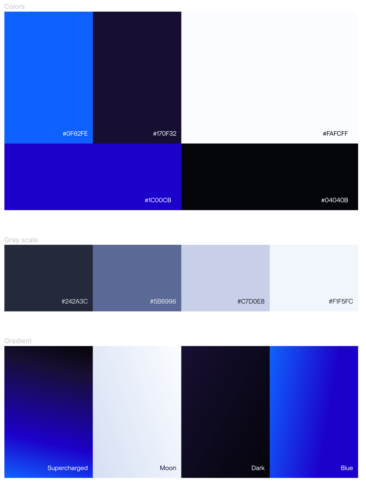
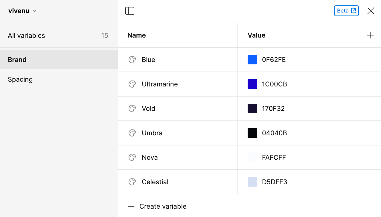
We leverage Figma variables to easily change colors if necessary, for example, vivenu ended up changing the background color last minute, and we could easily see how that would be before giving it to developers.
Going overboard with too many colors is overwhelming and distracting for users, unfortunately many design systems still include a huge palette of colors with no other purpose than making the design system look more complete.
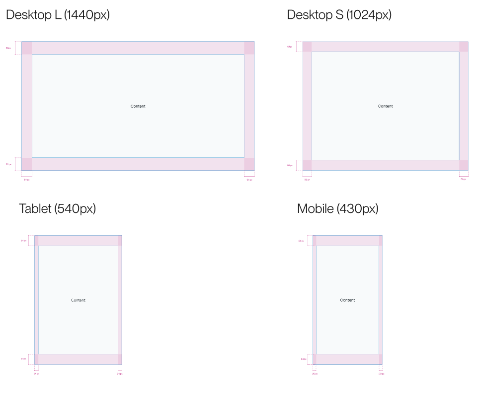
Site spacing
To ensure responsiveness, we present to the developer the breakpoints, and also mention what the max-width of the site is.

Block spacing
To make sure blocks are well-organized and visually consistent, we use a block spacing frame as the foundation. This frame sets the exact spacing between modules, both vertically and horizontally.
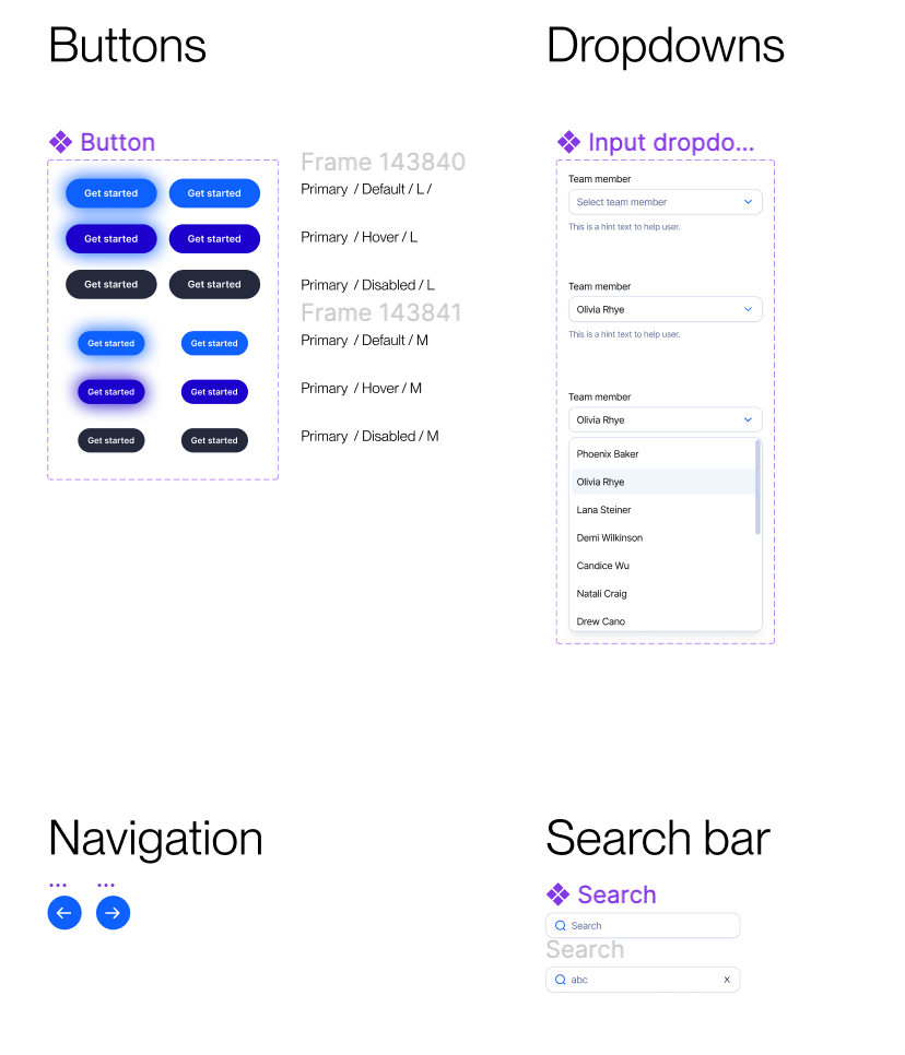
Components
To ensure that our components are well-documented and easy to manage, we document each component thoroughly, including its different states, such as hover effects, disabled, and pressed.
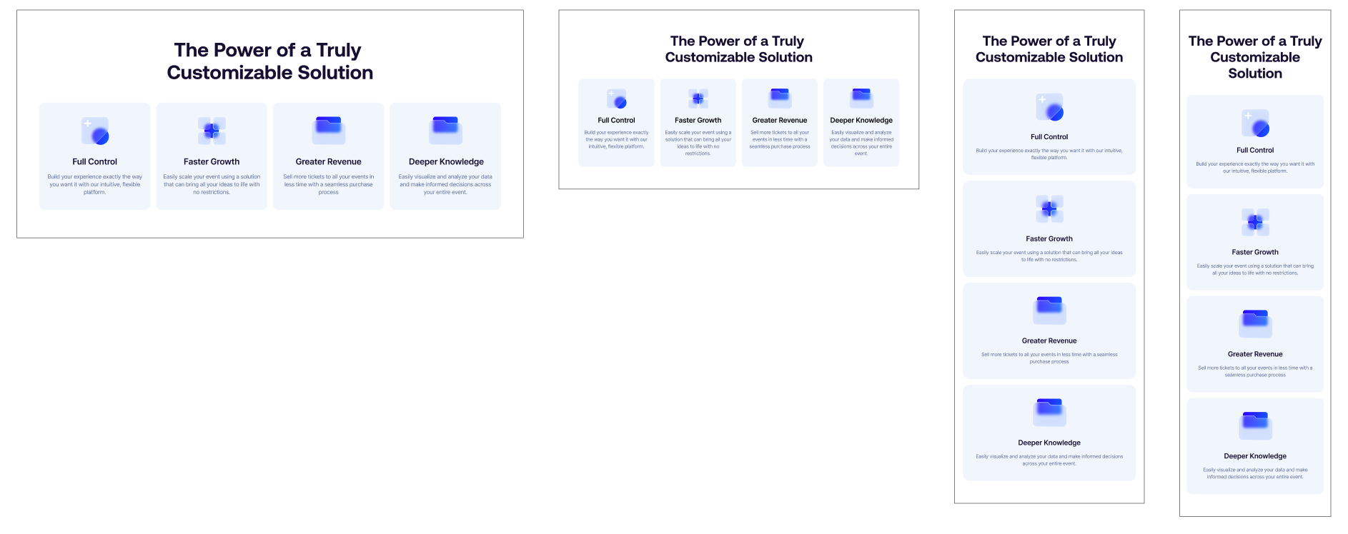
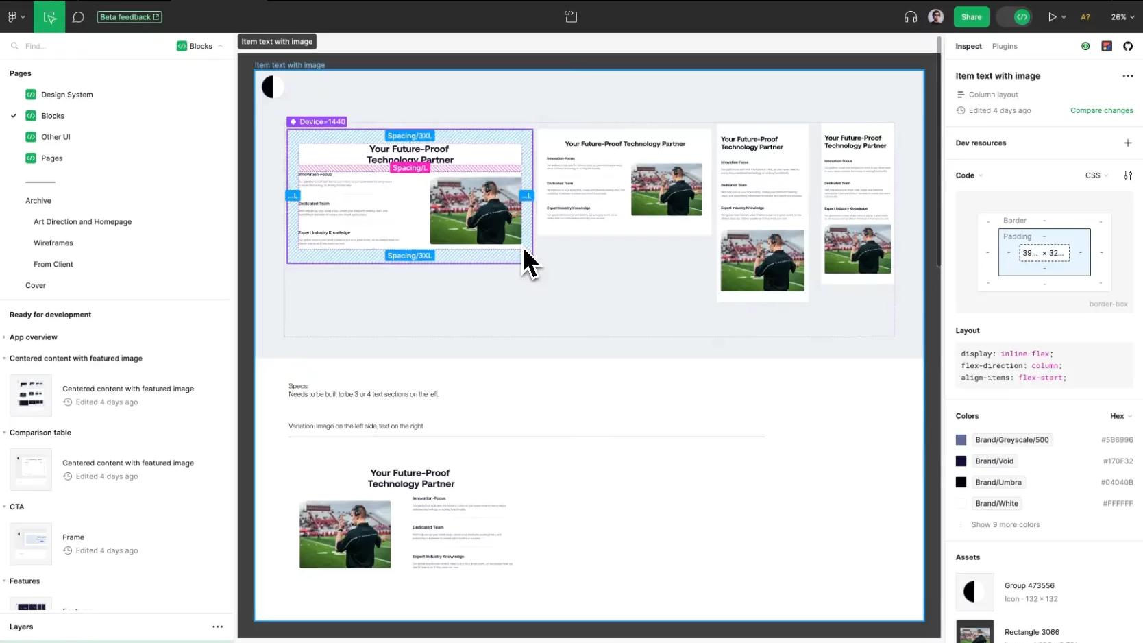
We build most website pages with a modular approach, not only to ensure an efficient and development process, but also to empower marketing teams to easily create pages with blocks that fit seamlessly.
A block spans the full width of the website, and regardless of where it's used, it will ensure brand consistency.
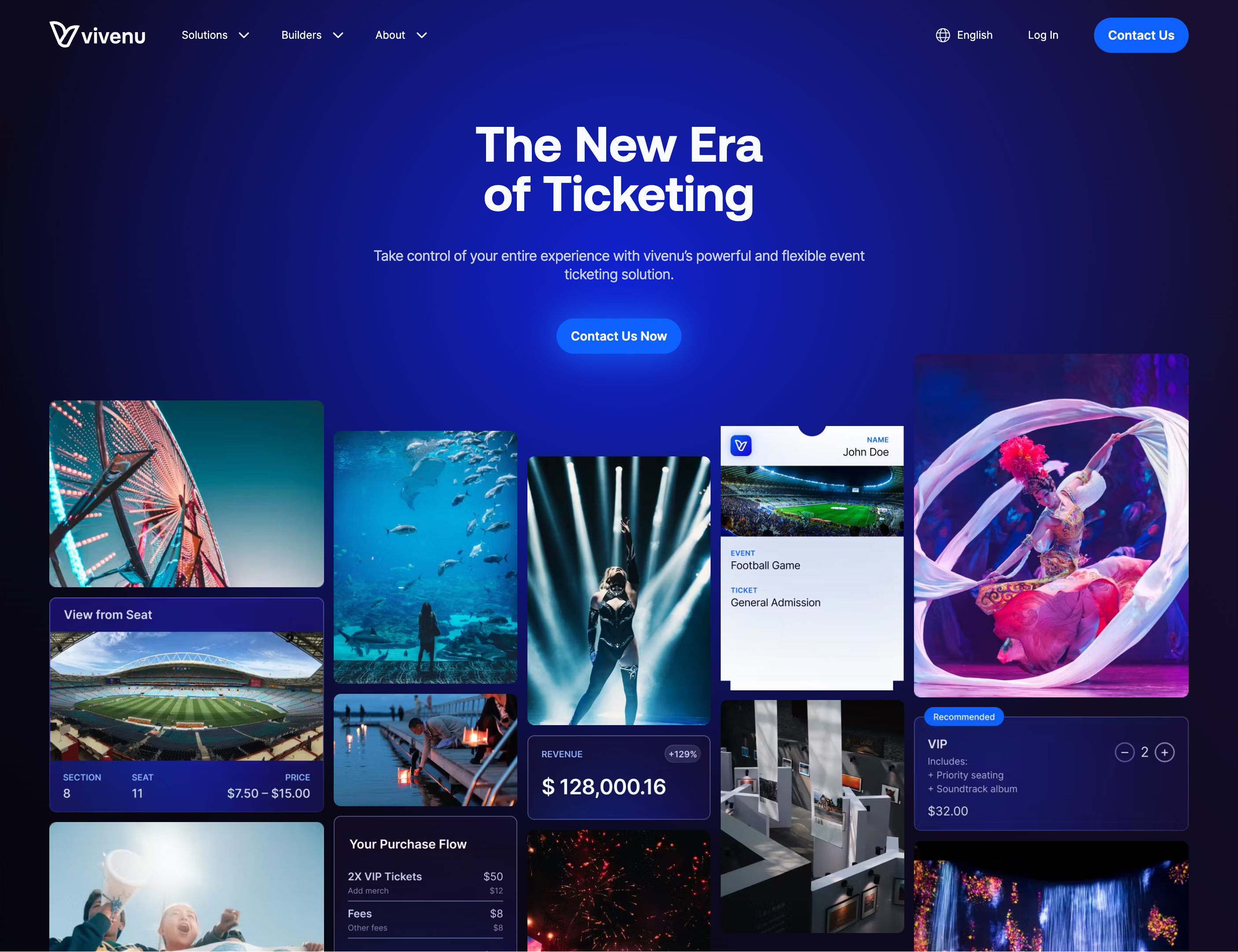
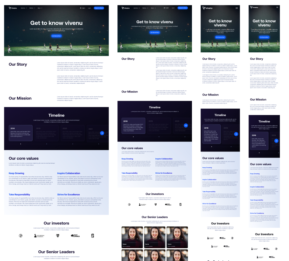
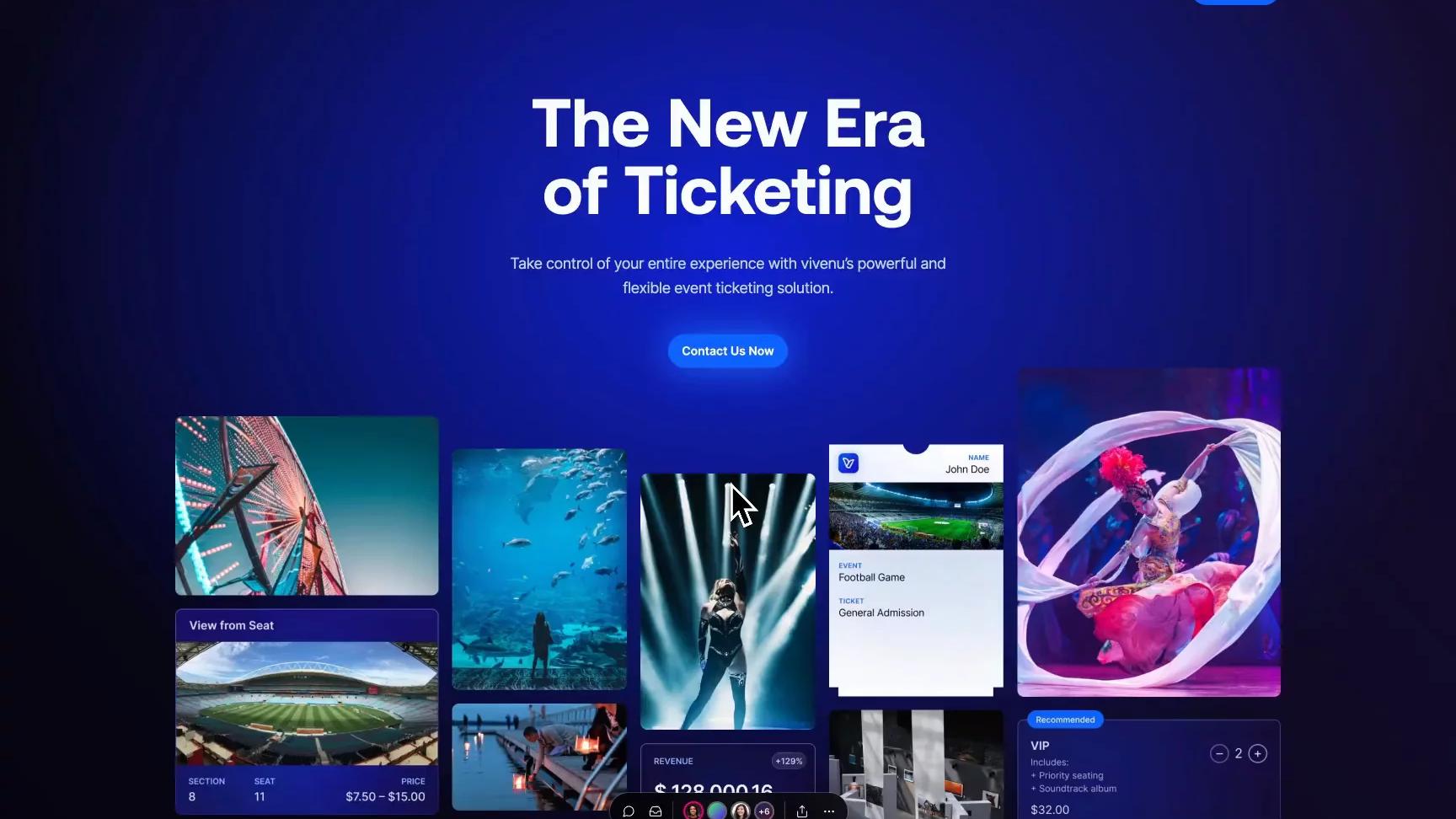
In vivenu's homepage, we can distinguish the following blocks:
1. Hero
2. Logo carousel
3. Centered asset with title
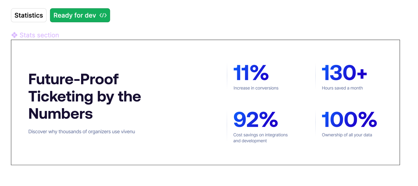
4. Statistics
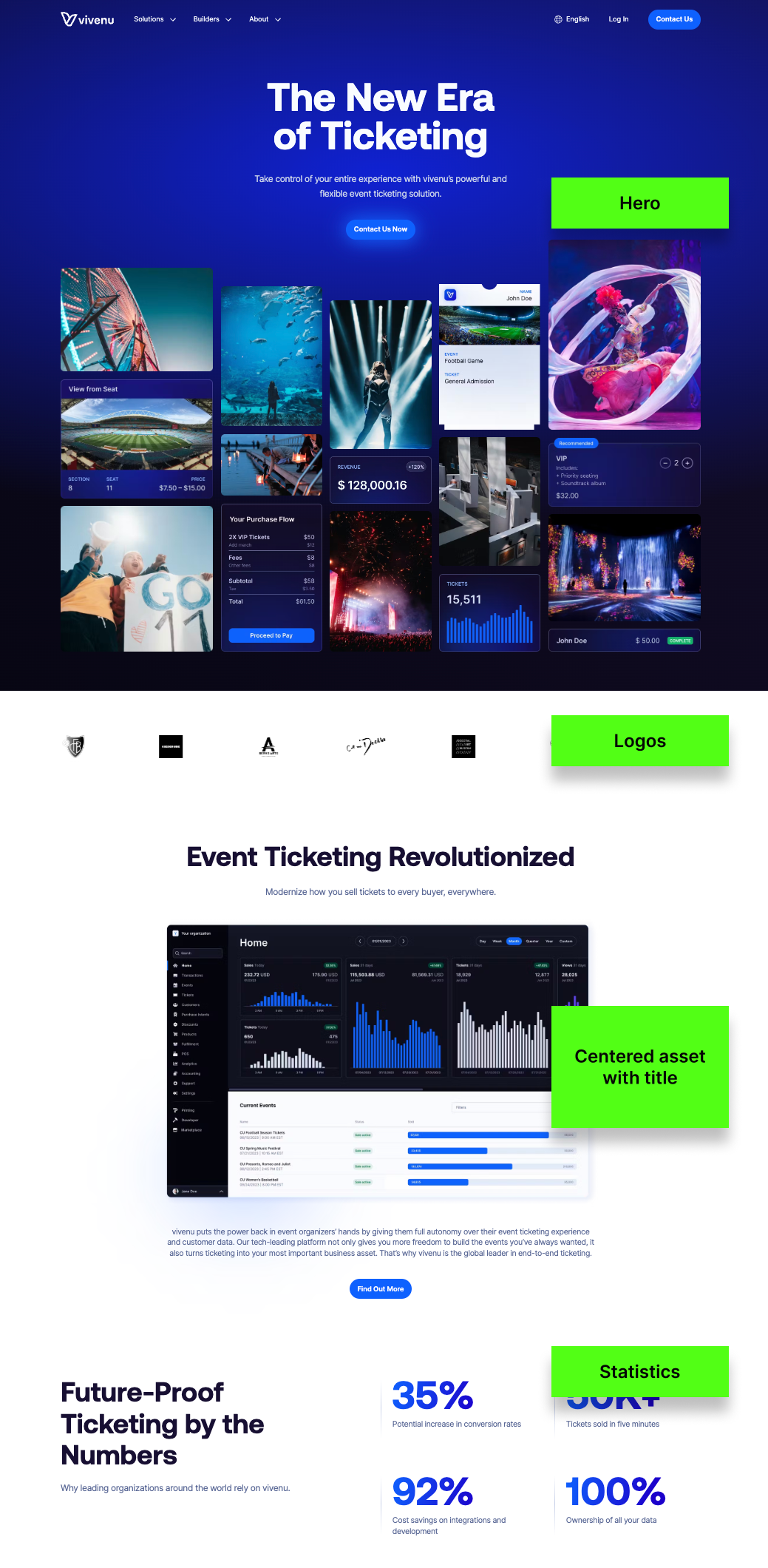
On Figma, each block is designed separately with the relevant specifications for the developer to easily implement.

Variations
Blocks often include variations to offer more layout or color options like Light/Dark modes. To keep things clear, designers list these variations under the main block so developers know they're not separate elements. We suggest limiting the number of variations, or even having none for certain blocks, to keep both the design and the codebase simple.
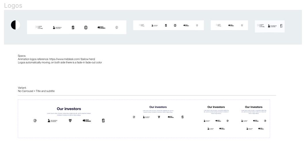
Naming
It's crucial to name blocks correctly on Figma because those are the names that developers will use to implement the blocks on the CMS, and it makes it possible to search through them on Figma.
Content managers will see these names and use them when creating pages and adding modules, so it's essential to use clear and descriptive names such as "Statistics Grid" instead of generic and unclear ones like "Img + Text Style 2".
Responsiveness breakpoints
We make sure each part of the design works well on all screen sizes, not just some. Often, designers make things that look good at certain sizes but don't work well at others. The goal is to have designs that adjust well to any screen size.
If a UI isn't scaling well, instead of adding more breakpoints, we change the UI layout to be more responsive.
Responsiveness consistency
We make sure the design stays consistent across all devices. For example, if we have a grid list with 9 items on a desktop, it should also have 9 items on tablet and mobile.
If it doesn't stay the same, it'll be hard to put into use.

We list pages from A to Z, make sure each screen has a clear name so you they can be found easily, and add the responsiveness version of each.
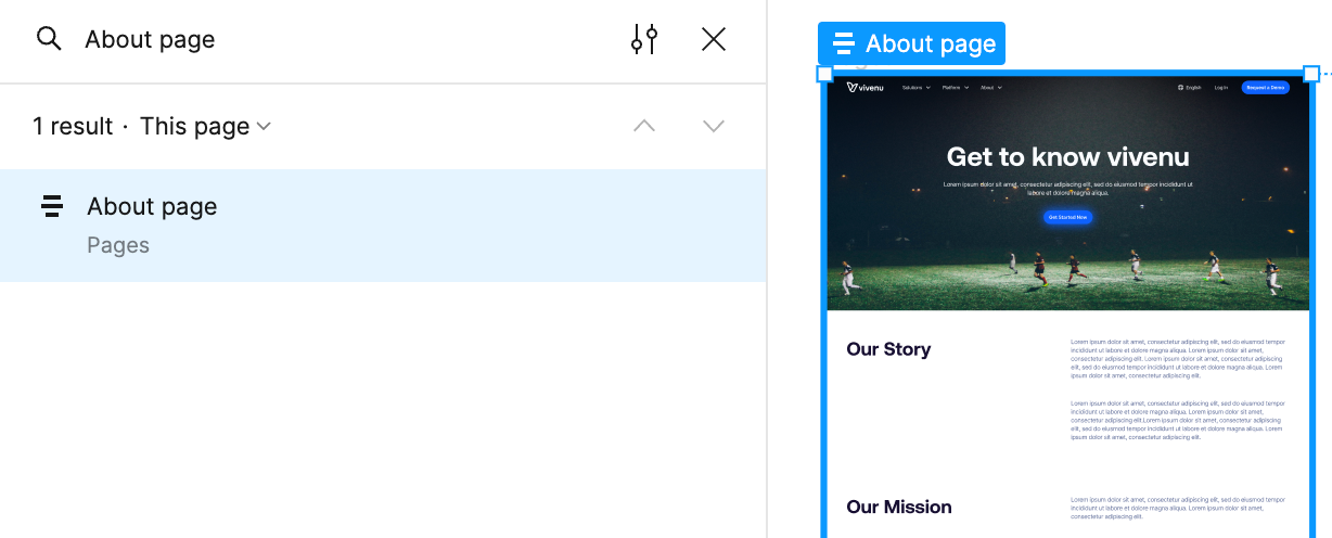
Reviewing if the implementation is conform to Figma
Whenever a page is ready for review, developers share a Vercel comment URL to request feedback from designers, before passing it over to the client.
Vercel comment URLs are autogenerated via GitHub, and block merging a Pull Request unless all the comments are resolved.
Handling client requests
Before starting development, we confirm with the client that the designs are final. However, minor changes often come up once the website starts taking shape.
Our policy is straightforward: we don't alter the code unless the Figma design is updated first, making Figma the go-to reference.
Keeping the code and Figma designs identical is crucial, especially when new team members join and need to understand the project quickly.
Figma offers many goodies that make it easier for developers to pick up designs.
Ready for dev
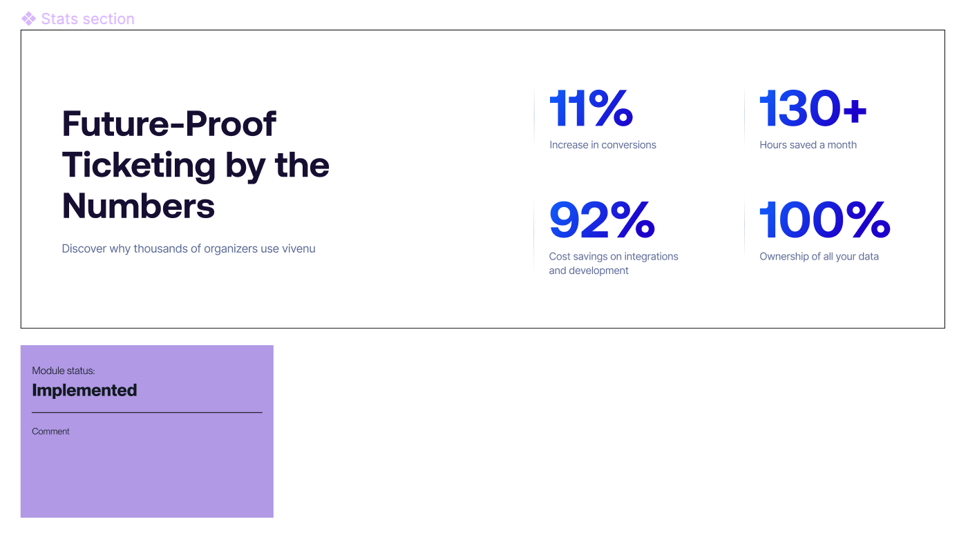
No developer gets to every ask "is this block/page ready to pick up?" to a designer. Thanks to the "Ready for dev" label, it is clear what is ready and what is not.
Unfortunately, as of the time of writing this article, there is no official way of marking "Developed", when the implementation of a certain UI is complete. We are temporarily using stickers marked with "Implemented".
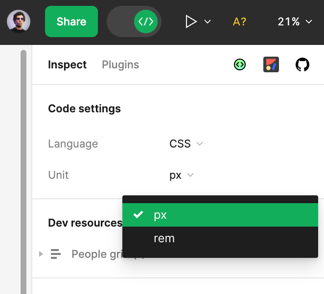
Switch from "px" to "rem"
In case a design has been implemented with `px` in mind, a developer can easily switch to `rem`, which is practical when they are using Tailwind.
This ends up in a better result for the user as the site adjusts based on their browser's settings, lowering the potential for readability and usability issues.
GitHub integration
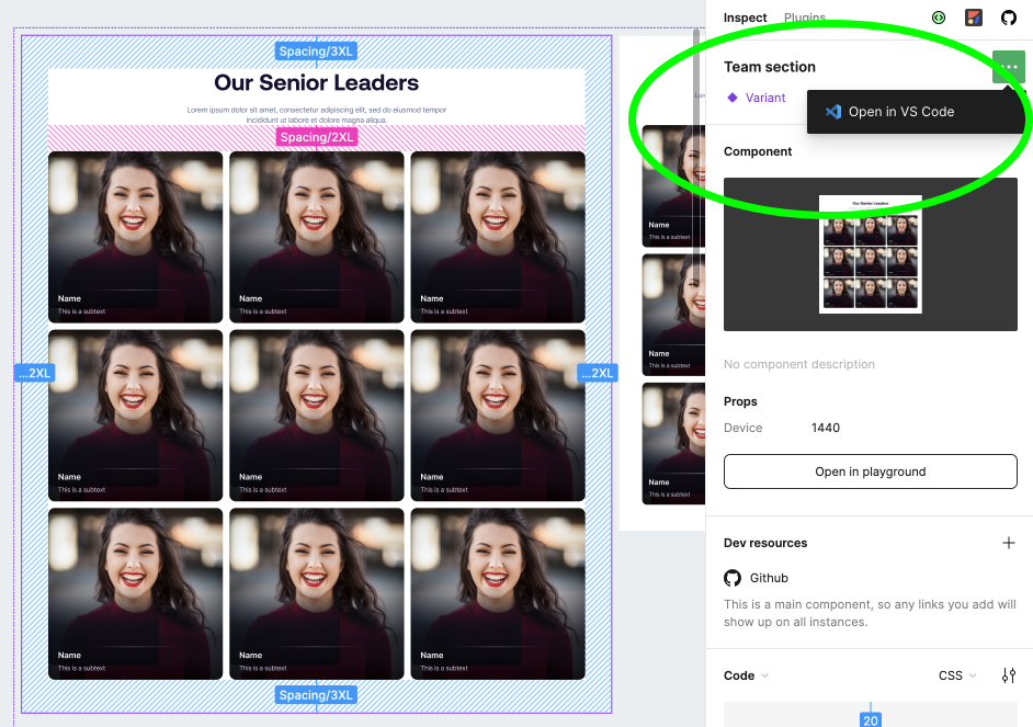
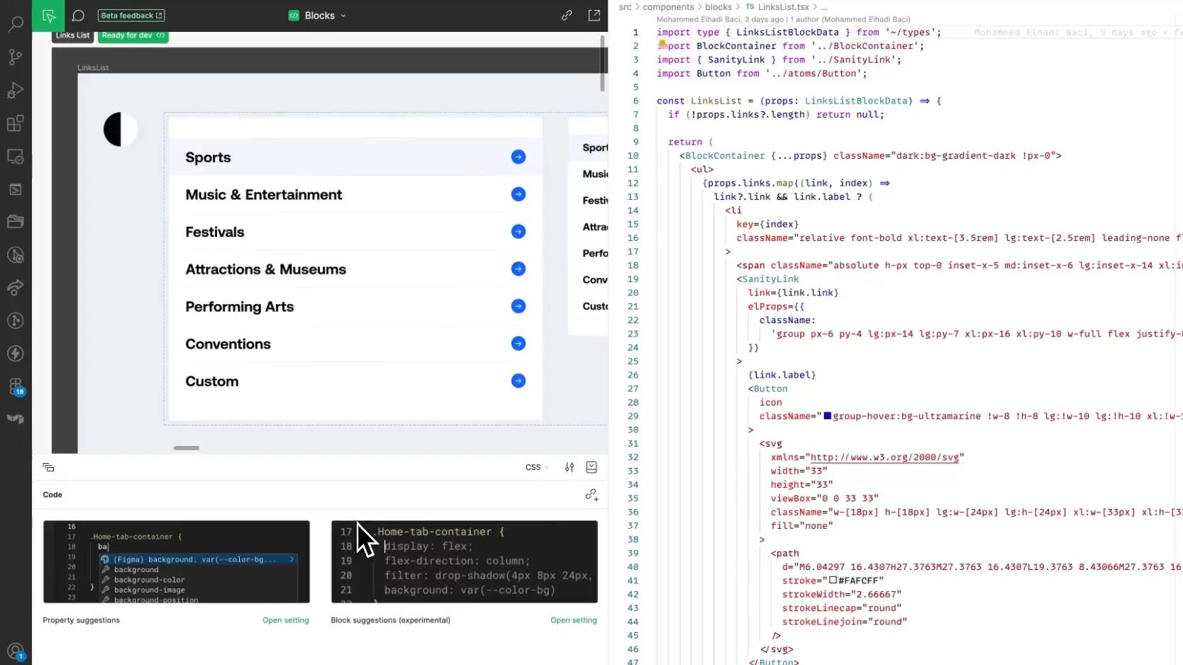
When implementing a new block, developers are encouraged to use the GitHub integration to link the user interface in Figma to the actual code. This is particularly helpful for new developers who join the project.
Instead of asking if something is already done, they can just look it up in Figma. This also avoids confusion, as sometimes the names in the code and Figma might be a bit different.
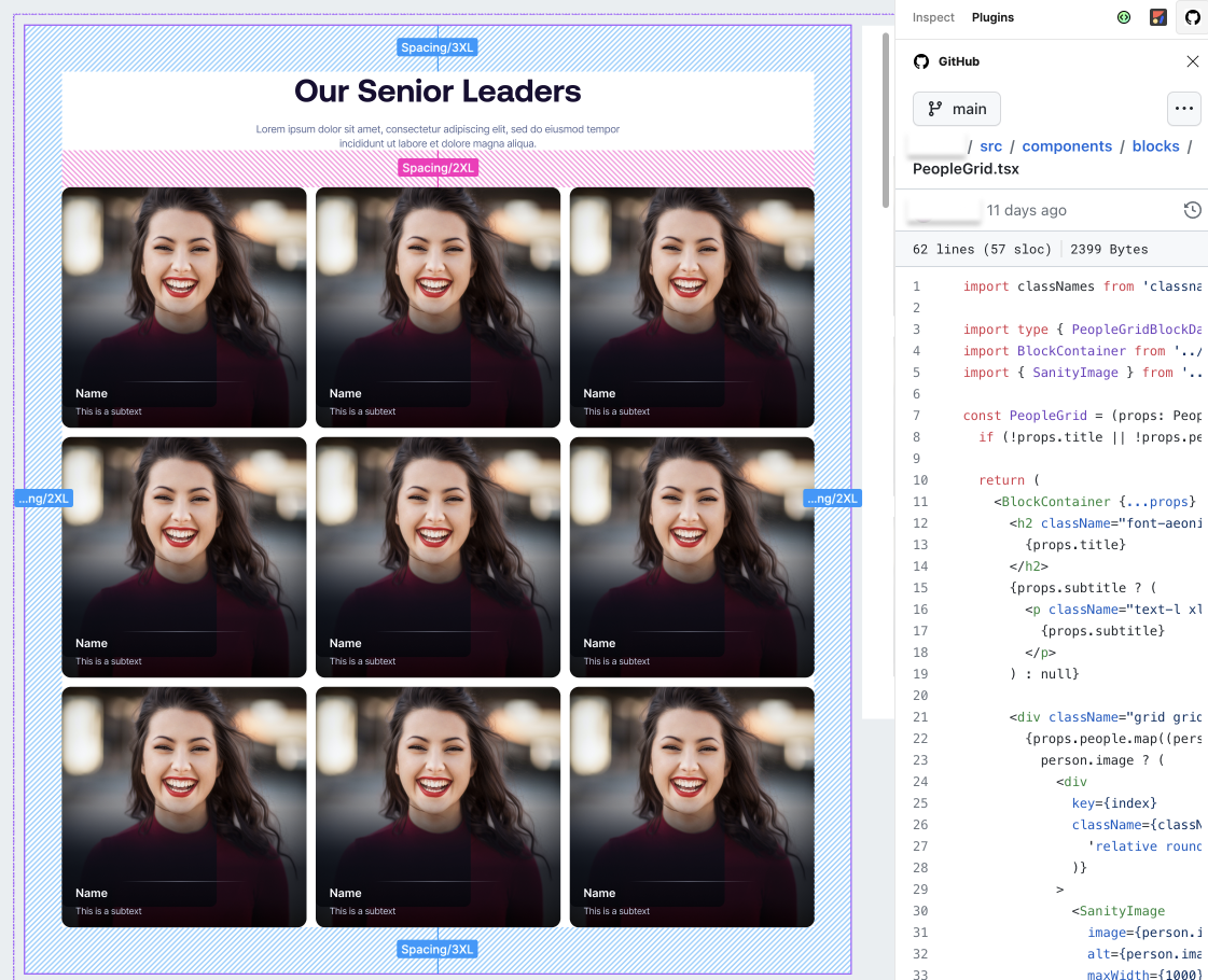
This makes it also easier for anyone to access the piece of code directly:
Figma in VSCode
Developers can choose to use the Figma VSCode plugin to make their work easier. This allows them to implement designs without having to switch between screens or tabs.
It's especially handy for exporting assets, as they get saved directly into the codebase. This eliminates the need to first download them and then manually add them to VSCode.
Compare changes
"Hello dear developer, we changed this block, can you please adjust that?"
"What have you changed, dear designer?"
These dialogues are now unnecessary, considering that Figma offers you the ability to compare changes on Dev mode.
The effort to perfect the design handoff is ongoing, especially as tools continue to get better. While a "0 questions asked" handoff may seem unlikely, we believe it's possible through constant improvement.
We've already seen significant progress compared to projects six months ago.
Designers are more satisfied because they spend less time explaining basic elements and can see their designs come to life.
Developers are happier focusing on coding rather than figuring out design details.
