23rd October 2024 • 10 min read
On designing a commerce starter

Omar Benseddik
Starter templates often focus on simplicity at the expense of style, and sometimes neglecting designers' involvement.
With the new DTC Medusa starter — an open-source commerce platform — we aimed to create a template that balances expressiveness with customizability, moving beyond the minimalist norm.
Alongside the GitHub repo, we’ve launched our first Figma Community file to showcase our handover process and demonstrate how Figma’s variables can seamlessly switch between brands.
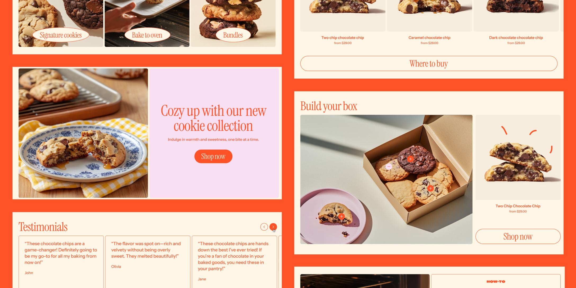
To ensure the starter wasn't overly minimalistic yet still retained design flexibility, we created Munchies, a fictional brand with a focus on identity rather than UI complexity to make a difference in the amount of templates you can find.
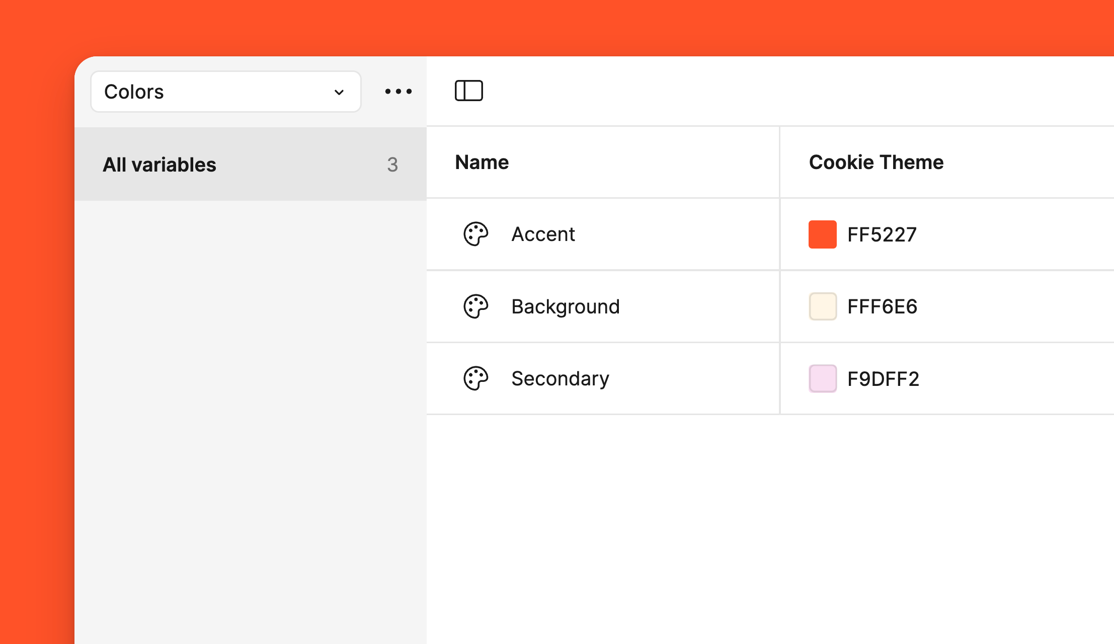
The color palette was limited to Accent, Background, and Secondary tones to maintain an adaptable design. The layout choices adhered to standard e-commerce practices, ensuring ease of use without sacrificing creativity.
While creating this unique theme, every design decision was filtered through the question, “Can this easily adapt to another brand?”
Assets creation and copyright
Instead of custom illustrations and complex motion, we chose a more scalable approach, generating cookie images through Midjourney.
Using /describe on an existing image that fitted the vision we had for Munchies, we used these proposed prompts to then /create the appropriate visual. After several iterations, we managed to produce very realistic high-quality imagery with prompts like:
"A close-up shot of four cookies, each with different ingredients and textures, arranged on an off-white background. The chocolate chip cookie is the focus in the foreground, showcasing its soft texture against the smooth surface. Sunlight filters through from above, casting gentle shadows that accentuate details like crinkles or drizzle. This composition emphasizes the color contrast between the warm brown edges and the cool white center, adding depth to the visual experience."
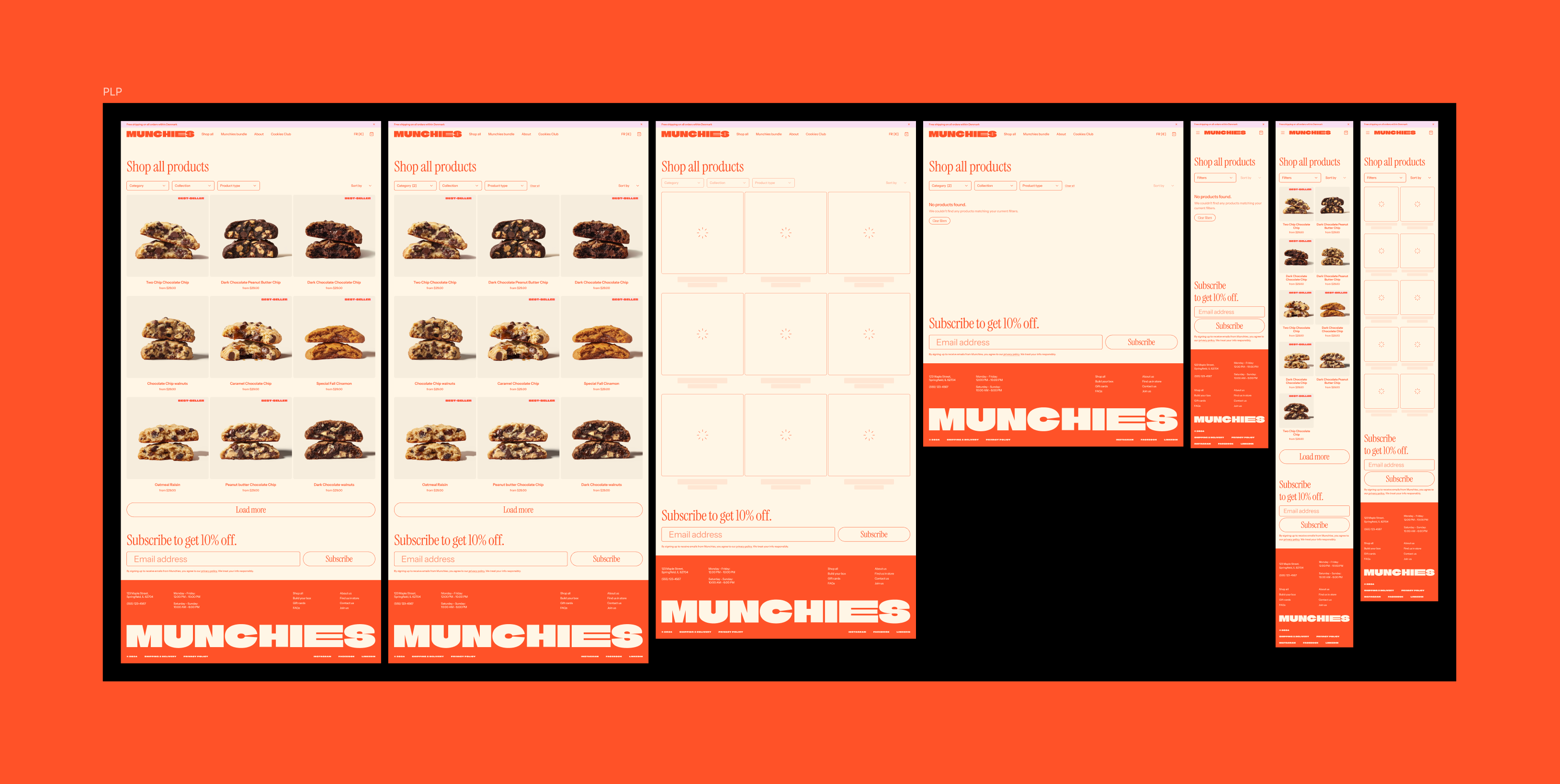
To finalize, we edited the background color and position of all product shots to be cohesive, making a uniform PLP to look at.
As for video in the Hero, we bought one asset from Envato.
We continuously improve our design handover process for several key reasons:
Developers can work efficiently without unnecessary roadblocks.
Designers can focus on new projects without being held back by constant reviews.
The product or store can easily scale in the future with a strong foundation.
Users enjoy a smooth and seamless experience.
The files are easily adaptable for marketing or as a starting point for future projects.
Closing the gap between designers and developers
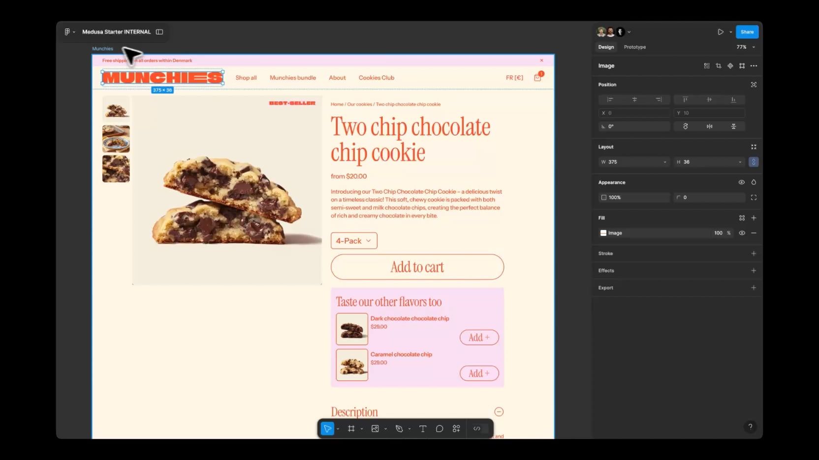
Crafting the perfect handover is not only a matter of cleaning and documenting everything in great detail after the design is approved and consolidated. If that was the case, handover would just be an afterthought. Instead, we establish strong conventions that both designers and developers agree on before a project is even started. These shared standards cover everything from naming Figma variables and color tokens to defining typography and component variants.
Example 1: Figma variables match 1:1 the TailwindCSS utility classes that our developers use during implementation. So if a component in Figma has the "rounded-md" variable applied to the border radius (using scoped variables), the developer knows the rounded-md Tailwind utility class needs to be applied.
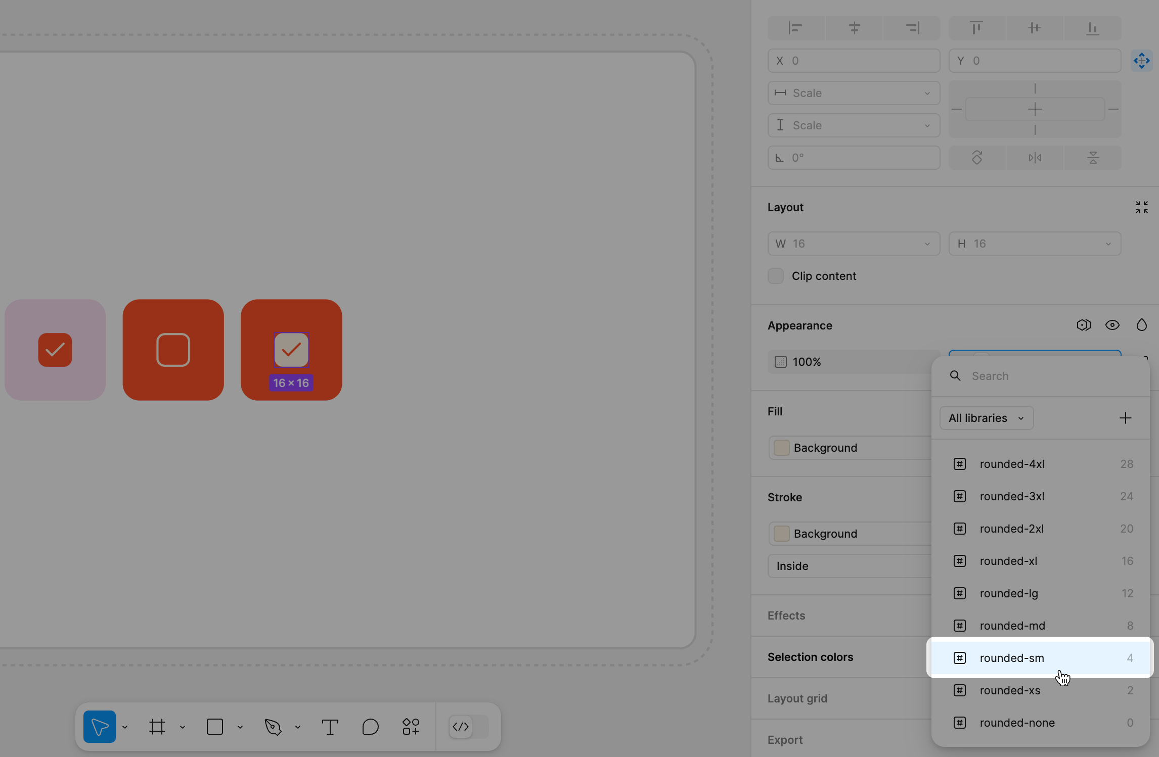
Applying rounded-sm to the Design System checkbox
1<div className="rounded-md"/>Example 2: While designing a component in Figma, variants are organised to make their porting to React props as seamless as possible.
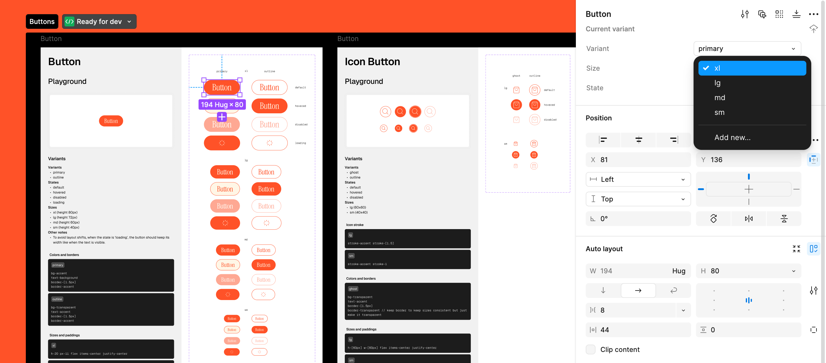
Picking one of the available options from the Size variant of the button.
1<Button2 size="xl" // xl | lg | md | sm3 variant="primary" // "primary" | "outline" etc.4/>
By establishing a shared foundation, we create a common language and mental model between design and development teams. This approach naturally aligns designers' work with developers' needs from the start.
-
Another good practice to facilitate handover is to organize our Figma files in a standardized and predicable way, so that nobody gets lost, ever.
Conventionally, we spread our designs across the following pages:
Design system
This is the foundation of all our projects. We focus on delivering a comprehensive list of all variants, states, and sizes. When a design engineer is involved, we even write the code directly.
For example, our button designs include primary and outline variants, with four different states and sizes. We also include an "Other notes" section for any additional specs.
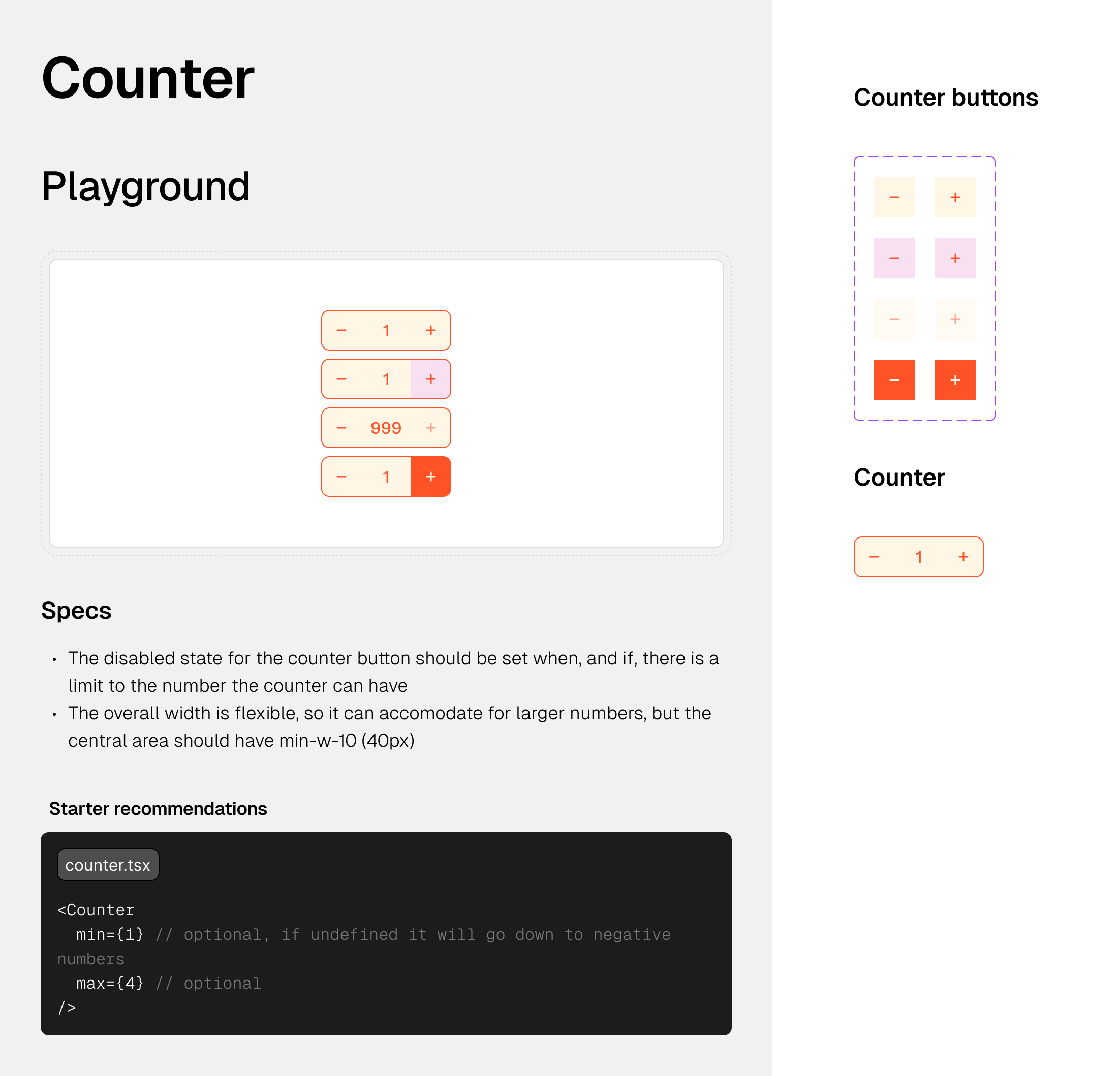
When relevant, we include prototypes to grasp the interaction from A to Z.
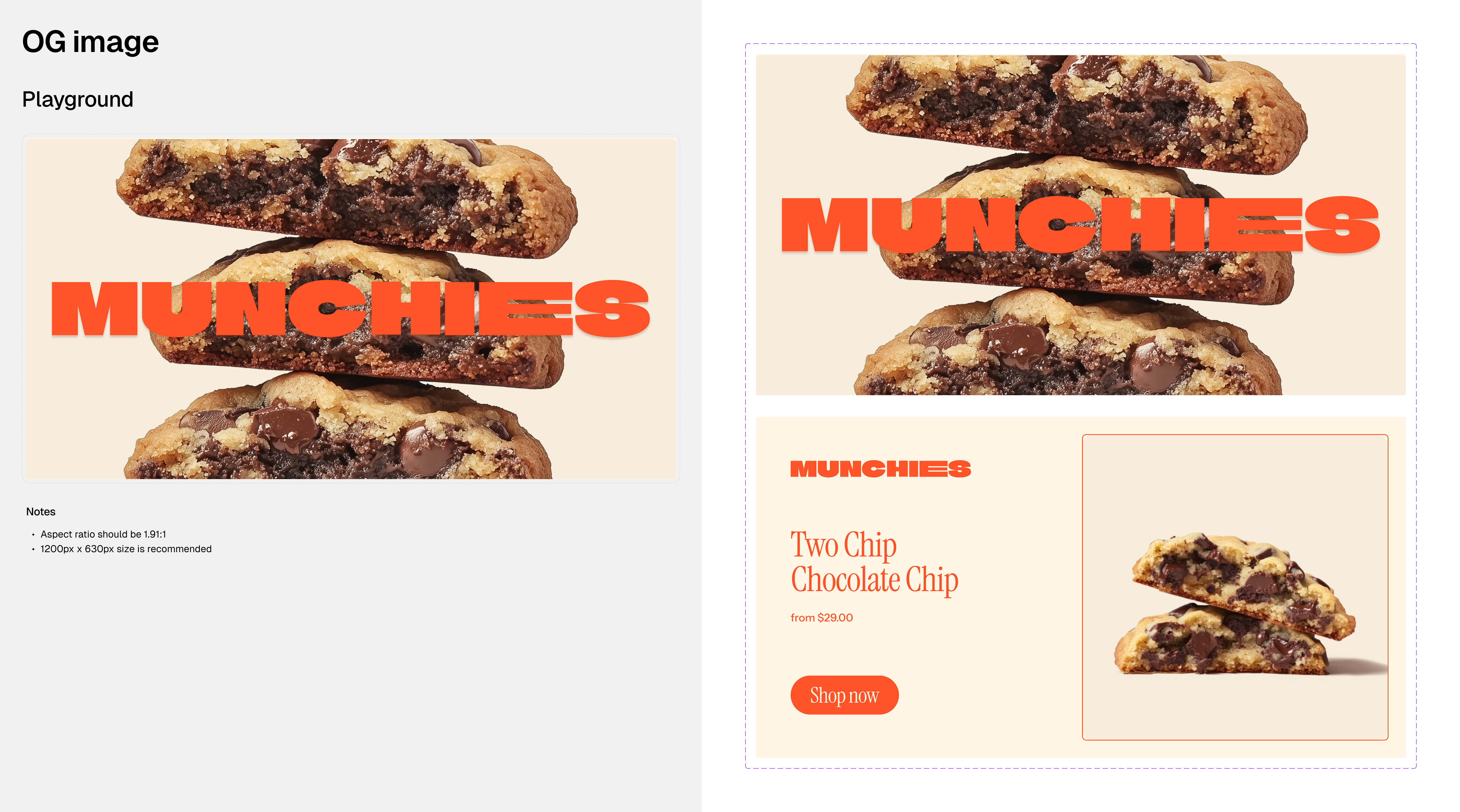
For OG image handover, we consider dynamic templates, especially for pages like PDPs.
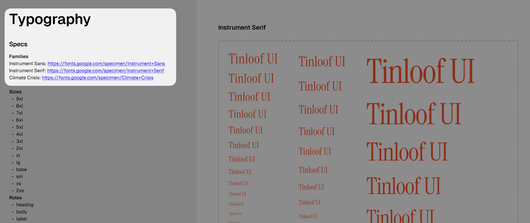
We always provide font URLs to avoid the common "Where can I download the font?" question.
Our goal is to create a "build-your-site" concept, similar to IKEA's "assemble-your-furniture" approach. Here, the developer is one of the designer's main clients, and they should be fully equipped to implement everything without having to make design decisions on their own. It's simple in theory, but challenging to perfect.
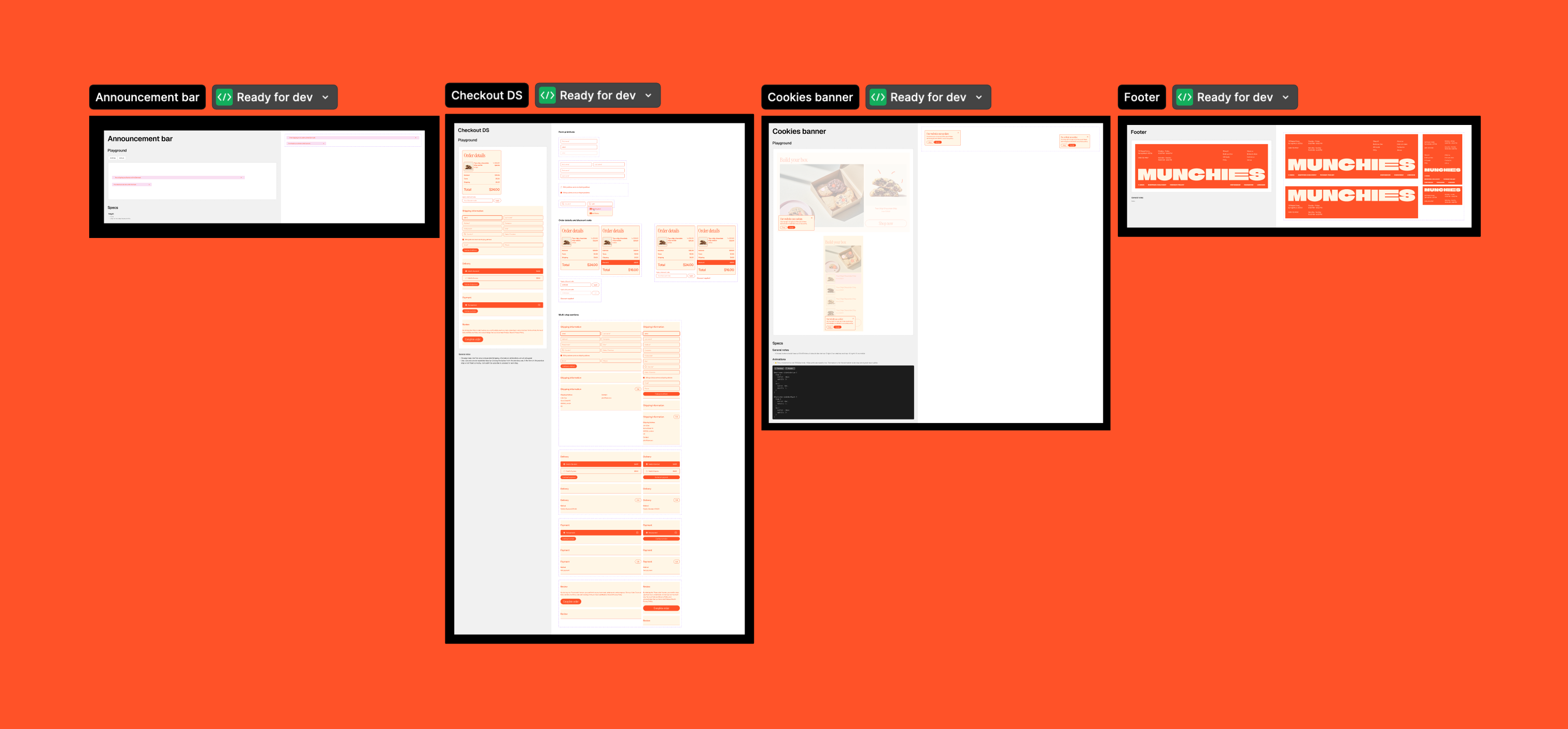
UI
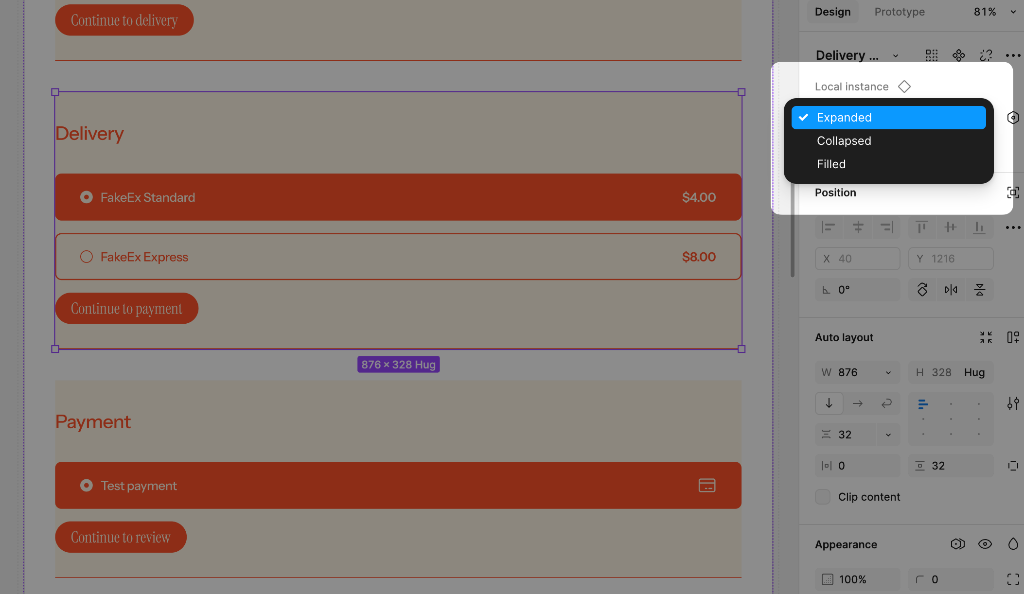
This is where we store UI components that aren't tied to specific sections and can be used globally, like an announcement bar, navigation with a mega-menu, or multi-step interfaces like checkout.
Rather than creating separate pages for each step of the checkout process, we create variants (e.g., Expanded, Collapsed, Filled). This makes handovers smoother and helps streamline the process of building prototypes.
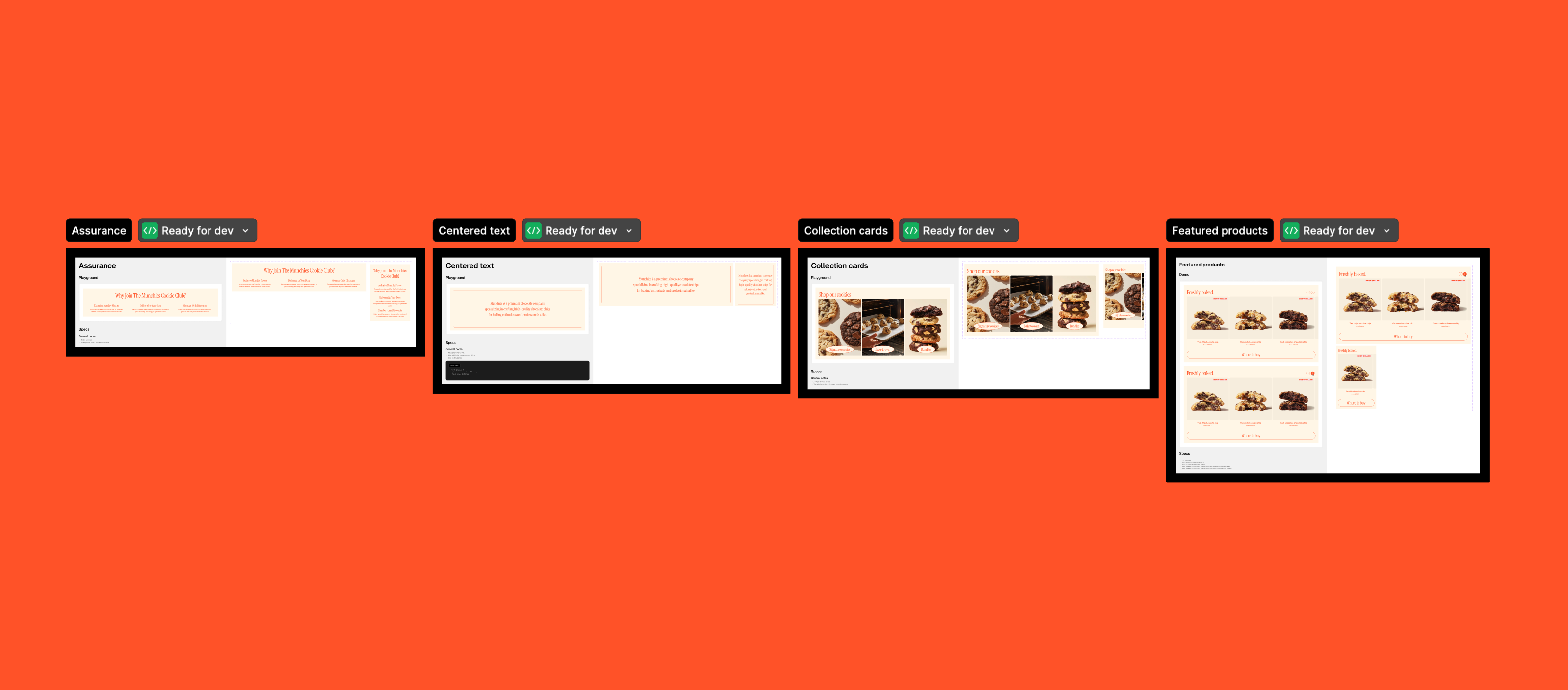
Sections
The marketing sites and stores we create give content managers the freedom to build pages independently. We use Sanity to manage and create pages or expand existing ones, like PDPs.
These sections are flexible and can be arranged in any order between global elements like the navigation bar and footer, making it easy to build landing pages or add more context to a PDP.
We keep these sections separate from the UI components above, as designers often use them to create pages, and it also makes it easier for developers to see what needs to be implemented in the CMS.
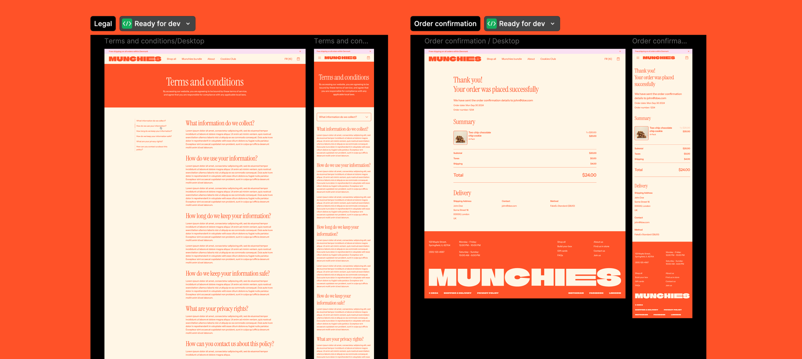
Pages
These pages are built by assembling Local Assets from Figma, simply piecing them together to form a complete page.
The purpose is to get a clear view of the full page. Some pages, like 404 or Legal, aren’t made from components, which is why we include them under Pages.
We offer two versions of each page: one for desktop and one for mobile. In special cases, we do provide tablet too.
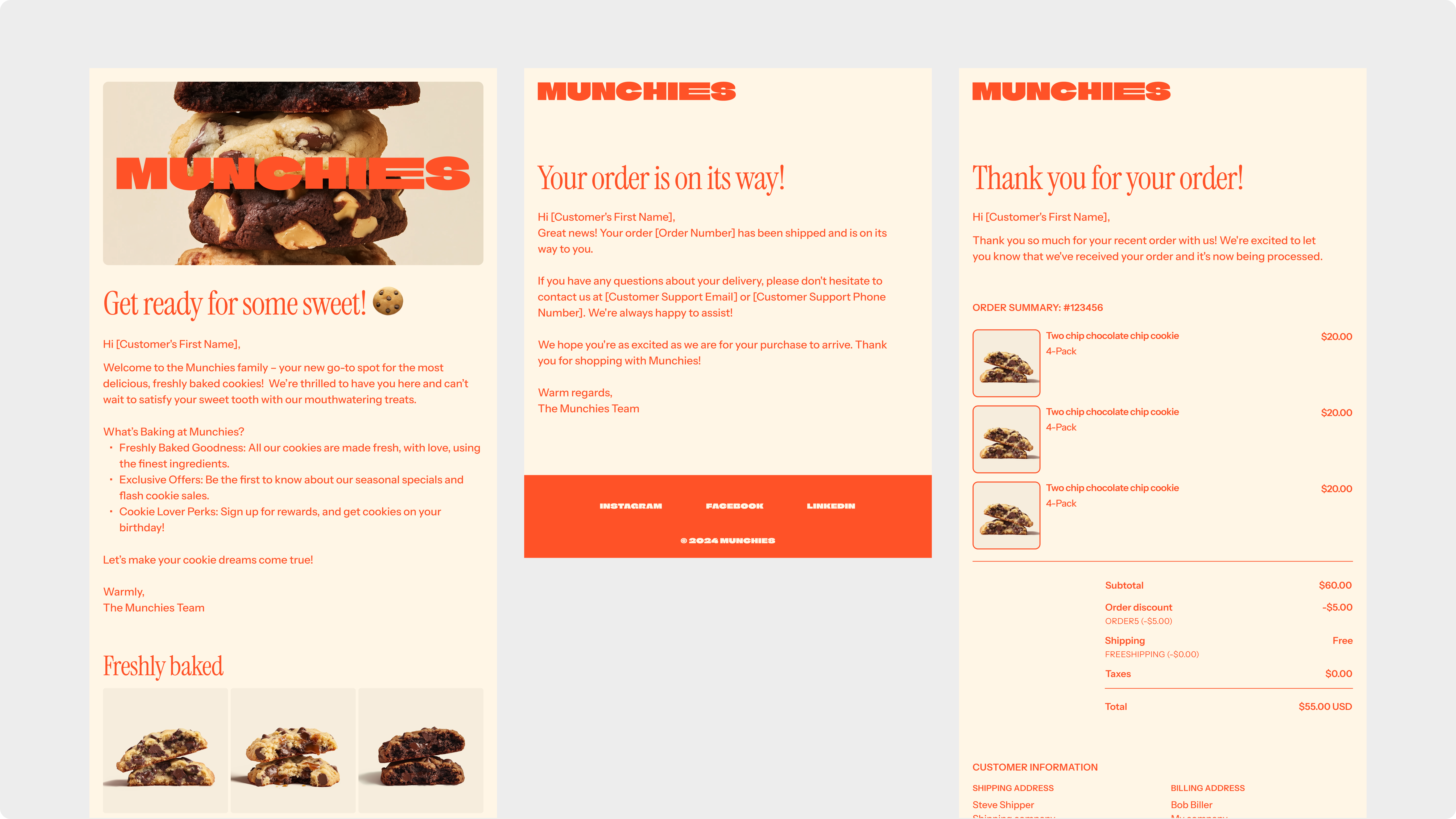
Emails (optional)
There are few limitations we keep into account when designing email templates:
We keep multi-column layouts to a minimum, and ensure to have a responsive design from the get-go (e.g. if desktop is the same as mobile, bingo). However, when we need to have big column cards, we aim to have a maximum of 2 columns.
We use the following fonts only: Arial, Helvetica, Comic Sans MS , Times, Courier, Courier New, Georgia, Trebuchet MS,Verdana, Impact, Geneva, or Tahoma.
We avoid having multiple images in one line.
For big column cards, we aim to have a maximum of 2 columns.
If the list of emails grows too long, we organize them into two groups: notification emails and marketing emails.
Now to the crunchy part. To demonstrate that this is truly a customizable starter, we decided to put it to the test ourselves.
With Dean Norton's approval to use his stunning designs (no need for Midjourney here), we created a new style that stands apart from Munchies.
Thanks to the structure of our design system, overall UI, and the way we organized our variables, it took only a couple of minutes to transition from Munchies to Dean Norton.
Here's what we were able to adjust with a single click:
Border radii
Colors
Font sizes
Font families
Text content (optional, but useful)
Once those basics were handled, all that remained was to swap out:
Logo
Additional content
Assets (shortcut on Figma is CMD+K)
And voilà, it’s fully reusable.
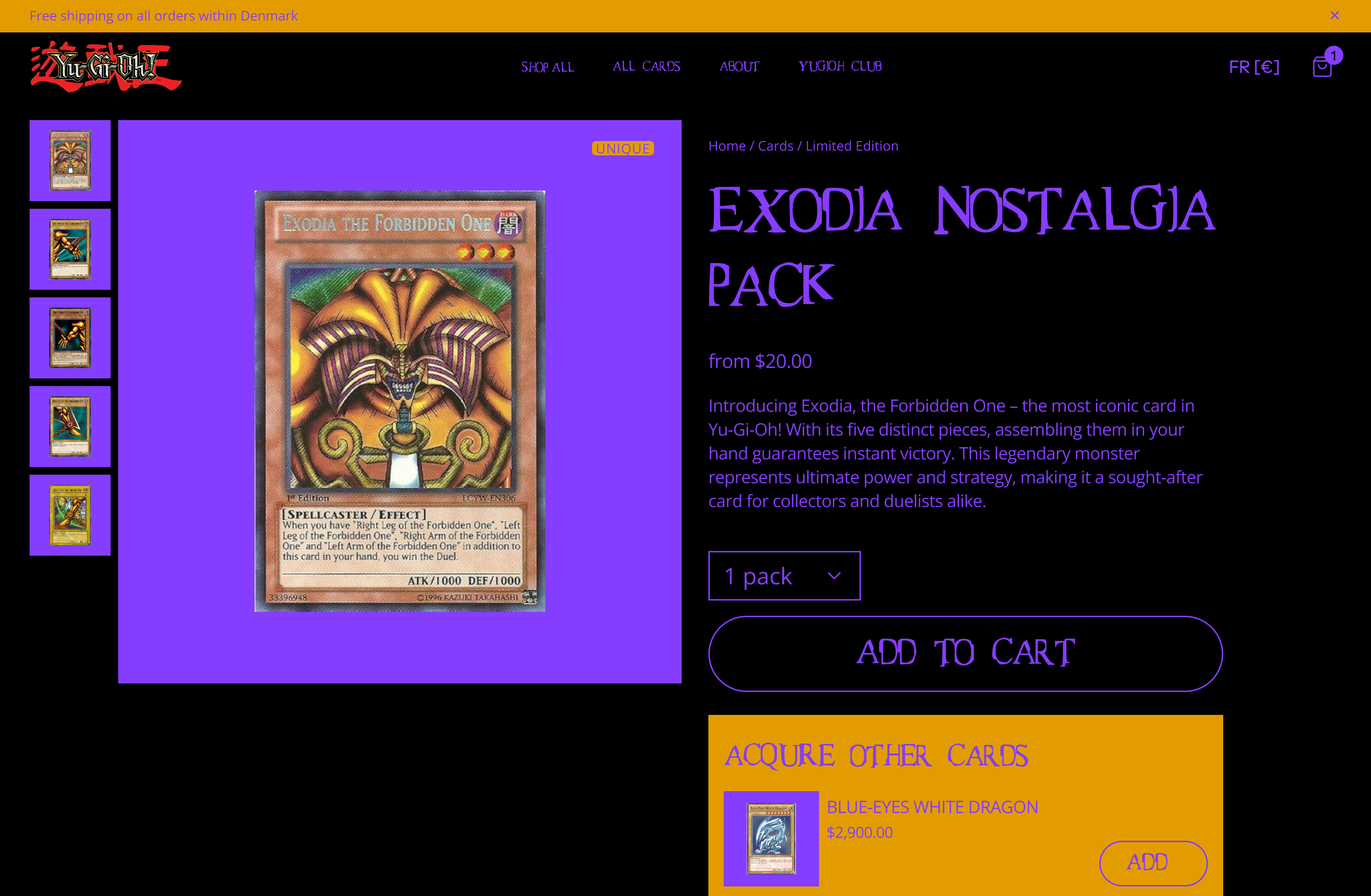
For fun, we even created a version for a Yu-Gi-Oh! store in a couple of minutes: