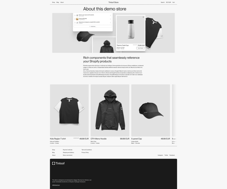
In this first article, we provide a comprehensive guide to designing an intuitive and universally accessible carousel for any web project.
In an upcoming second part, we'll focus on the development approach, walking you through implementing a carousel from start to finish.
Outcome
Carousels in UI are practical interactive elements that efficiently display images or content pieces without taking up too much vertical space.
Improper implementation often results in more harm than benefit, particularly due to inadequate adherence to accessibility best practices.
Layout
Foundations
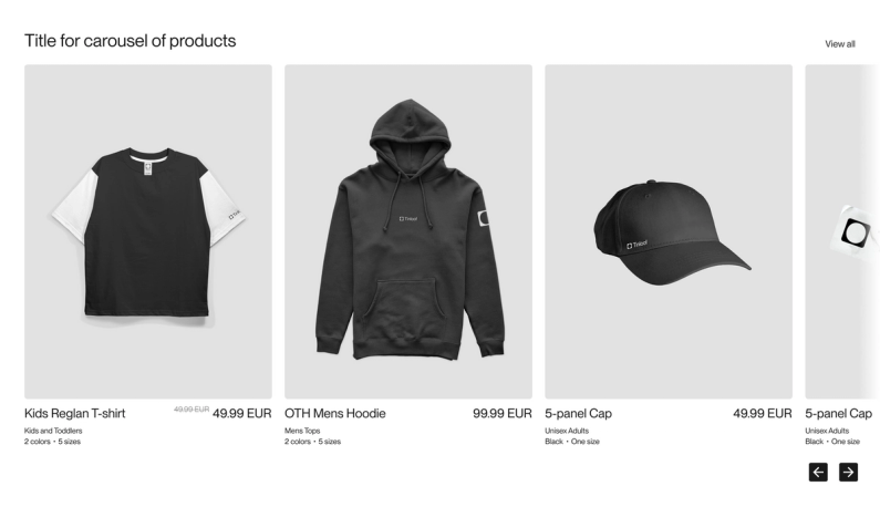
The carousel UI is made out of two components:
1. Card: encapsulates a segment of information potentially incorporating images, text, buttons, or a combination thereof.
2. Slider: the visible section featuring cards the user can interact with.
Product cardProducts slider
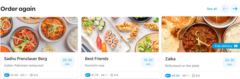
The carousel displays a selection of cards (identifiable as the slider), highlighted in blue in the following image.
Additional products reside off-screen, and users must engage with the carousel to browse and interact with the additional cards.
Visible cards
Information scent
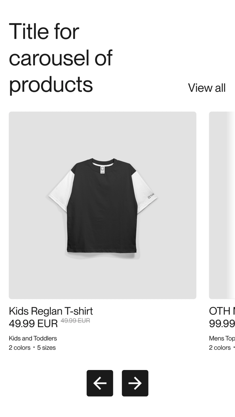
People are naturally curious and respond well to hints of information, often referred to as "information scent".
Showing a partial view of the next card in a carousel can encourage users to explore further.
Typically, you'd want to show just enough to pique interest but not so much to overwhelm users — around 10-20% of the next card could be visible.
This approach makes navigation more intuitive and engaging.
Information scent
Cards style
Most of the time we deliberately employ a "boxed" style in our UI card design to ensure clarity and minimize confusion.
This design helps avoid floating text that might seem misplaced while also creating distinct boundaries between cards.
Below is an example that lacks this "boxed" style, serving as a contrast to our intentional design approach.
"Unboxed" cards
Fade
Applying a fade effect at the ends of the carousel contributes to the creation of a "partially hidden" aesthetic. Simultaneously, it helps mitigate the appearance of abrupt cutoffs, a necessity in specific styles.
This technique is particularly useful when adapting the carousel to fit within the maximum width on larger screens.
Fade on the slice
Below a couple of examples in a large screen, one without fade, and the other with.
Carousel without fadeCarousel with fade
Top part
We plan to design the carousel with top space ready to accomodate for extra content like a title and link.
Adding buttons navigation is a must for accessibility, considering that some people are unable to complete swiping gestures.
It may be tempting to make the buttons of carousel invisible for stylistic purposes, but without the visual cues, some users may struggle to understand how to interact, navigate, or control the carousel.
To make them easily reachable for thumbs on mobile, we will place them on the bottom.
If you opt for a smaller button size, say 32px, you could compensate for the decrease by adding adequate padding.
However, be aware that this approach might necessitate careful alignment adjustments.
For instance, suppose there's a "View all" link that's 42px from the right, and you want your buttons to also have a 42px margin from the right. Given the padding around smaller buttons, they might not appear aligned with the "View all" link.
On purpose we add a blue stroke to the right button to make the example clearer.
Buttons without padding offset
To remedy this, adjust the button's margin to be 38px from the right, accounting for the additional 6px padding (half of the 12px total padding split on either side of the button).
Below is an example with the buttons with 36px on the right, instead of 42px.
Buttons with padding offset
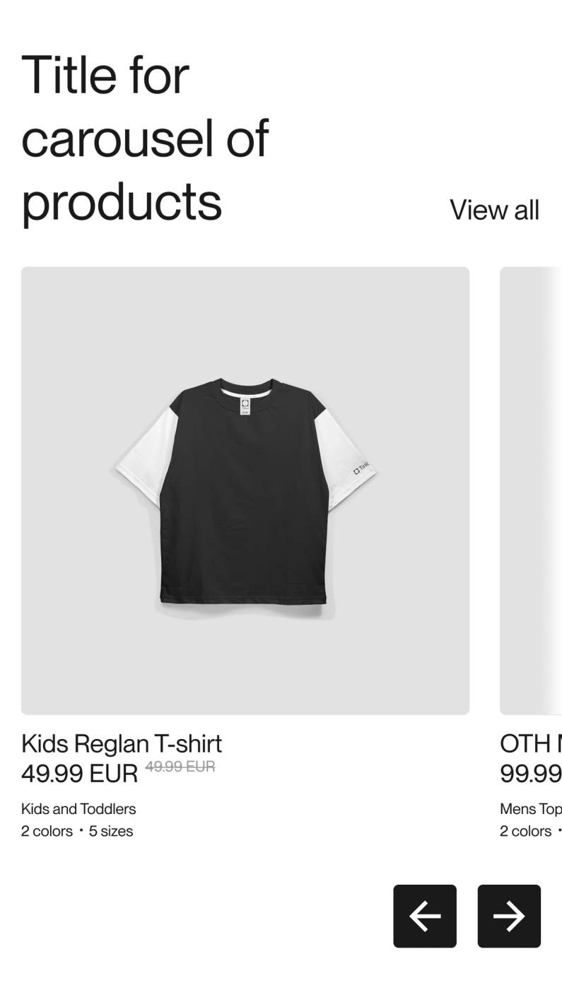
Button position
Buttons should be strategically positioned for easy access and adaptability across various devices.
Placing buttons directly on sliders can conserve space, but it often creates significant issues:
1. In mobile view, users might inadvertently click on the card rather than the button, leading them to an undesired link instead of the intended action.
2. Contrasting colors between the button and card backgrounds can create visual confusion. For example, a button with a black background on top of a card with a black-background image.
This doesn't mean that buttons are absolutely forbidden on sliders. It is feasible if the card backgrounds are predictable (e.g., consistent background in ecommerce products) and the button is sufficiently large.
In light of these potential issues, it's generally preferable to situate the buttons outside the slider area.
The remaining question is whether to position them above or below the slider.
We advocate for a placement below the slider to facilitate easier thumb access in mobile view.
In the following example, buttons are correctly located at the top right, adjacent to the "See all" button. However, due to space constraints, they disappear in the mobile view.
Desktop carousel with buttons next to "See all"Mobile carousel without buttons
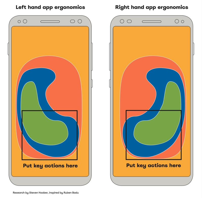
The positioning of buttons on our mobile carousel, currently at the bottom right, may not be conducive for left-handed users. We should contemplate centering these controls for enhanced accessibility.
Center buttons on mobileLeft-handed vs right-handed UX
Button states
To enhance user engagement, we've implemented a button hover effect that explicitly indicates when a user is poised to interact with a button.
Additionally, we ensure the cursor transitions to a pointer for straightforward visual feedback.
To explicitly denote the start and end of the carousel and prevent sudden looping - which can lead to disorienting rapid movements - we opt to disable the buttons once an extreme end is reached, enhancing overall user experience.
Hover effect on buttonsDisabled buttons
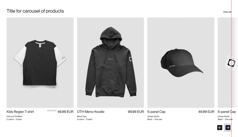
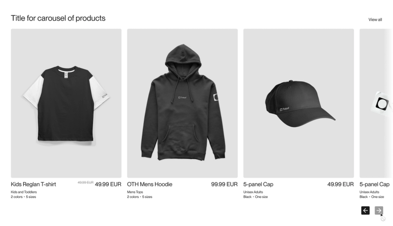
Button proximity
The buttons are intentionally positioned adjacently to facilitate easy navigation without having to traverse across the entire screen, an advantage particularly on larger displays.
This also frees up space, enabling us to utilize the bottom left section for a progress indicator or another element.
Distanced buttons complicate navigation
Progress indicator
Some carousels might benefit from progress indicators to show users where they are and how much is left to see.
Options include dashed progress bars, jointed progress bars, or number indicators like "1/4, 2/4."
Progress indicator in carousel
Small dots progress indicators
We mentioned the use of progress indicators earlier, which can be helpful in some cases.
However, many sites use small dot indicators that can be frustrating to interact with, have poor contrast, and are usually too small to easily click on.
Challenge: spot the progress dots
Motion dynamics
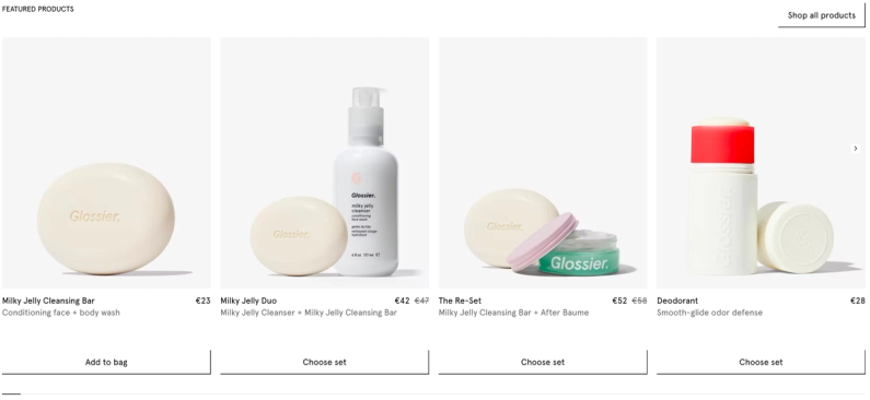
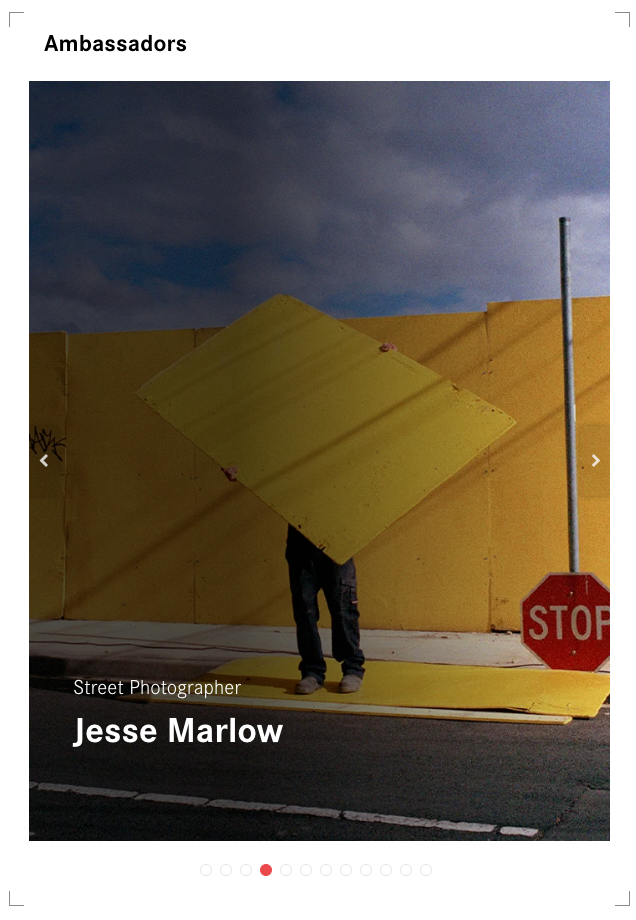
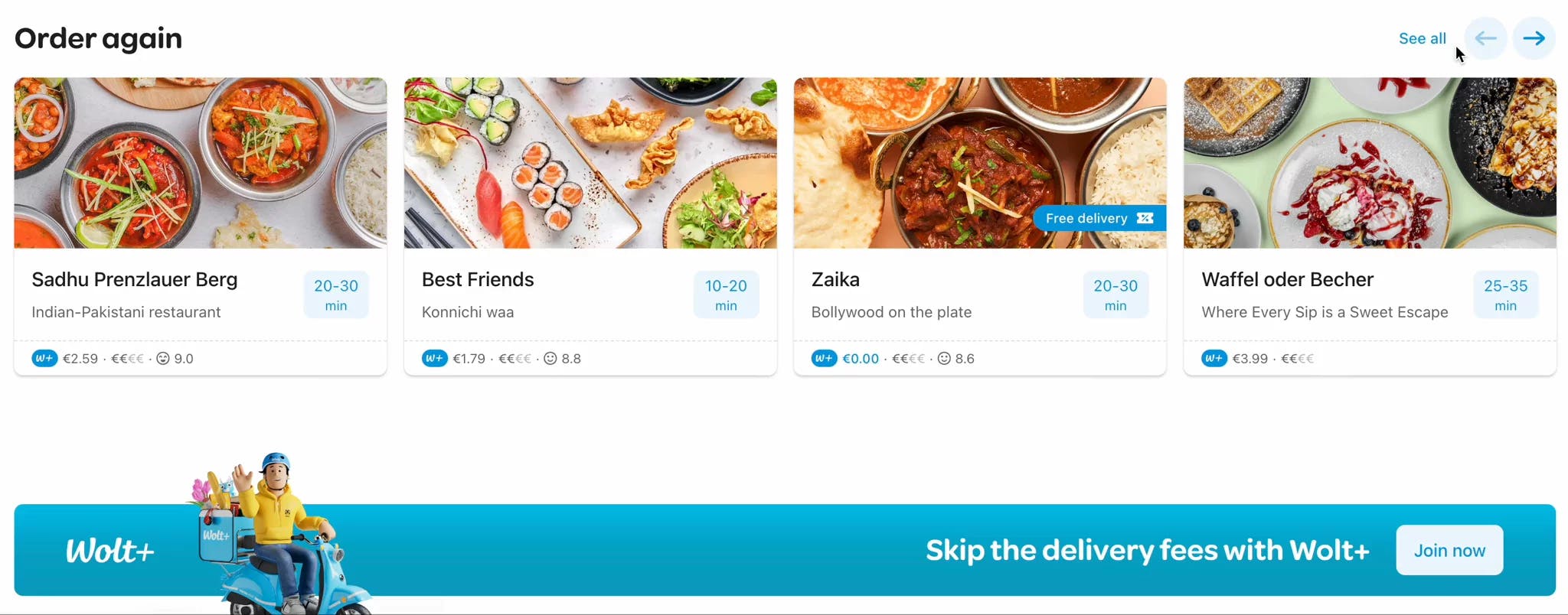
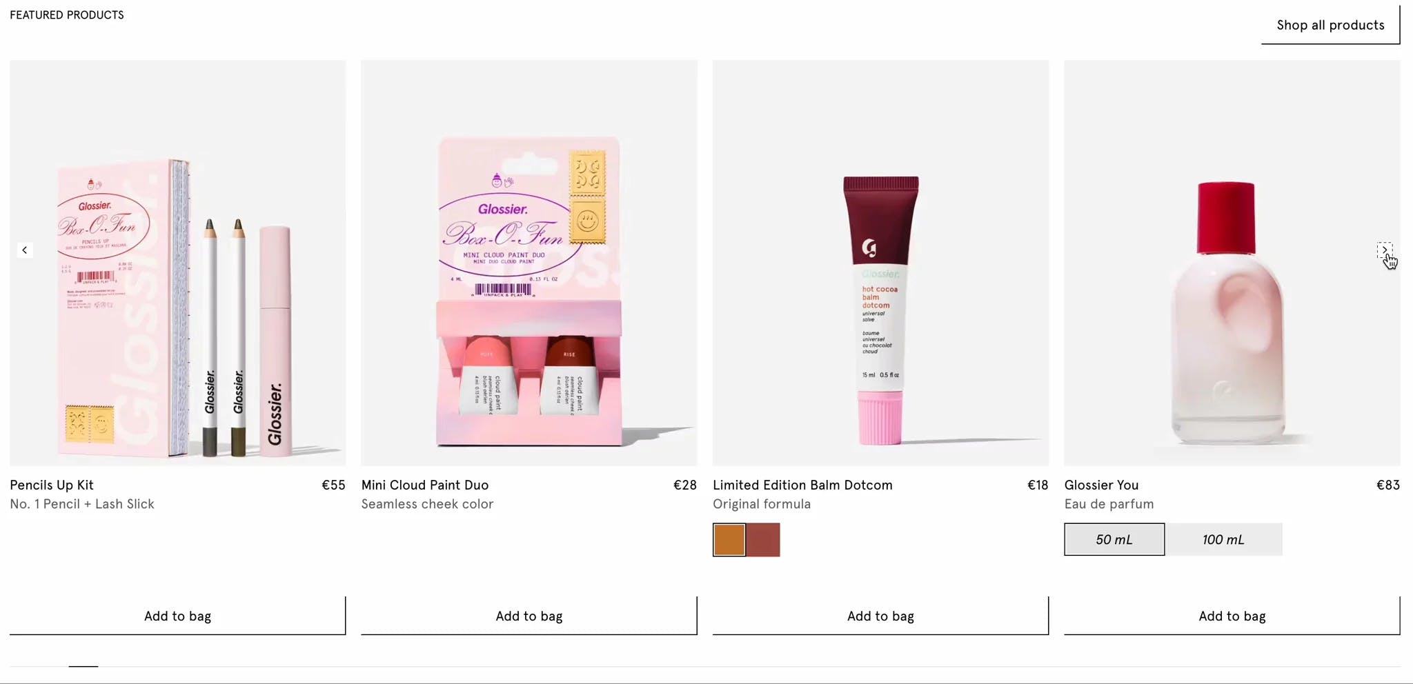
The carousel's movement, which can shift either card by card or in card groups, is use case specific.
While there isn't a definitive best approach, it's important to consider that moving in groups of cards could potentially induce a dizziness effect, warranting caution.
Wolt's carousel moves groups of cards
Glossier's carousel moves card by card
Auto-sliding
Auto-scrolling carousels that move too fast can annoy users, especially if it's hard to go back to a card they want to see again. Although there might be some cases where auto-scroll is useful, it usually hurts the user experience.
One specific issue with auto-scrolling is that a user might try to click a button to see the next slide, but the auto-scroll kicks in before they can click, taking them to a different slide than they wanted.
If the carousel autoplays, we suggest adding pause/play buttons. A great example below from AMIRI.
Play/pause buttons on autoplaying slideshow
Locking scroll
Carousels that lock scrolling to a horizontal direction can be annoying, particularly when users don't know how many items remain before they can scroll down further, especially when they want to know what's left on the site or reach the footer.
We recommend allowing users the option to scroll past a carousel. This gives them the freedom to choose how to interact with it, whether that's by dragging, swiping, or clicking buttons. Or to not interact with it at all.
Scroll storytelling works well on special landing pages meant to entertain or wow users. But it can be tricky on informational or transactional sites, unless done very carefully.
Stuck on horizontal scroll on thestorio.com
Infinite scroll back
When you reach the final card of a carousel and click to go next, having it quickly zip back to the first slide can be jarring.
This fast transition can create a poor visual experience and may even be problematic for people with conditions like epilepsy.
It's important to either make the transition smooth and visually comfortable for all users, or disable “next” button when reaching the last card.
The great thing about not allowing for infinite carousel is that it doesn't have to go back fast causing an epileptic effect.
Infinite scroll on soul-kabarza.webflow.io/about-us
Responsiveness
When scaling down, we make sure to keep the next slice visible and buttons accessible.
Mobile carousel
Animation
When cards move, the animation should be smooth and not too fast to avoid causing discomfort or dizziness.
Smooth animation on Ranch Barba Tone
Cool but dazzling carousel from atck.fr
Content management
Adding way too many cards / groups of cards
The sequence of cards in a carousel should be limited. A carousel should not contain more than 5 or 6 cards (or group of cards). Beyond this number, users' attention may wane, leading to a less effective engagement with the content.
By keeping the sequence limited, we can maintain user interest and ensure a more focused interaction with the carousel content.
Expecting that users will interact with the carousel
It’s likely that users may not even interact with your carousel, beyond viewing the first slide, and the majority won’t scroll past the 3rd or 4th slide.
That is why it's important to not keep vital information "buried" in the carousel, and that all the items in the carousel can be accessible from other navigation paths.
Using carousels indistinctively
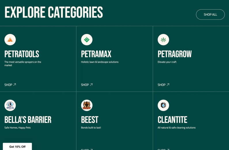
Carousels aren't the go-to solution for every list of items. It's important to consider the context before opting for a carousel, and to know when a product grid or a 'See All' button leading to a full grid may be more appropriate.
For instance, Petratools only has six brands to display, and a grid layout can suffice in this case.
In summary, there's no one-size-fits-all answer.
The suitability of a carousel depends on various factors such as the website's style, the layout of the information, and the aspect ratio of the carousel cards.
It's important to not hide key information in a carousel, as users might not fully interact with it. When using a carousel, make sure the content is easy to find and access.
Consistency
If the design and behavior differ between multiple carousels on the same site, it can confuse users.
We make sure to use the same carousel component across the site so users don't get confused when navigating with one carousel of the other.
In the ÖBB example below, users can navigate by clicking on the tiny dots, dragging the slider, clicking on the slices (although there is a drag cursor), and clicking on the buttons.
History slider on oebb-history.at/en/how-it-all-began
On Frederik Bagger's homepage, there are two carousels with different navigation setups: one has buttons above the carousel, while the other has buttons placed directly on the carousel.
Buttons above the carousel on frederikbagger.dk/Buttons on top of the carousel on frederikbagger.dk/
Final words
Crafting a carousel that is accessible, responsive, user-friendly, and engaging can be complex, as illustrated by the points discussed above.
One might suggest forgoing carousels, but their practical nature due their space-saving capacity cannot be overlooked.
Consider Netflix's use of carousels for movie selection, Zalando's application for clothing showcase, or LinkedIn's approach for post display.
At Tinloof, we aim for seamless and efficient design handoffs, drawing from our experience completing dozens of projects.
Our ultimate goal is a "0 questions asked" handoff, akin...
If you're a frontend developer, you are probably spending as much time on VS Code as on Figma.
This quick read highlights some of the goodies that I personally use to speed up my workflow....
Text over images or videos is common on websites, and when not done right, it can make the text hard to read and cause accessibility and usability issues. Designers might not catch...