11th May 2019 • 9 min read
ReasonML for production React Apps? (Part 3)

Seif Ghezala
A while ago I published this article about building an accessible and reusable modal/dialog component in React.
The component achieves the following requirements:
A reusable component API: we should be able to easily use our accessible modal anywhere and populate it with content.
Accessible markup.
We should be able to open & close the modal just using the keyboard.
Trap the focus in the modal: since the modal is an inert component, the keyboard navigation should be trapped inside of it once it’s open.
The component makes use of React features like the Context, Portals, and Ref. To evaluate whether ReasonReact is ready for production, I will build the same modal in Reason and report what I like/dislike.
This article is the third part in a series. Access Part 1 here, Part 2 here and Part 4 here.
I will be doing that once again in iterations. You can find the final source code here. There is a separate branch for each iteration.
Final result
Iteration #1: the modal as a simple div
The modal component
First, let's create the modal component:
1/* src/Modal.re */23[%bs.raw {|require('./Modal.css')|}];45[@bs.scope "document"] [@bs.val] external body: Dom.element = "body";67[@react.component]8let make = (~children) =>9 ReactDOMRe.createPortal(10 <div className="modal-container" role="dialog" ariaModal=true>11 <div className="modal-content"> children </div>12 </div>,13 body,14 );
To make the modal accessible, it should be isolated from the main application content. Using the createPortal function of ReactDOMRe, the modal is rendered directly in the body of the document.
But first, we need to access the body...
Reason ships with a Dom module. Unfortunately, the module only contains useful types in it and doesn't provide bindings to the actual DOM.
We can of course just use raw JavaScript to access document.body and type the value using the Dom module:
1let body: Dom.element = [%raw "document.body"];If we look at the compiled Modal.bs.js file, we'll see this totally unnecessary line:
1var body = document.body;Can you imagine how the compiled code would look like if we start using this approach whenever we want to access a JavaScript value? We can do better than that!
To access the body of the document, we can use BuckleScript's external feature:
1[@bs.scope "document"] [@bs.val] external body: Dom.element = "body";We simply tell BuckleScript to give us the value body of type Dom.element present in the global value document. This syntax is pretty smart and efficient. If we look at the compiled Modal.bs.js file, we'll see that the body is accessed directly from the document object, the same way we would do it in JavaScript!
Opening the modal
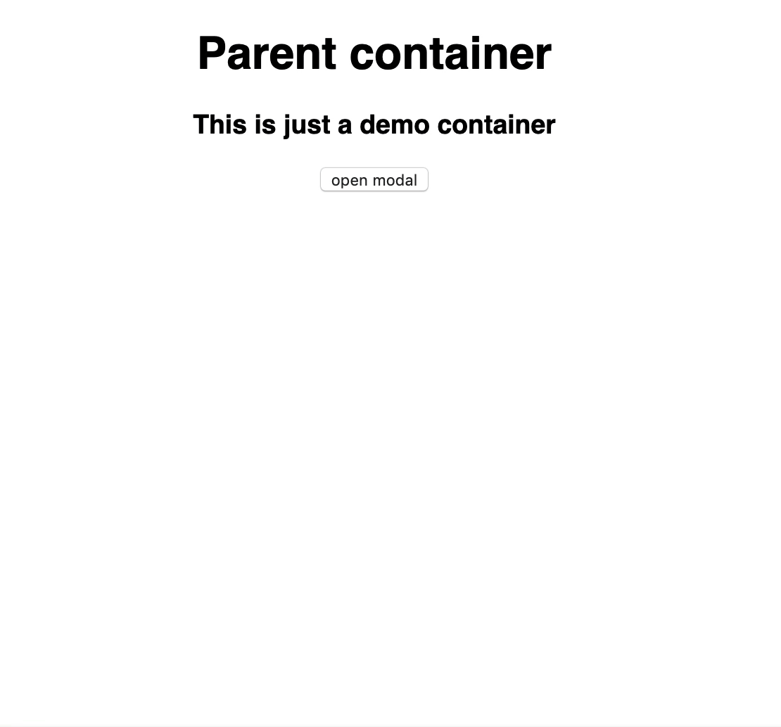
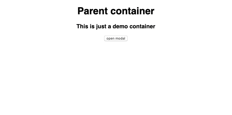
1/* src/App.re */23[%bs.raw {|require('./App.css')|}];45[@react.component]6let make = () => {7 let (isModalVisible, setIsModalVisible) = React.useState(() => false);8 <div className="App">9 <h1> {"Parent container" |> ReasonReact.string} </h1>10 <h3> {"This is just a demo container" |> ReasonReact.string} </h3>11 <button onClick={_ => setIsModalVisible(_ => true)}>12 {"open modal" |> ReasonReact.string}13 </button>14 {!isModalVisible15 ? ReasonReact.null : <Modal> {"Foo" |> ReasonReact.string} </Modal>}16 </div>;17};
To view/hide the modal, it's rendered in the App component conditionally based on the isModalVisible boolean state value.
The "open modal" button simply sets that value to true, opening the modal.
I like
Using portals is pretty simple.
BuckleSript external syntax makes accessing a DOM element simple and efficient.
I dislike
The absence of actual bindings to the DOM. It would have made accessing the body of the document as easy as it is in JavaScript while benefiting from typing.
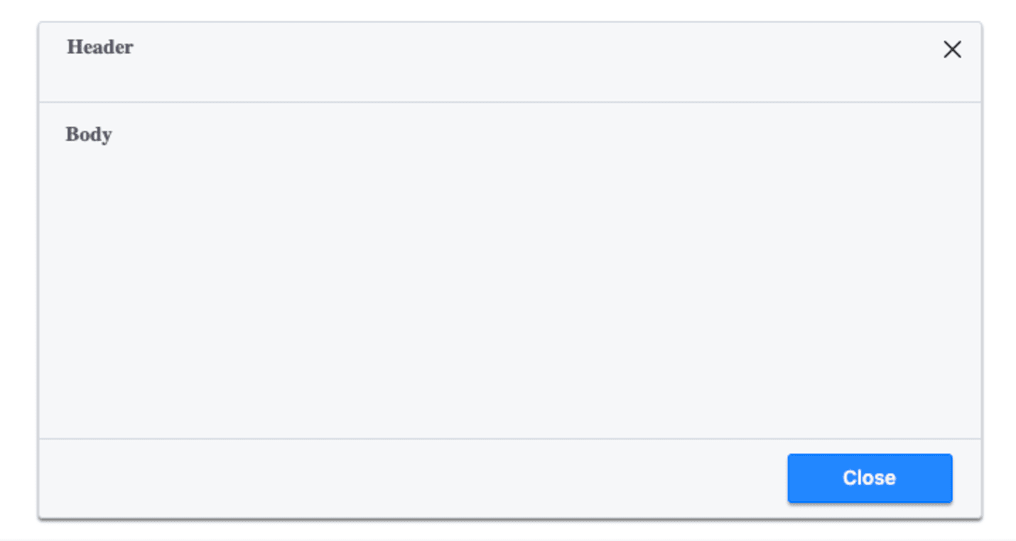
Iteration #2: adding close buttons
We want to have 2 buttons to close the modal:
A cross button in the header.
A "Close" button in the footer.
Before doing that, we need first have the modal expose:
A header component that contains the cross closing button and any elements we wish to render in the header of the modal.
A body component that contains any elements we wish to render in the body of the modal.
A footer component that will contain the second closing button and any elements we wish to render in the footer of the modal.
1/* src/Modal.re */23[%bs.raw {|require('./Modal.css')|}];45[@bs.scope "document"] [@bs.val] external body: Dom.element = "body";67module Cross = {8 [@bs.module "./cross.svg"] [@react.component]9 external make: unit => React.element = "default";10};1112[@react.component]13let make = (~children) => {14 ReactDOMRe.createPortal(15 <div className="modal-container" role="dialog" ariaModal=true>16 <div className="modal-content"> children </div>17 </div>,18 body,19 );20};2122module Header = {23 [@react.component]24 let make = (~children) => {25 <div className="modal-header">26 children27 <button className="cross-btn" title="close modal"> <Cross /> </button>28 </div>;29 };30};3132module Body = {33 [@react.component]34 let make = (~children) => <div className="modal-body"> children </div>;35};3637module Footer = {38 [@react.component]39 let make = (~children) => <div className="modal-footer"> children </div>;4041 module CloseBtn = {42 [@react.component]43 let make = (~children) => {44 <button className="close-btn" title="close modal"> children </button>;45 };46 };47};
We can then refactor our App.re and make use of the new modal sub-components:
1/* src/App.re */23[%bs.raw {|require('./App.css')|}];45[@react.component]6let make = () => {7 let (isModalVisible, setIsModalVisible) = React.useState(() => false);89 <div className="App">10 <h1> {"Parent container" |> ReasonReact.string} </h1>11 <h3> {"This is just a demo container" |> ReasonReact.string} </h3>12 <button onClick={_ => setIsModalVisible(_ => !isModalVisible)}>13 {"open modal" |> ReasonReact.string}14 </button>15 {!isModalVisible16 ? ReasonReact.null17 : <Modal>18 <Modal.Header> {"Header" |> ReasonReact.string} </Modal.Header>19 <Modal.Body> {"Body" |> ReasonReact.string} </Modal.Body>20 <Modal.Footer>21 <Modal.Footer.CloseBtn>22 {"Close" |> ReasonReact.string}23 </Modal.Footer.CloseBtn>24 </Modal.Footer>25 </Modal>}26 </div>;27};
I like
Reason's module syntax is pretty simple and creating sub-modules is effortless.
Just like opening the modal, closing it can be done by setting isModalVisible in App.re to true.
Let's pass to the Modal a function, onModalClose, that does exactly that:
1/* src/App.re*/234[%bs.raw {|require('./App.css')|}];56[@react.component]7let make = () => {8 let (isModalVisible, setIsModalVisible) = React.useState(() => false);910 <div className="App">11 <h1> {"Parent container" |> ReasonReact.string} </h1>12 <h3> {"This is just a demo container" |> ReasonReact.string} </h3>13 <button onClick={_ => setIsModalVisible(_ => !isModalVisible)}>14 {"open modal" |> ReasonReact.string}15 </button>16 {!isModalVisible17 ? ReasonReact.null18 : <Modal onModalClose={() => setIsModalVisible(_ => false)}>19 <Modal.Header> {"Header" |> ReasonReact.string} </Modal.Header>20 <Modal.Body> {"Body" |> ReasonReact.string} </Modal.Body>21 <Modal.Footer>22 <Modal.Footer.CloseBtn>23 {"Close" |> ReasonReact.string}24 </Modal.Footer.CloseBtn>25 </Modal.Footer>26 </Modal>}27 </div>;28};
By now, the modal component has a prop function to close the Modal. The only thing left is to make it available to the header and footer close buttons.
To do that we can expose it in a React Context Provider. Any component that needs to access the onModalClose function can then consume it using a useContext hook.
To create a context for the modal, we can use React createContext function and pass to it an initial value. Since the onModalClose function is of type unit => unit, the initial value needs to be of the same type:
1let modalContext = React.createContext(() => ());The provider can't be accessed directly from the modal's context. One way of using it is to create a provider module which exposes a make and makeProps functions:
1module ContextProvider = {2 let makeProps = (~value, ~children, ()) => {3 "value": value,4 "children": children,5 };67 let make = React.Context.provider(modalContext);8};
We can then wrap the modal's children inside the context provider and consume our value in the header and footer:
1/* src/Modal.re */23[%bs.raw {|require('./Modal.css')|}];45[@bs.scope "document"] [@bs.val] external body: Dom.element = "body";67module Cross = {8 [@bs.module "./cross.svg"] [@react.component]9 external make: unit => React.element = "default";10};1112let modalContext = React.createContext(() => ());1314module ContextProvider = {15 let makeProps = (~value, ~children, ()) => {16 "value": value,17 "children": children,18 };1920 let make = React.Context.provider(modalContext);21};2223[@react.component]24let make = (~children, ~onModalClose) => {25 ReactDOMRe.createPortal(26 <div className="modal-container" role="dialog" ariaModal=true>27 <div className="modal-content">28 <ContextProvider value=onModalClose> children </ContextProvider>29 </div>30 </div>,31 body,32 );33};3435module Header = {36 [@react.component]37 let make = (~children) => {38 let onModalClose = React.useContext(modalContext);3940 <div className="modal-header">41 children42 <button43 className="cross-btn"44 title="close modal"45 onClick={_ => onModalClose()}>46 <Cross />47 </button>48 </div>;49 };50};5152module Body = {53 [@react.component]54 let make = (~children) => <div className="modal-body"> children </div>;55};5657module Footer = {58 [@react.component]59 let make = (~children) => <div className="modal-footer"> children </div>;6061 module CloseBtn = {62 [@react.component]63 let make = (~children) => {64 let onModalClose = React.useContext(modalContext);6566 <button67 className="close-btn"68 title="close modal"69 onClick={_ => onModalClose()}>70 children71 </button>;72 };73 };74};
I like
I was able to use the Context to implement the feature, even if it was a workaround.
After getting stuck with using the Context, I managed to get a working solution in no-time through the forum and discord channel.
I dislike
There is no documentation about using the context.
The solution I used is undoubtedly a hack.
Iteration #4: closing the modal through a keyboard shortcut
We want to be able to close the modal by pressing the ESCAPE key. To do so, we need to use the external syntax to access 2 functions:
document.addEventListener(to add a listener).document.removeEventListener(to remove a listener).
We have to be explicit about the type of event used in both functions. The ReactEvent module provides types for various events. In our case, we are dealing with events of type Keyboard. Since our functions only deal with keyboard events, I decided to name them a bit differently:
1[@bs.scope "document"] [@bs.val]2external addKeybordEventListener:3 (string, ReactEvent.Keyboard.t => unit) => unit =4 "addEventListener";56[@bs.scope "document"] [@bs.val]7external removeKeybordEventListener:8 (string, ReactEvent.Keyboard.t => unit) => unit =9 "removeEventListener";
We can then use the 2 functions to create a keydown listener that reacts to the ESCAPE key:
1let keyDownListener = e =>2 if (ReactEvent.Keyboard.keyCode(e) === 27) {3 onModalClose();4 };
The useEffect hook can be used to create a function to subscribe to our keyDownListener. The function returns than another function to clean up the effect, wrapped in an option:
1/* src/Modal.re */23[%bs.raw {|require('./Modal.css')|}];45[@bs.scope "document"] [@bs.val] external body: Dom.element = "body";67[@bs.scope "document"] [@bs.val]8external addKeybordEventListener:9 (string, ReactEvent.Keyboard.t => unit) => unit =10 "addEventListener";1112[@bs.scope "document"] [@bs.val]13external removeKeybordEventListener:14 (string, ReactEvent.Keyboard.t => unit) => unit =15 "removeEventListener";1617module Cross = {18 [@bs.module "./cross.svg"] [@react.component]19 external make: unit => React.element = "default";20};2122let modalContext = React.createContext(() => ());2324module ContextProvider = {25 let makeProps = (~value, ~children, ()) => {26 "value": value,27 "children": children,28 };2930 let make = React.Context.provider(modalContext);31};3233[@react.component]34let make = (~children, ~onModalClose) => {35 let keyDownListener = e =>36 if (ReactEvent.Keyboard.keyCode(e) === 27) {37 onModalClose();38 };3940 let effect = () => {41 addKeybordEventListener("keydown", keyDownListener);42 Some(() => removeKeybordEventListener("keyDown", keyDownListener));43 };4445 React.useEffect(effect);4647 ReactDOMRe.createPortal(48 <div className="modal-container" role="dialog" ariaModal=true>49 <div className="modal-content">50 <ContextProvider value=onModalClose> children </ContextProvider>51 </div>52 </div>,53 body,54 );55};5657module Header = {58 [@react.component]59 let make = (~children) => {60 let onModalClose = React.useContext(modalContext);6162 <div className="modal-header">63 children64 <button65 className="cross-btn"66 title="close modal"67 onClick={_ => onModalClose()}>68 <Cross />69 </button>70 </div>;71 };72};7374module Body = {75 [@react.component]76 let make = (~children) => <div className="modal-body"> children </div>;77};7879module Footer = {80 [@react.component]81 let make = (~children) => <div className="modal-footer"> children </div>;8283 module CloseBtn = {84 [@react.component]85 let make = (~children) => {86 let onModalClose = React.useContext(modalContext);8788 <button89 className="close-btn"90 title="close modal"91 onClick={_ => onModalClose()}>92 children93 </button>;94 };95 };96};
I like
useEffect being fully typed, it reminds you to clean up the effect. You either explicitly return
Noneor a cleanup function. This avoids memory leaks when adding listeners and not removing them.
I dislike
There is no documentation about the use of
useEffect.
There is one more thing left in order for our modal to be properly accessible: the focus inside of it should be trapped. Once the modal is opened, we should focus the first focusable element in it. From then, pressing the TAB or SHIFT + TAB keys will only allow the user to navigate inside the modal.
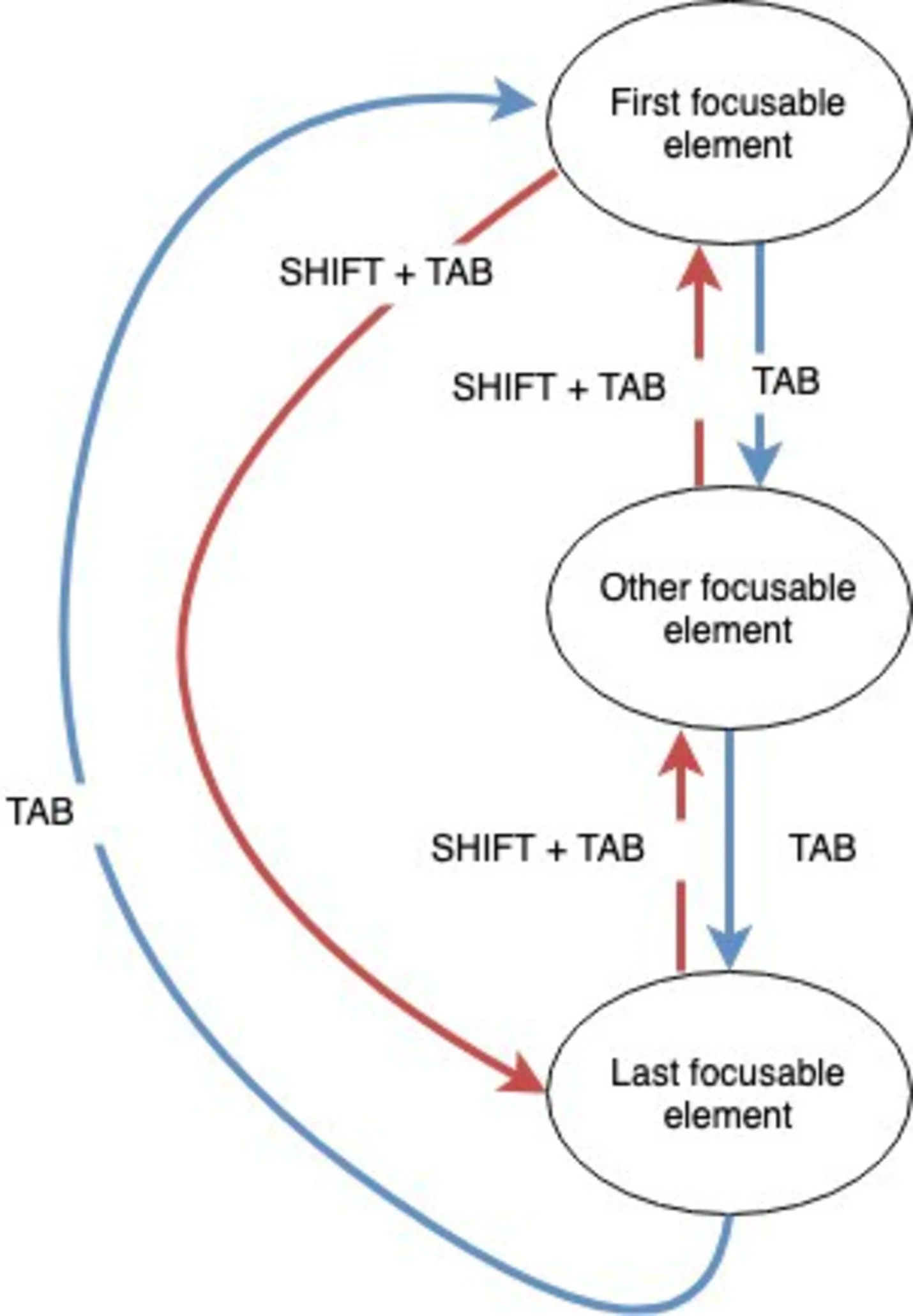
Trapping the focus inside the modal
We need to first create a Ref to access the modal dom element:
1let modalRef = React.useRef(Js.Nullable.null);Notice that we have to initiate useRef with a null value through the Js.Nullable module. Fortunatelty, it's pretty easy to convert from a Js.Nullable to an option:
1switch(Js.Nullable.toOption(someNullable)) {2 | Some(value) => ...3 | None => ...4}
To select all focusable elements inside the modal, we can use the querySelector function of the DOM element inside the Ref to the modal component.
Due to the absence of proper bindings to the DOM, we either have to write our own bindings, use some 3rd party library, or just use ReactDOMRe.domElementToObj which converts the DOM element inside the modal ref into an object.
For the time being, I choose the 3rd option. This allows us to access the querySelector function easily but lose track of all types:
1/* src/Modal.re */23[%bs.raw {|require('./Modal.css')|}];45[@bs.scope "document"] [@bs.val] external body: Dom.element = "body";67[@bs.scope "document"] [@bs.val]8external addKeybordEventListener:9 (string, ReactEvent.Keyboard.t => unit) => unit =10 "addEventListener";1112[@bs.scope "document"] [@bs.val]13external removeKeybordEventListener:14 (string, ReactEvent.Keyboard.t => unit) => unit =15 "removeEventListener";1617[@bs.scope "document"] [@bs.val]18external activeElement: Dom.element = "activeElement";1920module Cross = {21 [@bs.module "./cross.svg"] [@react.component]22 external make: unit => React.element = "default";23};2425let modalContext = React.createContext(() => ());2627module ContextProvider = {28 let makeProps = (~value, ~children, ()) => {29 "value": value,30 "children": children,31 };3233 let make = React.Context.provider(modalContext);34};35[@react.component]36let make = (~children, ~onModalClose) => {37 let modalRef = React.useRef(Js.Nullable.null);3839 let handleTabKey = e => {40 let current = React.Ref.current(modalRef);41 switch (Js.Nullable.toOption(current)) {42 | Some(element) =>43 let elementObj = ReactDOMRe.domElementToObj(element);44 let elements =45 elementObj##querySelectorAll(46 "a[href], button, textarea, input[type='text'], input[type='radio'], input[type='checkbox'], select",47 );48 let firstElement = elements[0];49 let lastElement = elements[elements##length - 1];5051 if (!ReactEvent.Keyboard.shiftKey(e) && activeElement !== firstElement) {52 firstElement##focus();53 ReactEvent.Keyboard.preventDefault(e);54 };5556 if (ReactEvent.Keyboard.shiftKey(e) && activeElement !== lastElement) {57 lastElement##focus();58 ReactEvent.Keyboard.preventDefault(e);59 };6061 | None => ignore()62 };63 };6465 let keyListenersMap =66 Js.Dict.fromArray([|("27", _ => onModalClose()), ("9", handleTabKey)|]);6768 let effect = () => {69 let keyDownListener = e => {70 let keyCodeStr = ReactEvent.Keyboard.keyCode(e) |> string_of_int;7172 switch (Js.Dict.get(keyListenersMap, keyCodeStr)) {73 | Some(eventListener) => eventListener(e)74 | None => ignore()75 };76 };7778 addKeybordEventListener("keydown", keyDownListener);79 Some(() => removeKeybordEventListener("keyDown", keyDownListener));80 };8182 React.useEffect(effect);8384 ReactDOMRe.createPortal(85 <div className="modal-container" role="dialog" ariaModal=true>86 <div className="modal-content" ref={ReactDOMRe.Ref.domRef(modalRef)}>87 <ContextProvider value=onModalClose> children </ContextProvider>88 </div>89 </div>,90 body,91 );92};9394module Header = {95 [@react.component]96 let make = (~children) => {97 let onModalClose = React.useContext(modalContext);9899 <div className="modal-header">100 children101 <button102 className="cross-btn"103 title="close modal"104 onClick={_ => onModalClose()}>105 <Cross />106 </button>107 </div>;108 };109};110111module Body = {112 [@react.component]113 let make = (~children) => <div className="modal-body"> children </div>;114};115116module Footer = {117 [@react.component]118 let make = (~children) => <div className="modal-footer"> children </div>;119120 module CloseBtn = {121 [@react.component]122 let make = (~children) => {123 let onModalClose = React.useContext(modalContext);124125 <button126 className="close-btn"127 title="close modal"128 onClick={_ => onModalClose()}>129 children130 </button>;131 };132 };133};
I like
Being able to convert from a
Js.Nullableto an option.I was able to implement the feature regardless of the absence of proper bindings to the DOM.
I dislike
Not being able to use an option with the useRef hook.
The absence of proper bindings to the DOM.
Keep reading the latest part of this series here.