Enroute is a running and cycling store and community based in Vancouver. It has been operating without a clearly defined identity for years, and ahead of relaunching its store, inaugurating new retail stores, and launching its first mobile app, they required rebranding.
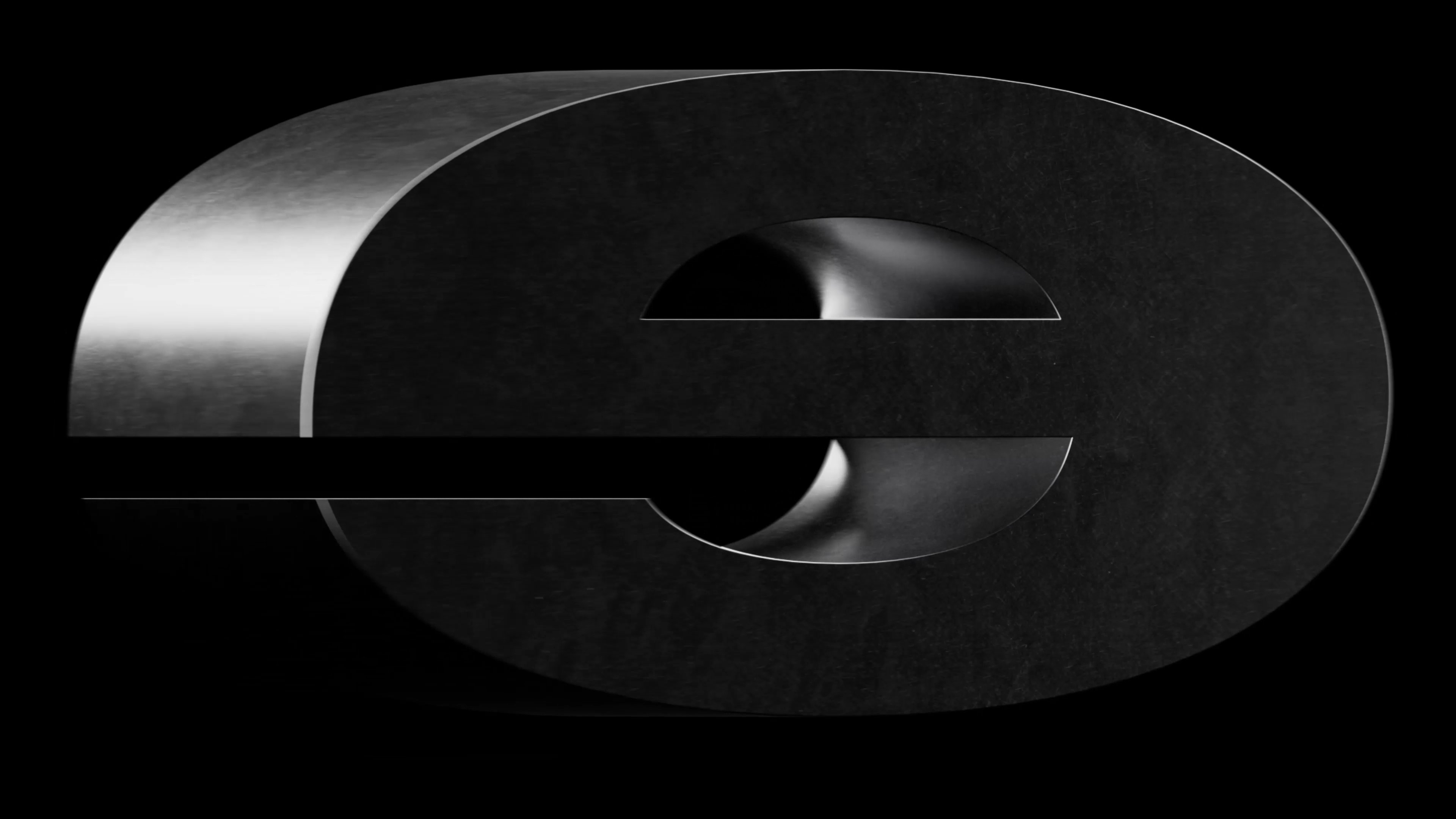
At its core, Enroute is about pushing its community to perform better. That idea inspired the visual language: a system built around the notion of pushing to the limits, where elements stretch, compress, and react under pressure.
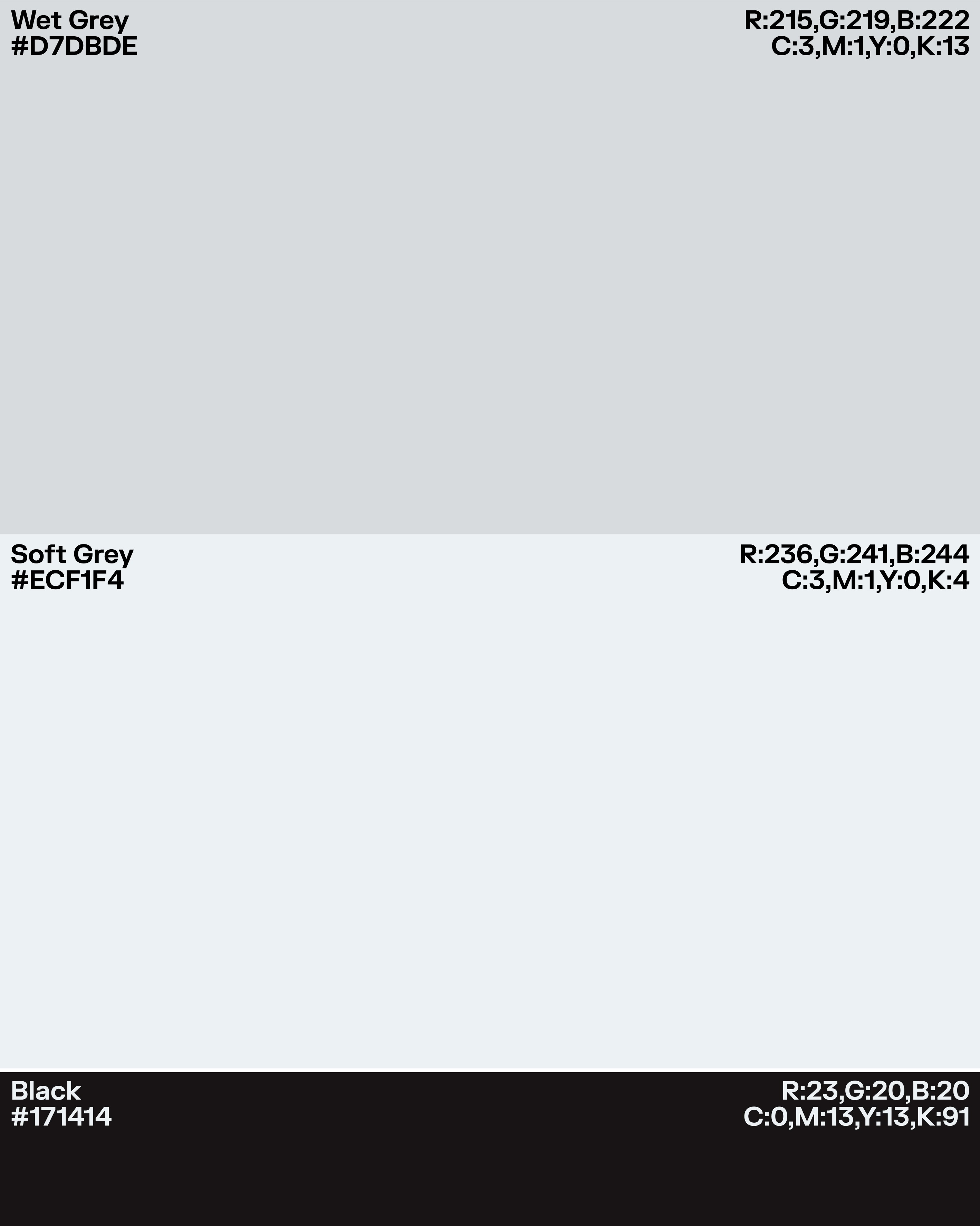
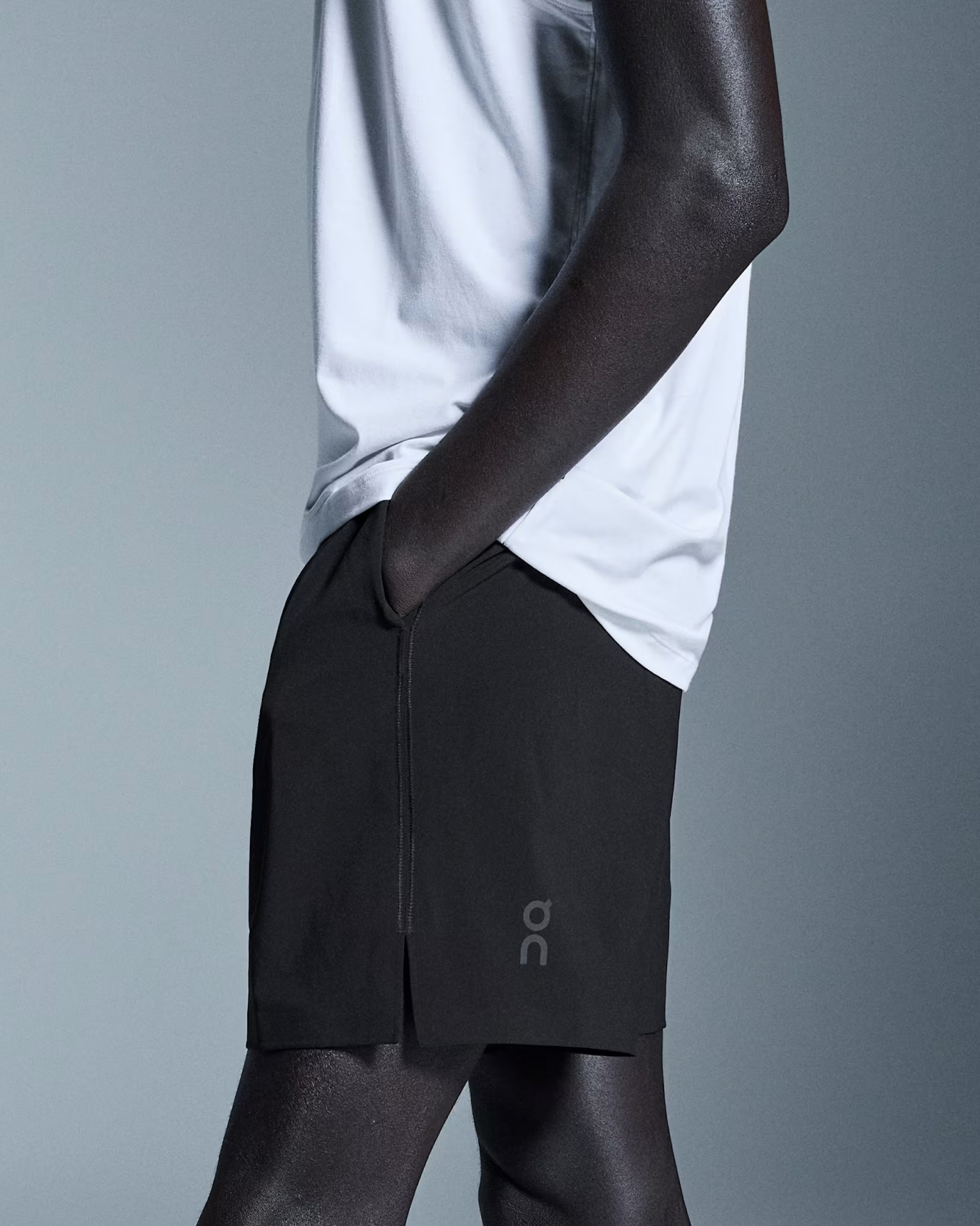
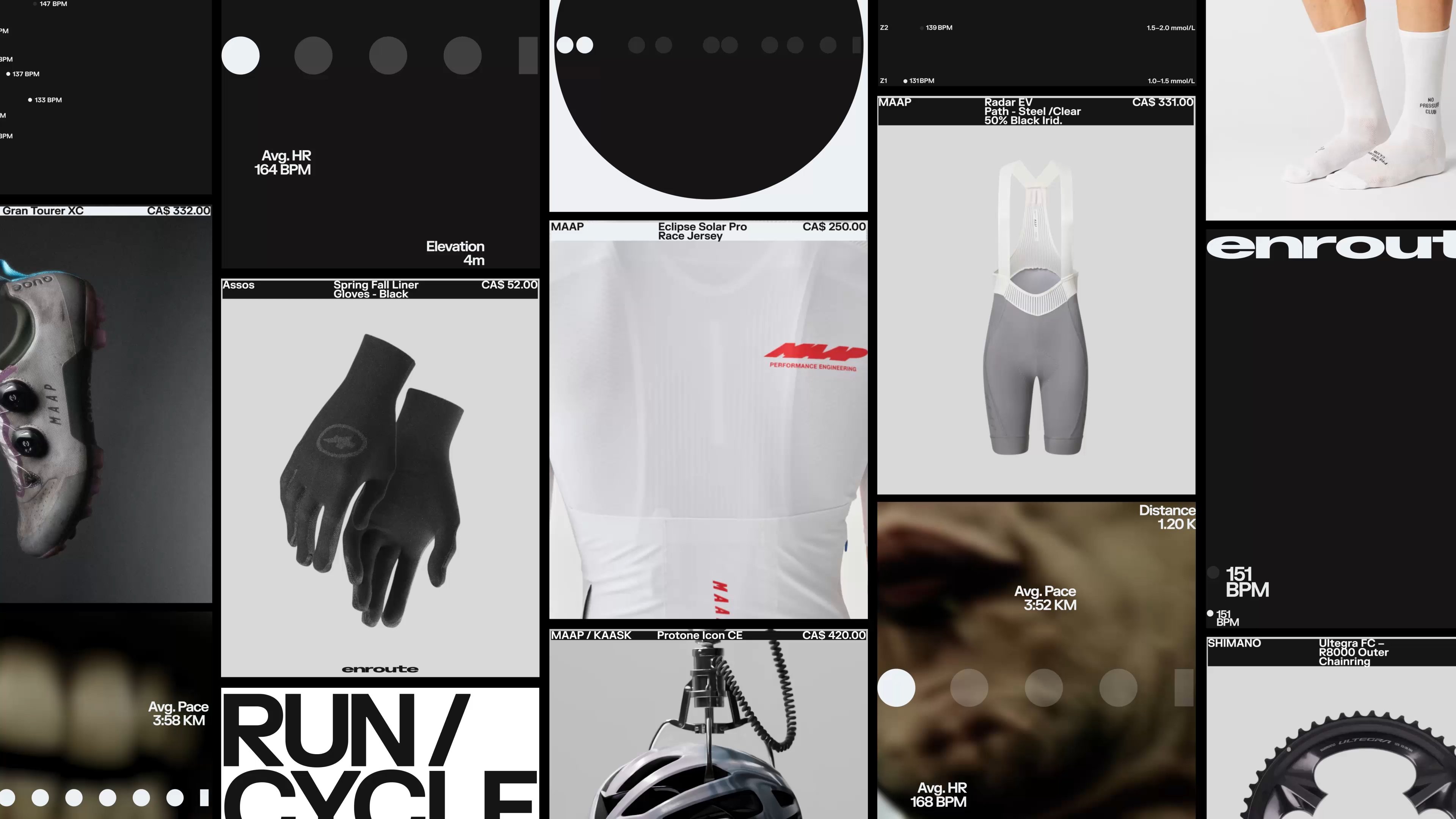
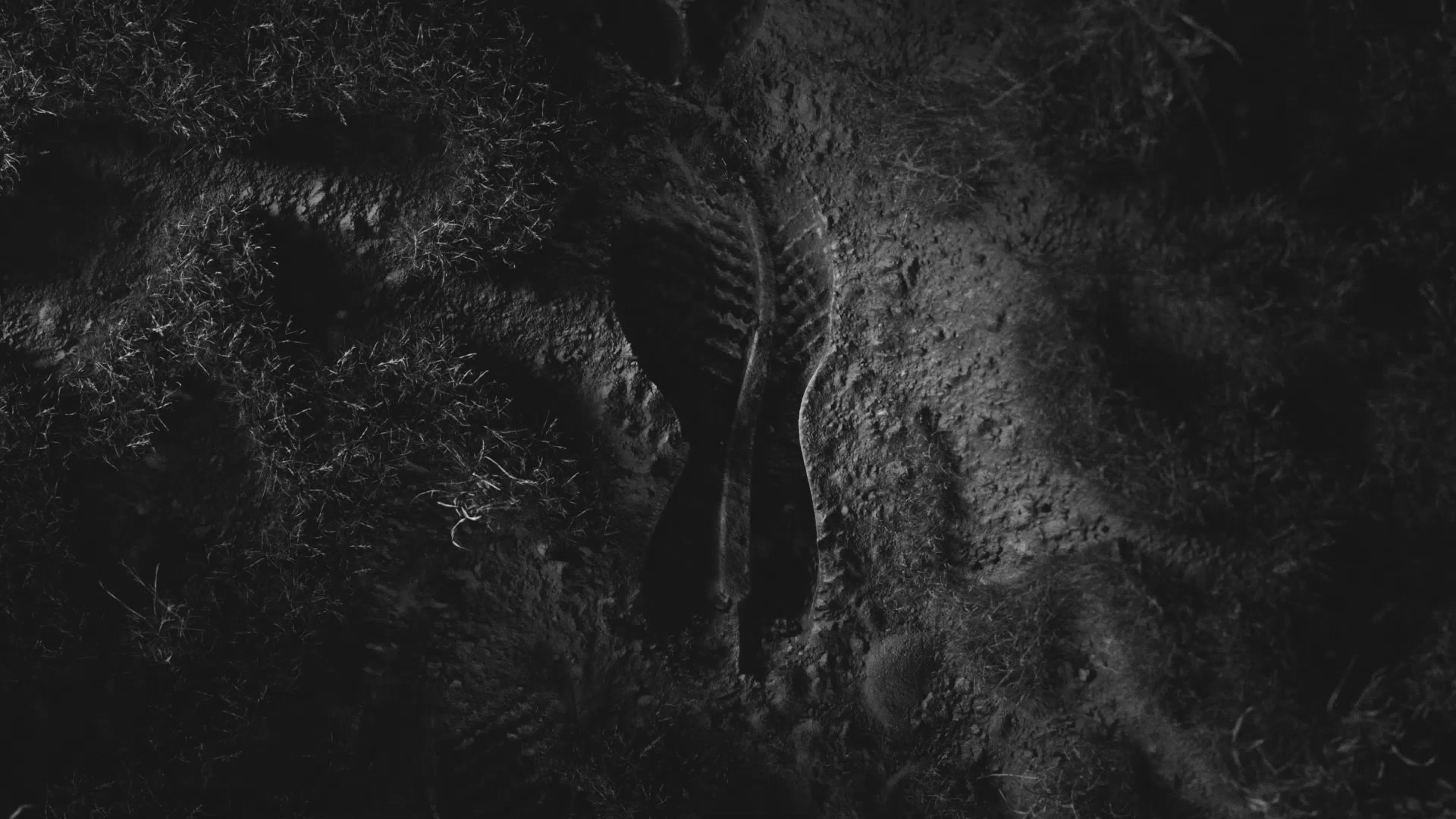
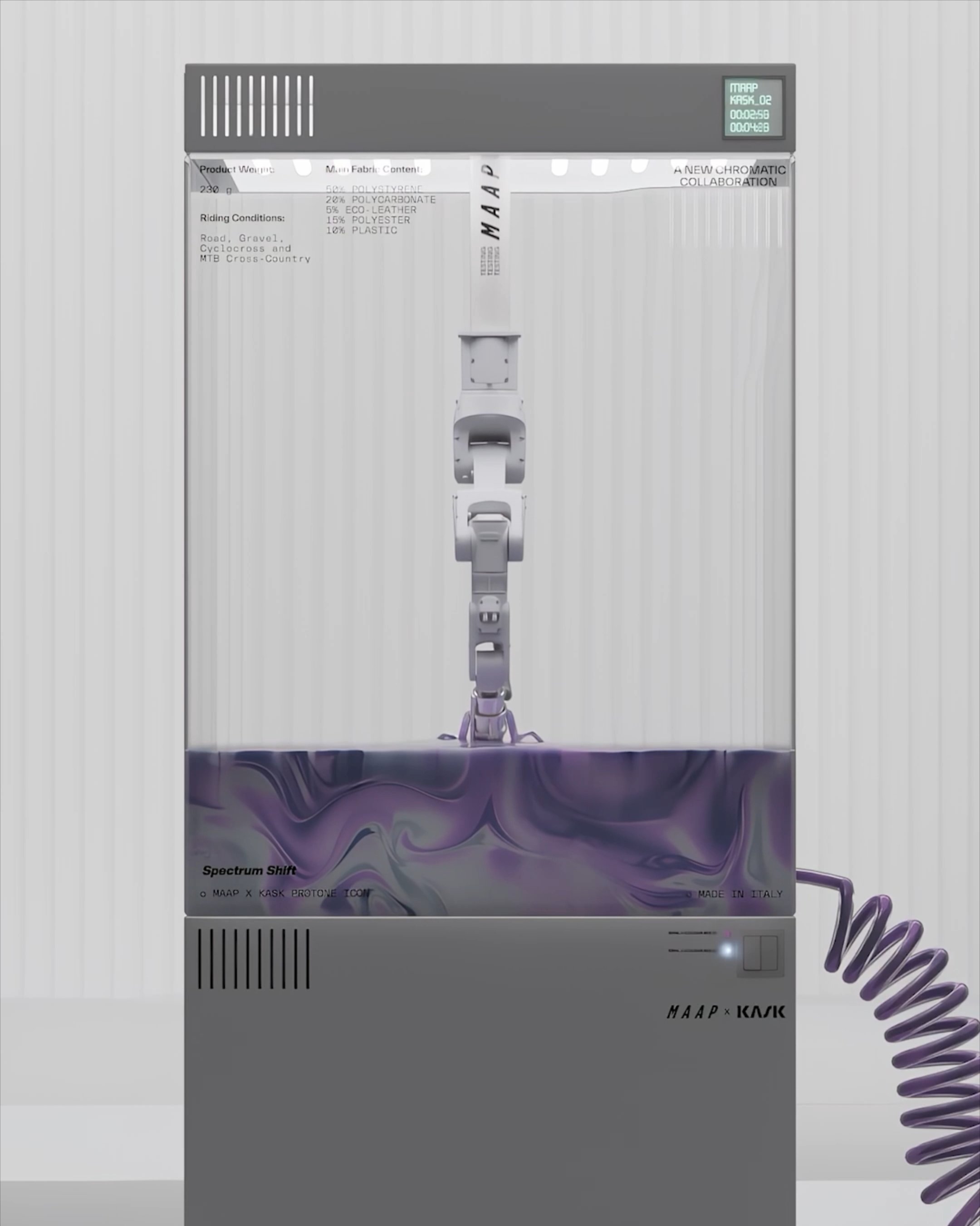
As Enroute is a reseller, it was important not to compete with the products themselves. We kept the color palette muted, allowing imagery of footwear and apparel, to remain the focus.
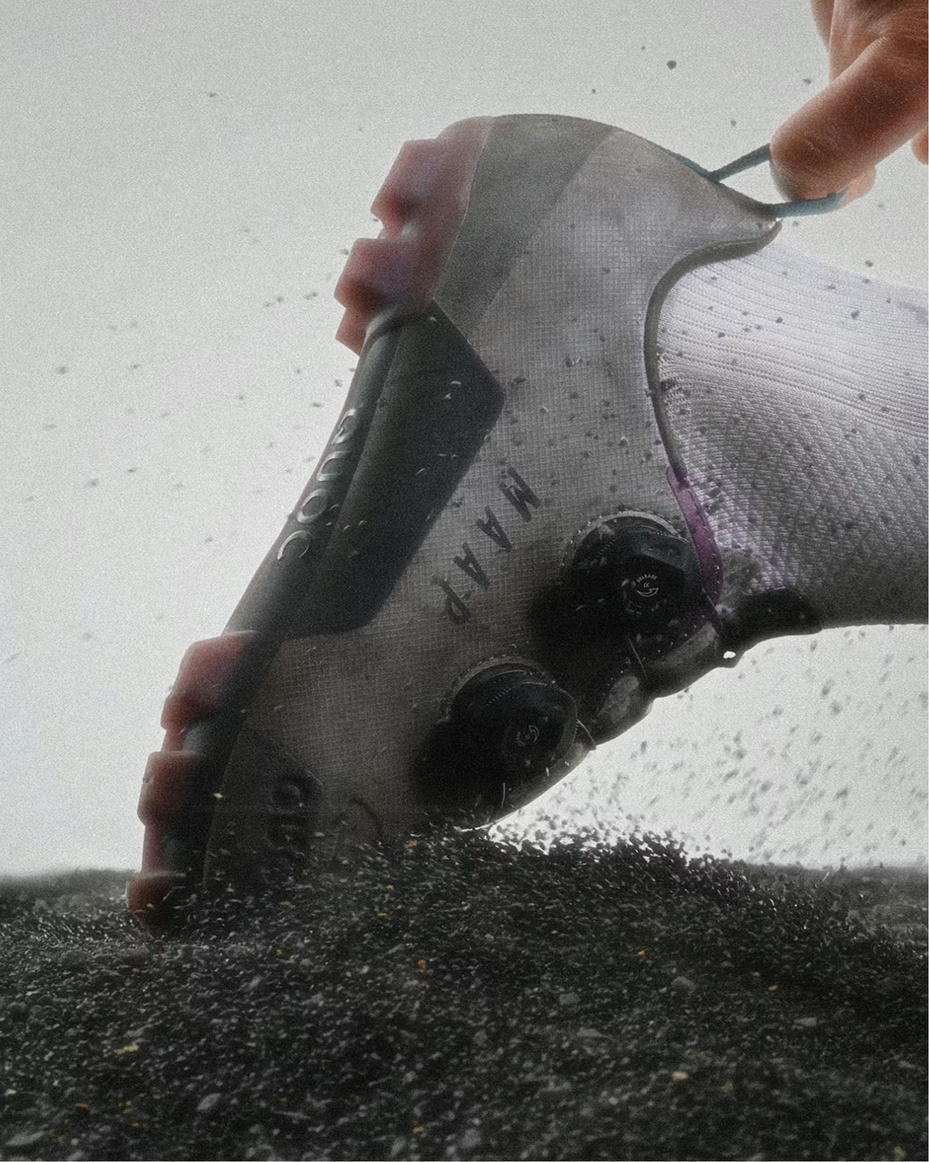
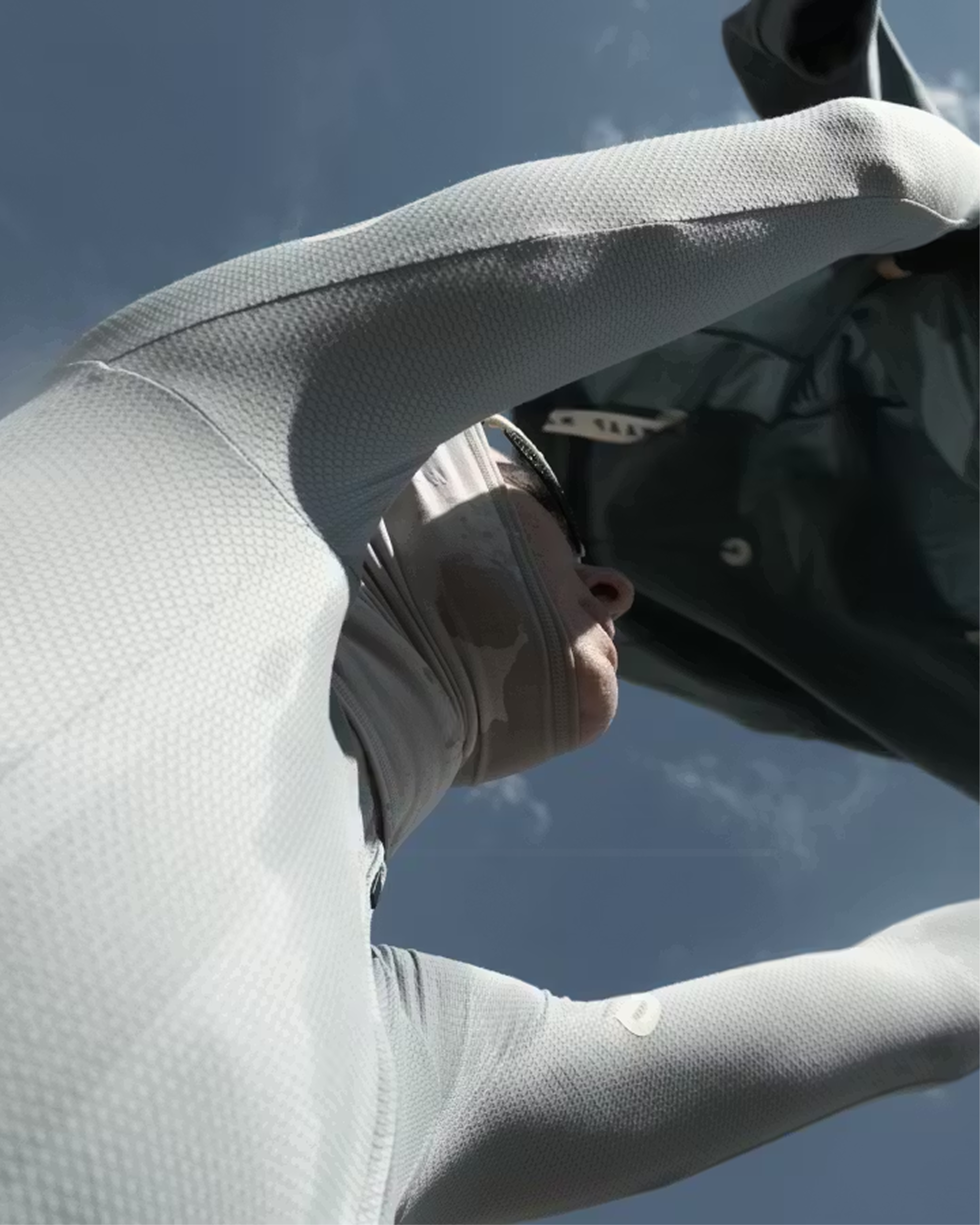
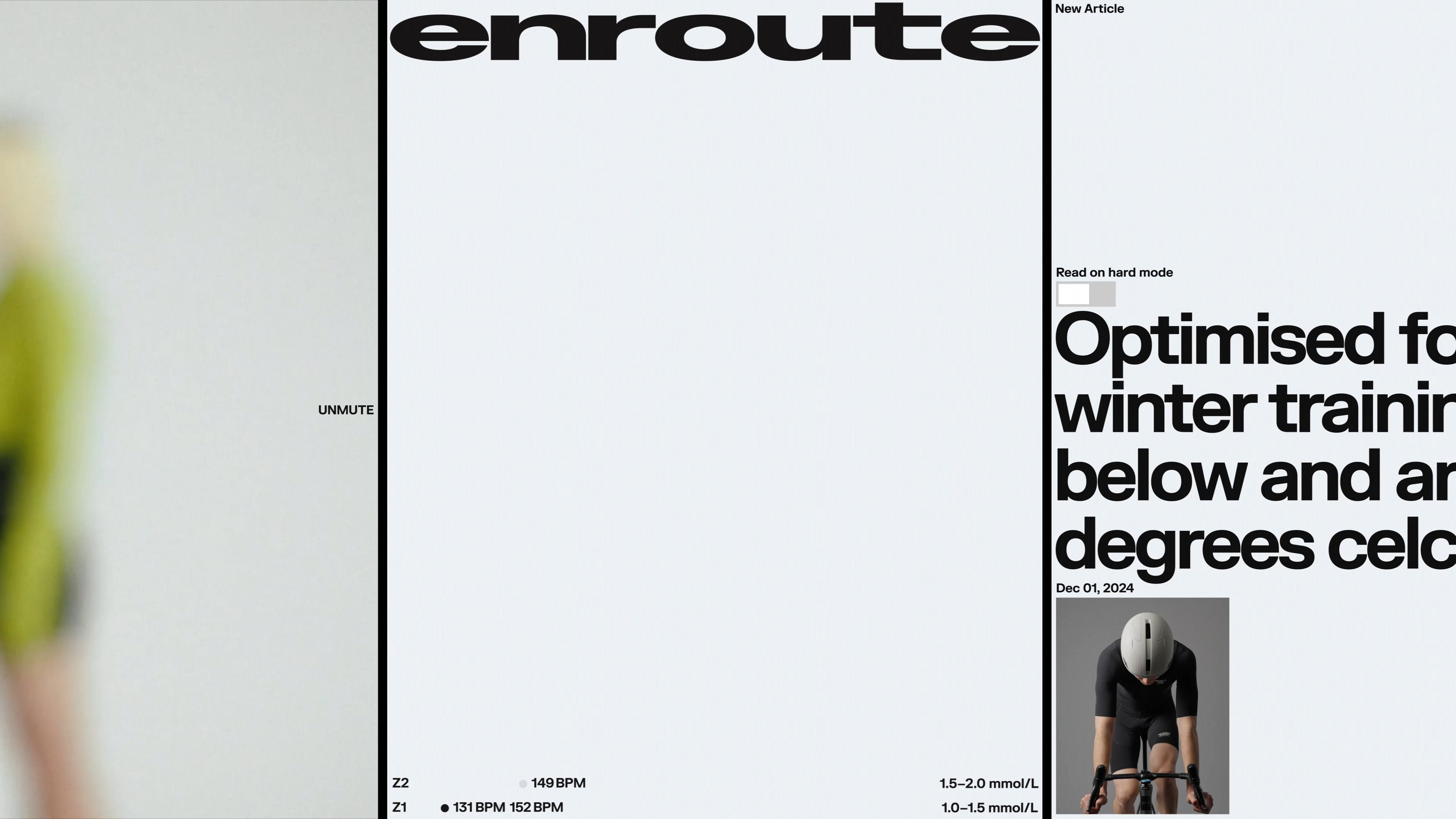
We also developed an art direction inspired by the blurred perception that comes with physical exertion. This was applied to real-life imagery of athletes in motion, capturing moments where focus fades and effort takes over.
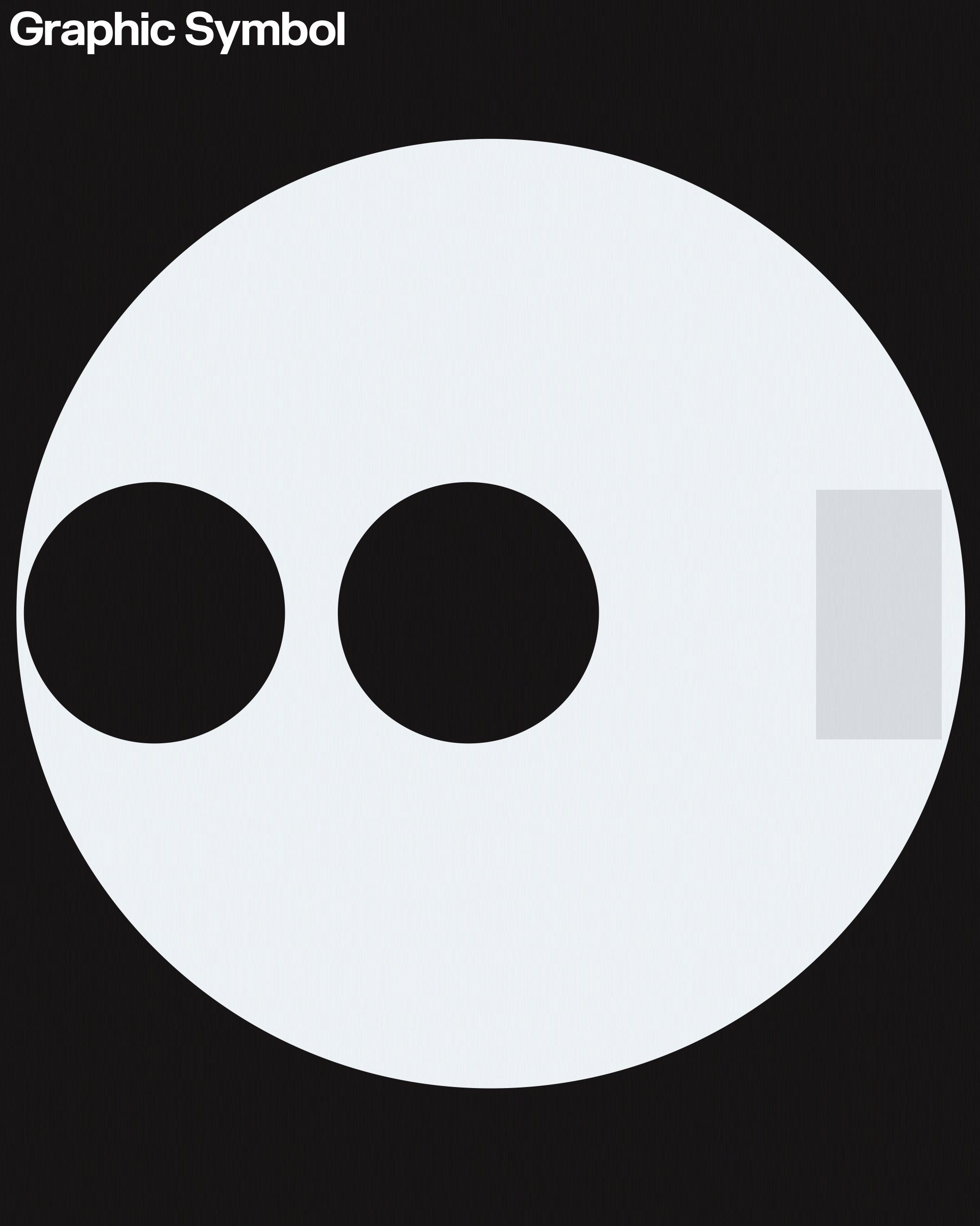
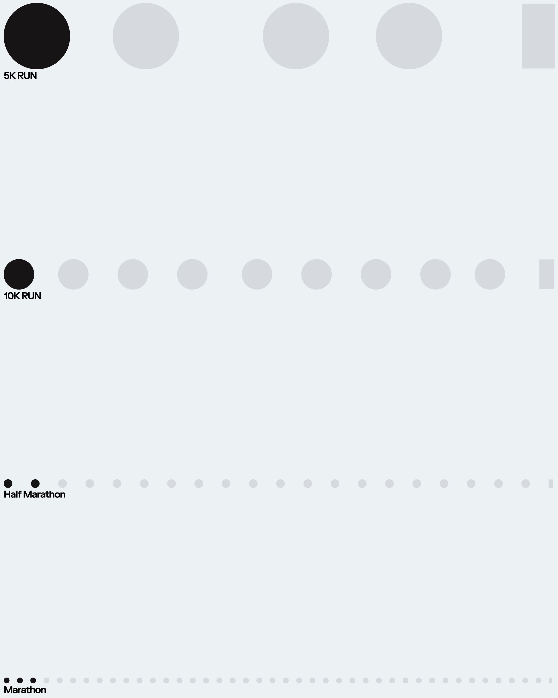
The motion language, which we expand on in a separate piece, draws from the inherent asymmetry of the body’s performance metrics; lactate levels, VO₂ max, and other indicators. These signals informed a graphic system of dots and bars, suggesting both the start of activity and its continuous progression.
The content of this page reflects the state of the project during Tinloof's engagement.