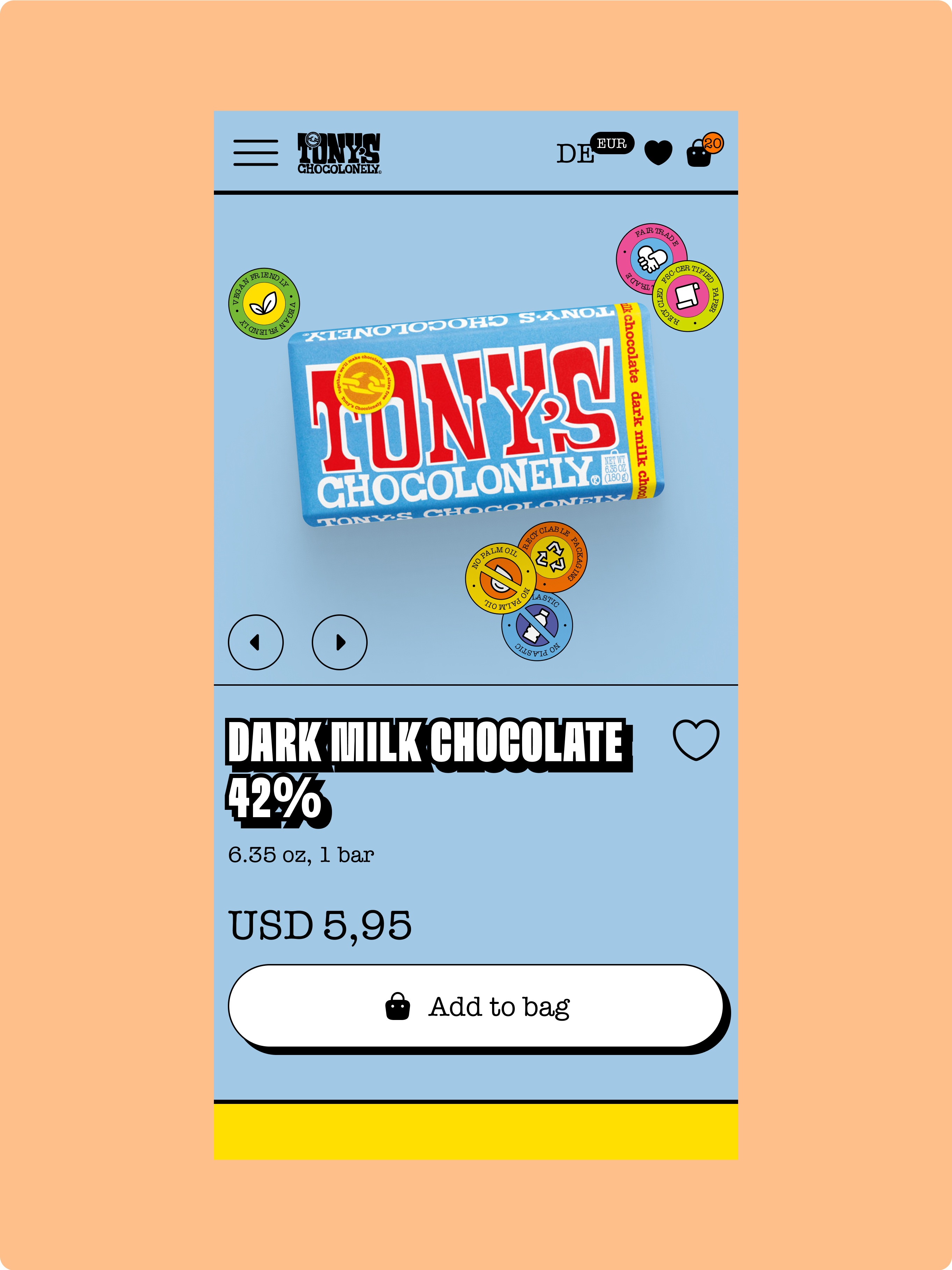
We designed and developed a demo store based on our favourite chocolate brand, Tony's Chocolonely, to showcase our approach to creating fast and engaging Shopify stores.
When you visit any page on this store, you instantly get a completely loaded page without spinners.
This is because we leveraged Remix to render pages on the server, instead of loading anything on the browser.
It's also because the website pages are served from Vercel's Edge, so they are provided to users from very fast servers that are close to them.
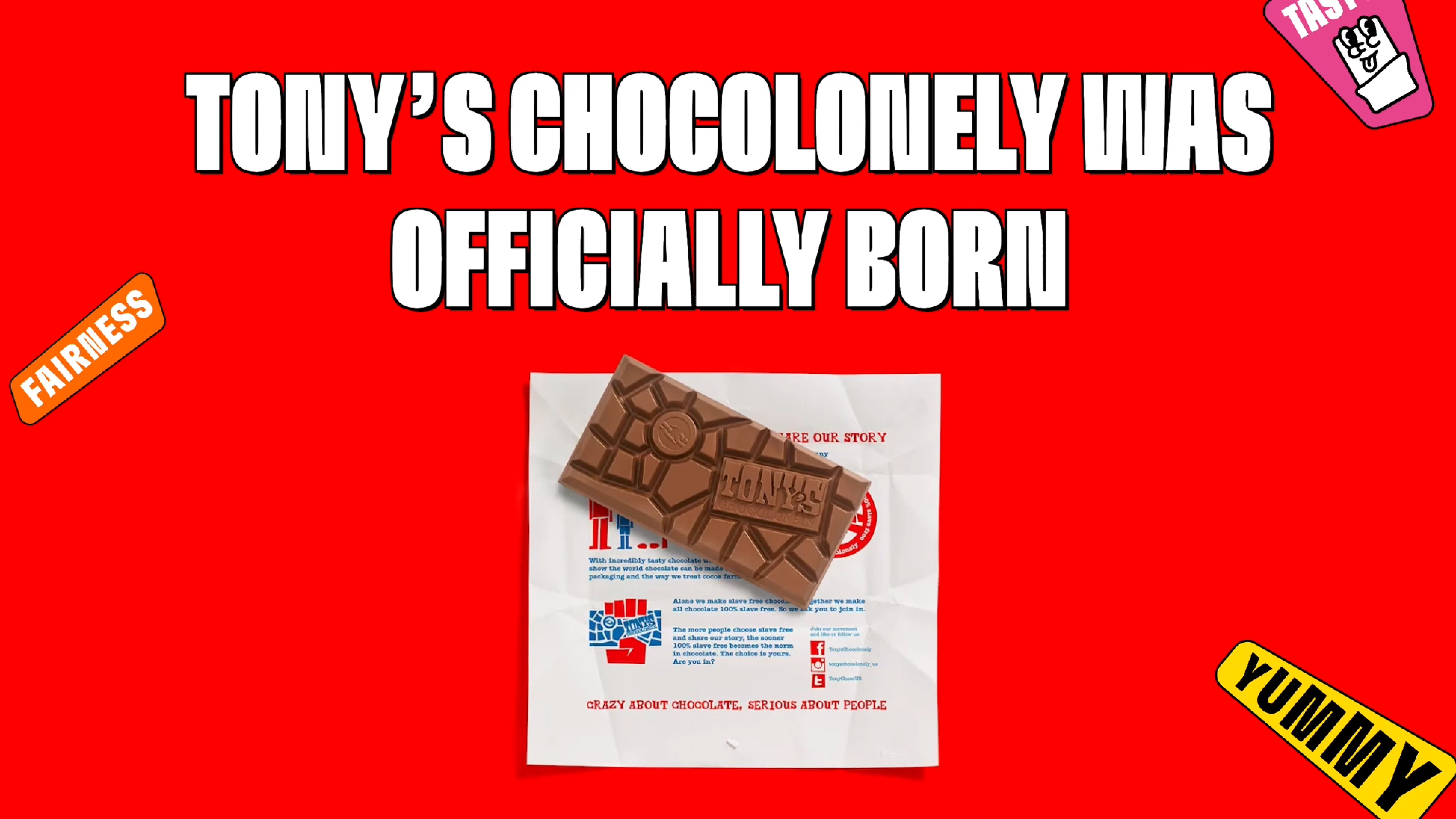
The difference is clearly displayed in the video below, where both Tinloof's Demo and Tony's Chocolonely are loaded from a slow 3G connection.
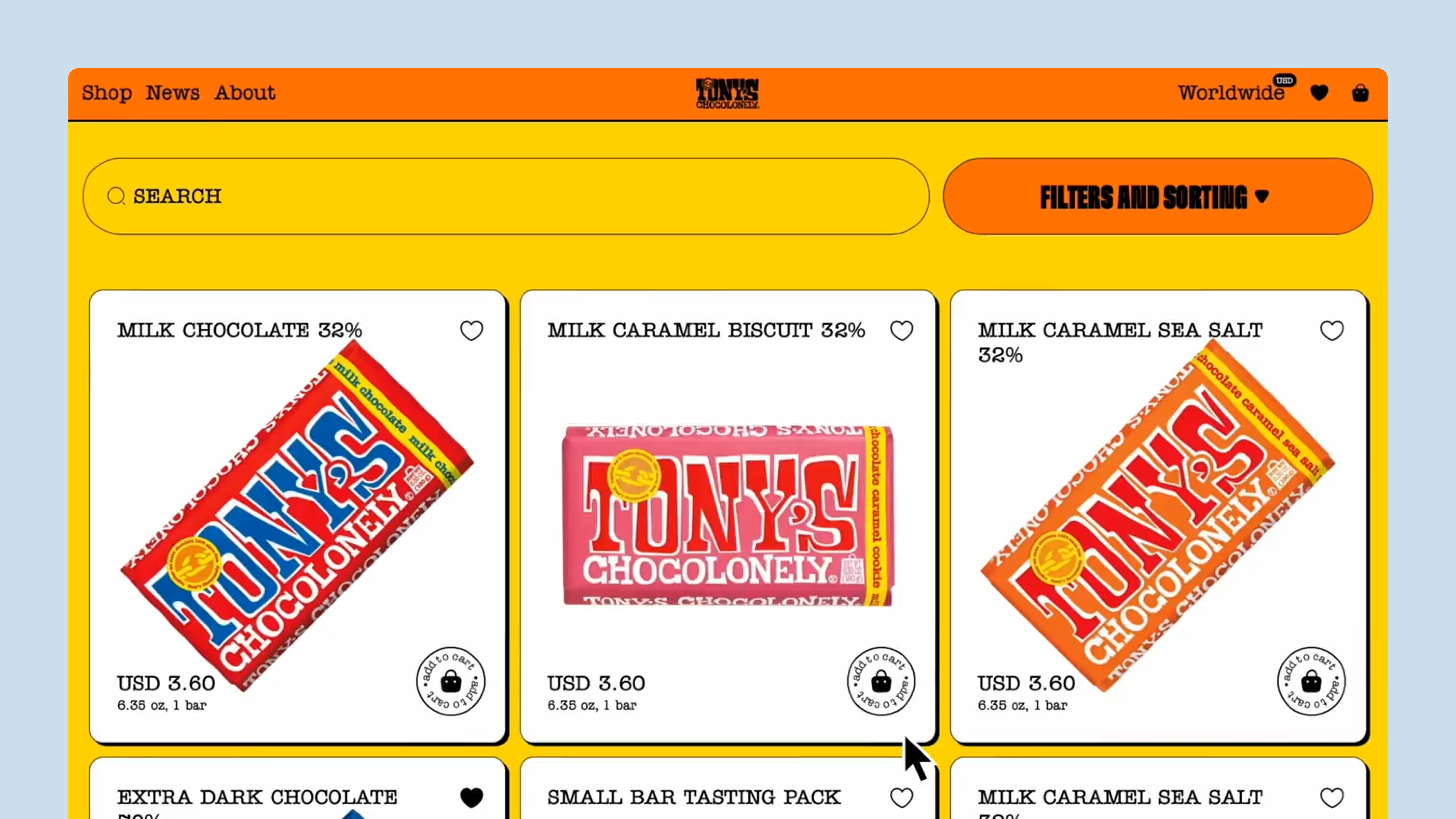
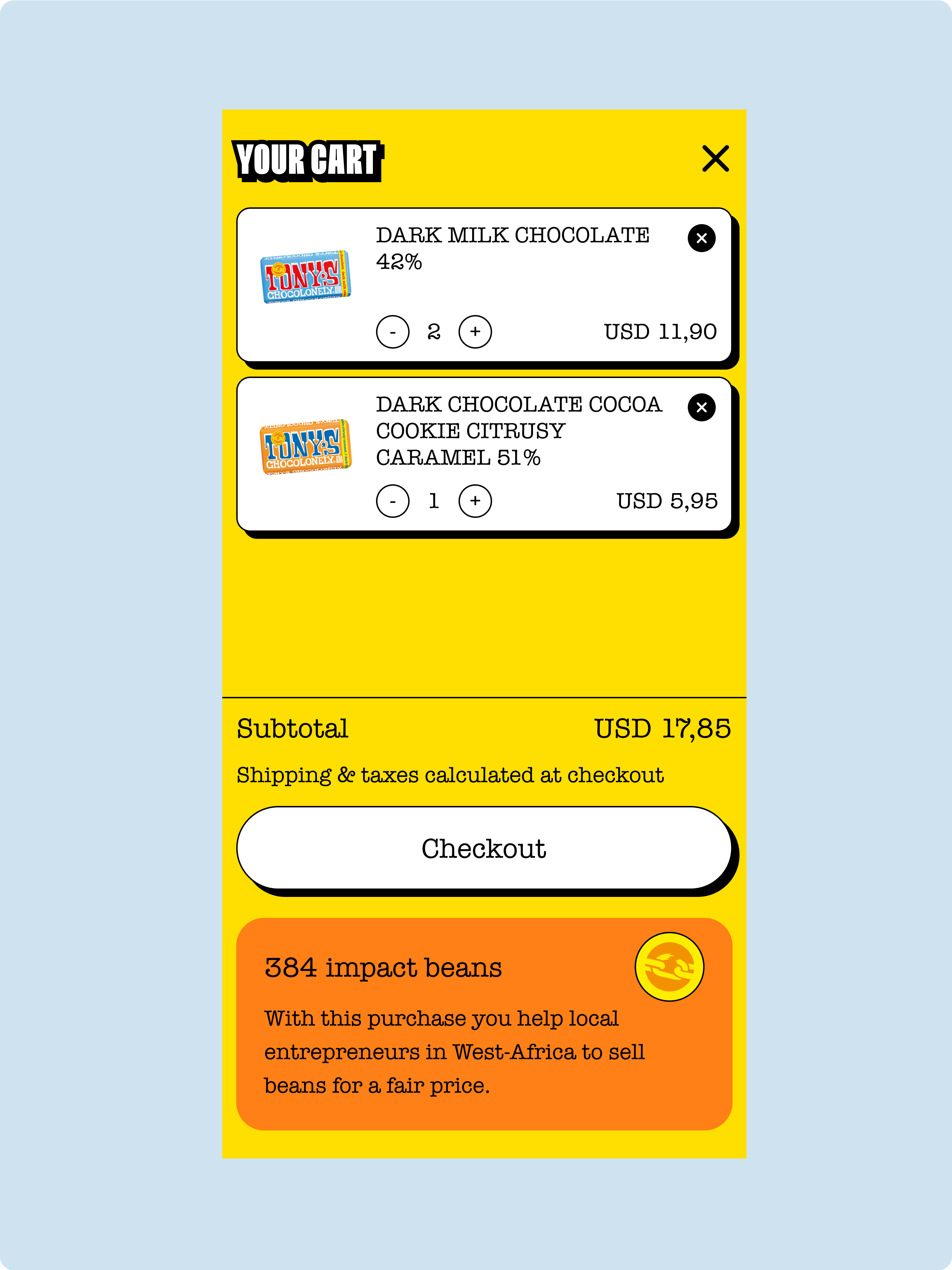
Adding an item to a cart or managing the cart usually takes several seconds in most Shopify stores, since requests have to travel from the browser to Shopify's APIs.
Since this is a critical part of the user journey, we used Remix's optimistic UI methods to make these actions happen instantly.
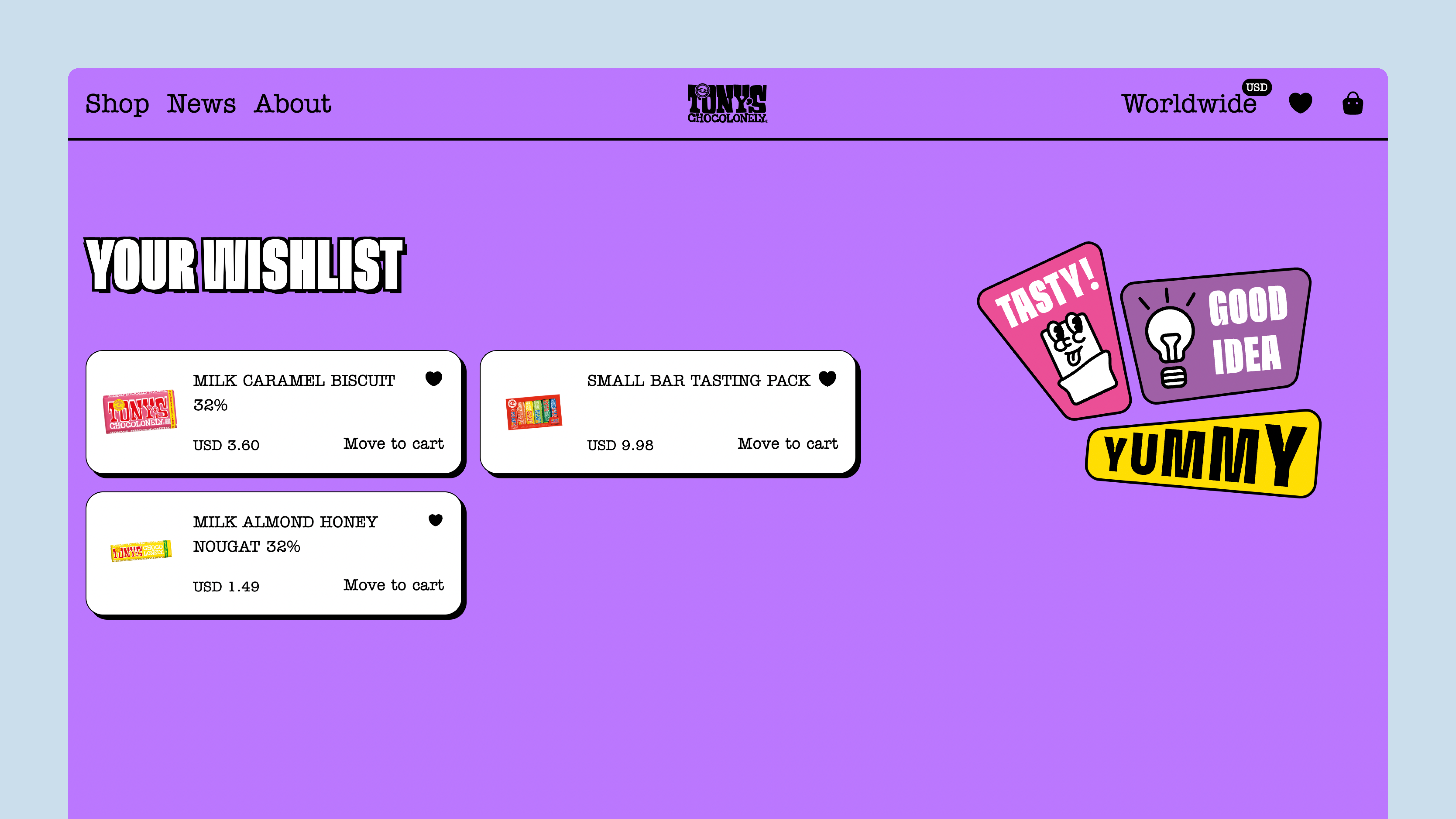
We also implemented a wishlist functionality to make it possible for users to bookmark their favourite chocolate bars.
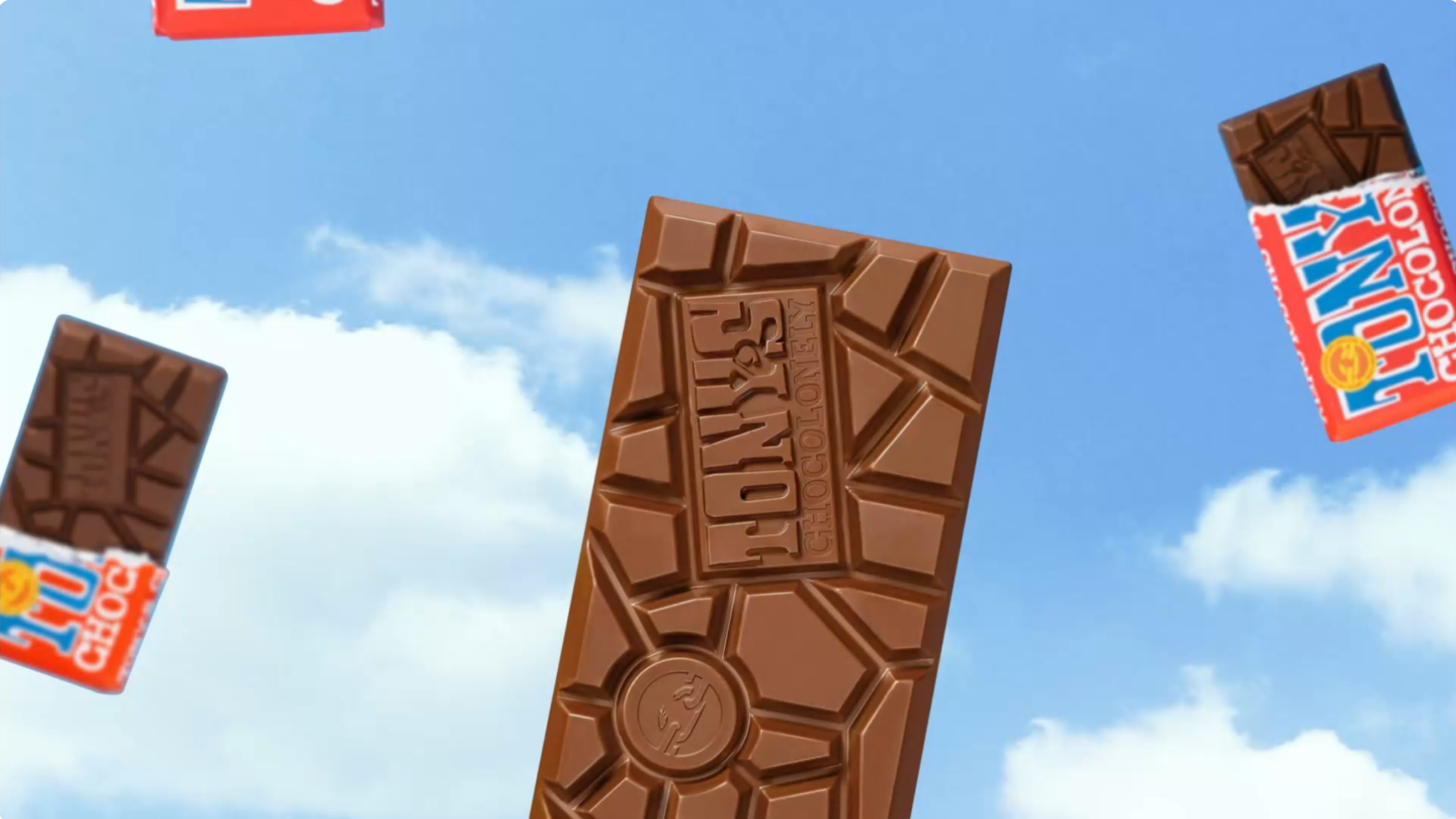
Thanks to Mux, we were able to have animations so smooth that they didn't even look like videos.
Mux also offers detailed analytics to store managers.
The site content, including landing pages and products, is entirely managed from Sanity CMS.
The store is designed as a collection of blocks, and then the blocks are developed. This is only required once - from there, content managers can be totally independent, no longer needing design or development resources to manage the site.
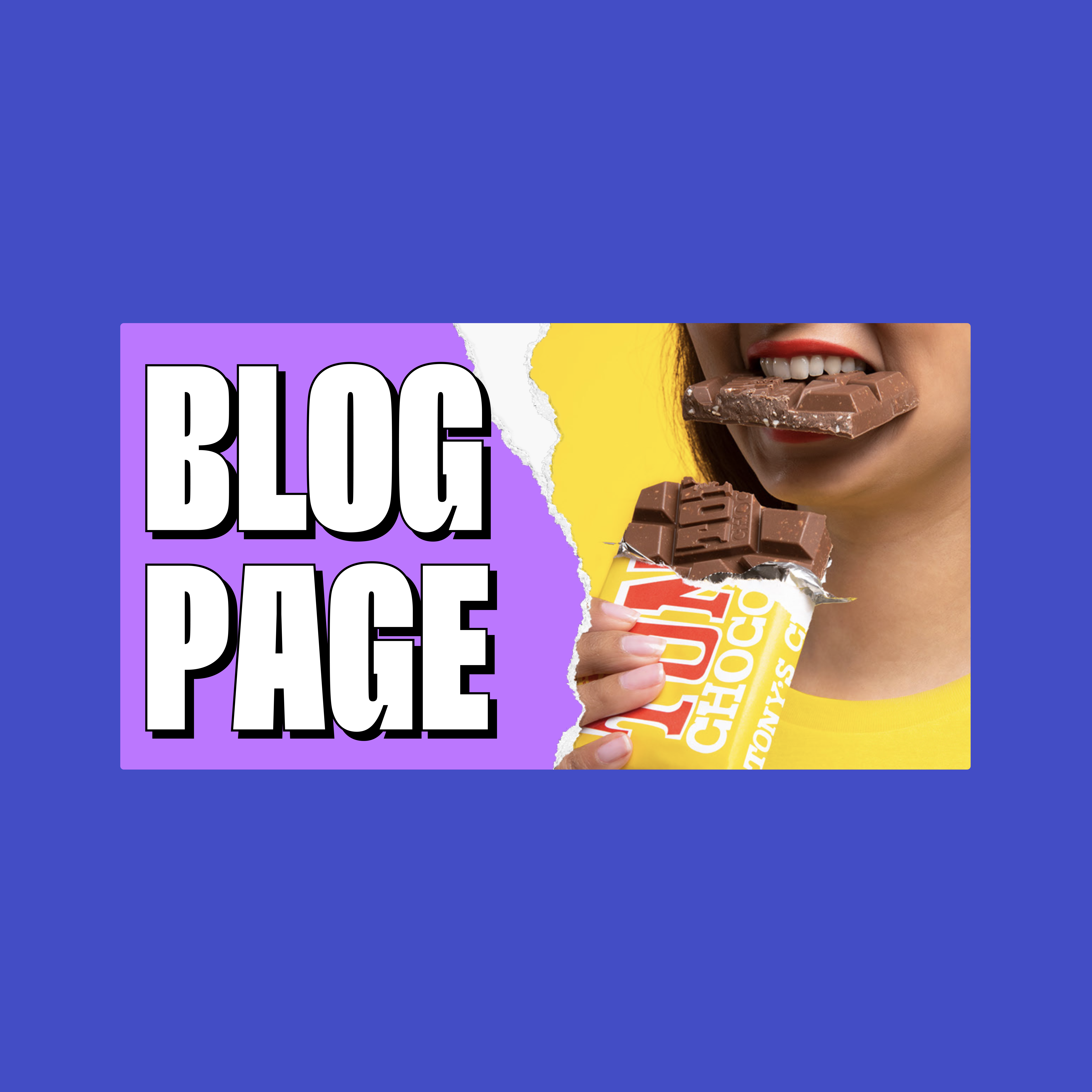
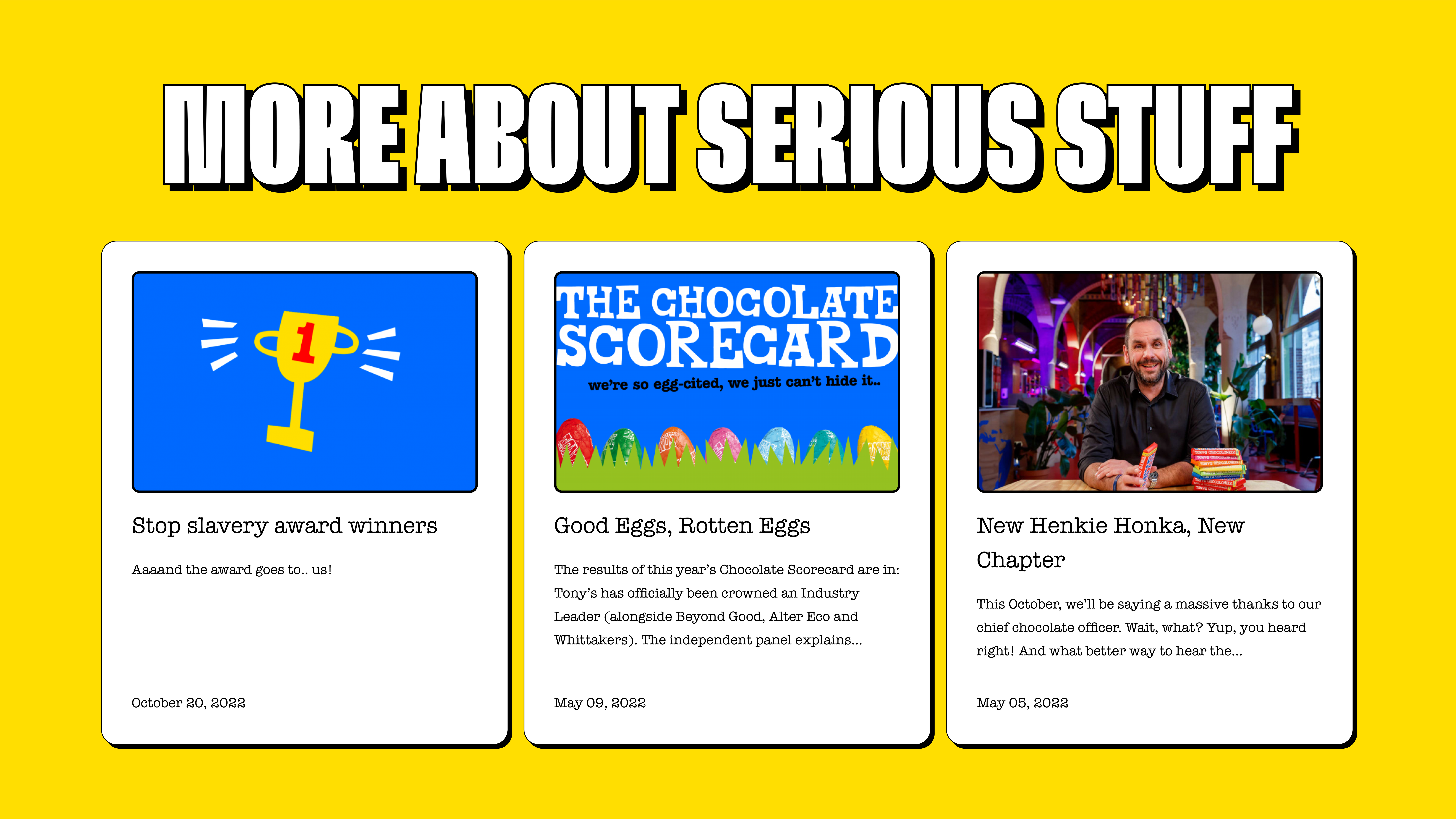
Content managers can create pages or blog posts, live-preview them, and publish them in minutes while focusing only on content.
Products can be added to blog articles as hotspots on banners, and blog readers can add them to their cart or wishlist.
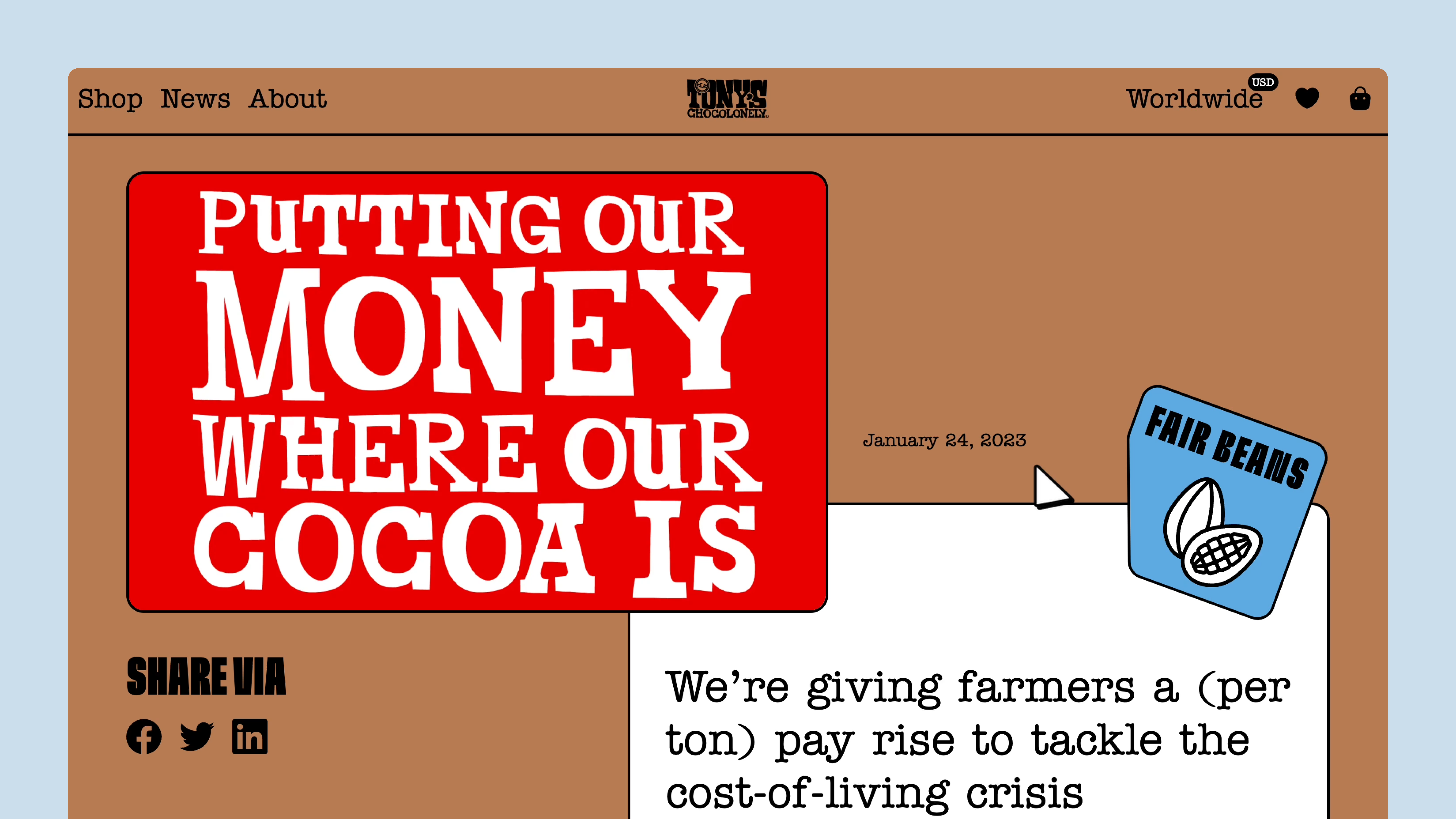
We began with art direction before creating concepts to choose the key visual style. We then applied this visual style to all website pages.
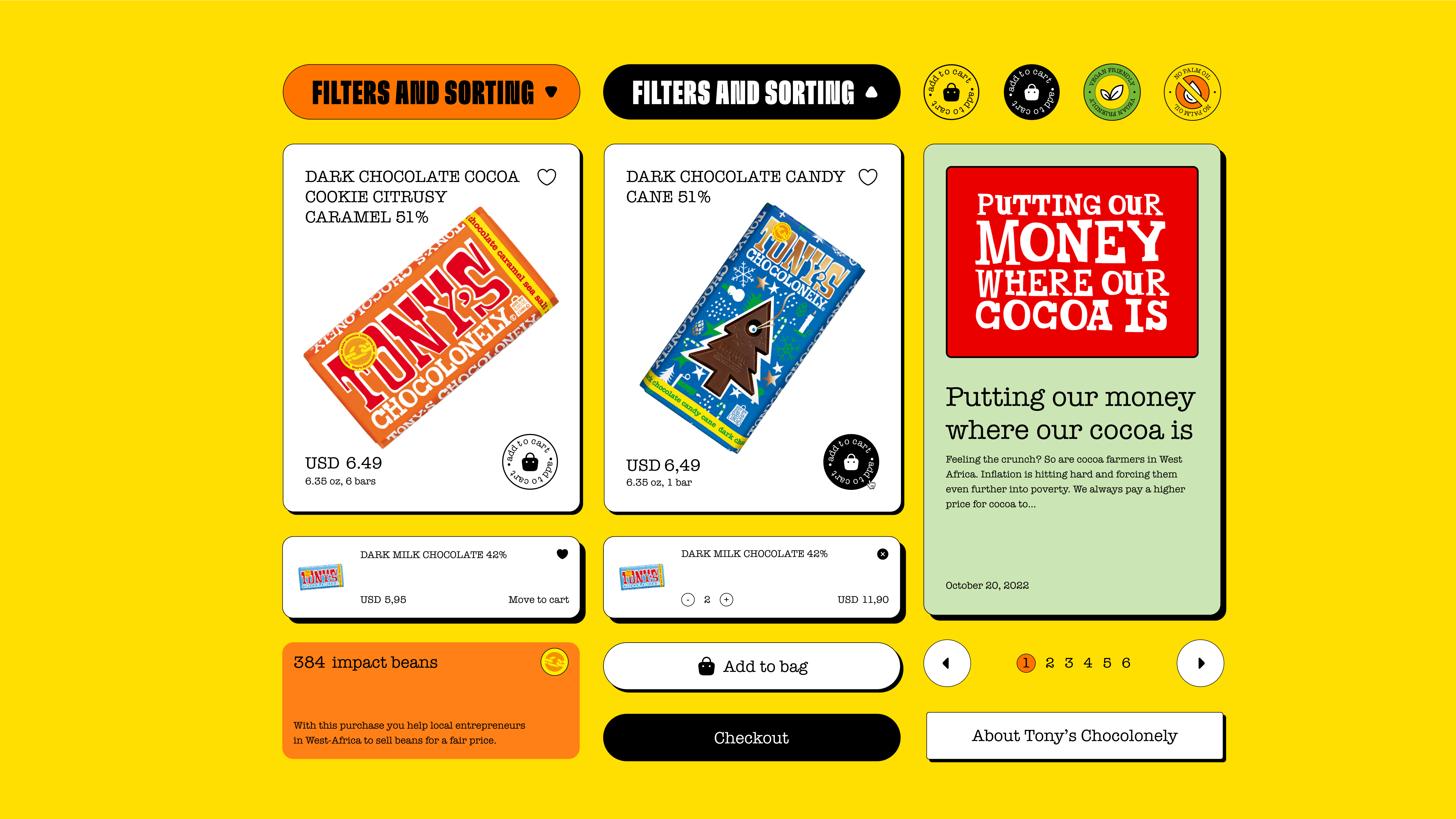
After completing the design process, we organised all the styles, components, and modules into a design system to hand off to the development team.
The goal of the visuals was to convey the brand message “Serious about people, crazy about chocolate” and keep the playful, brightly coloured style.
The main challenge was to keep the anti-design approach while making the composition, colour, and typography more organized.
We balanced the colour scheme to make it more comfortable for a user, while also conveying a playful tone.
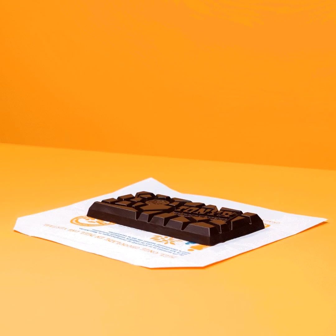
Dynamic and lifestyle product images helped to build friendly and open brand communication.
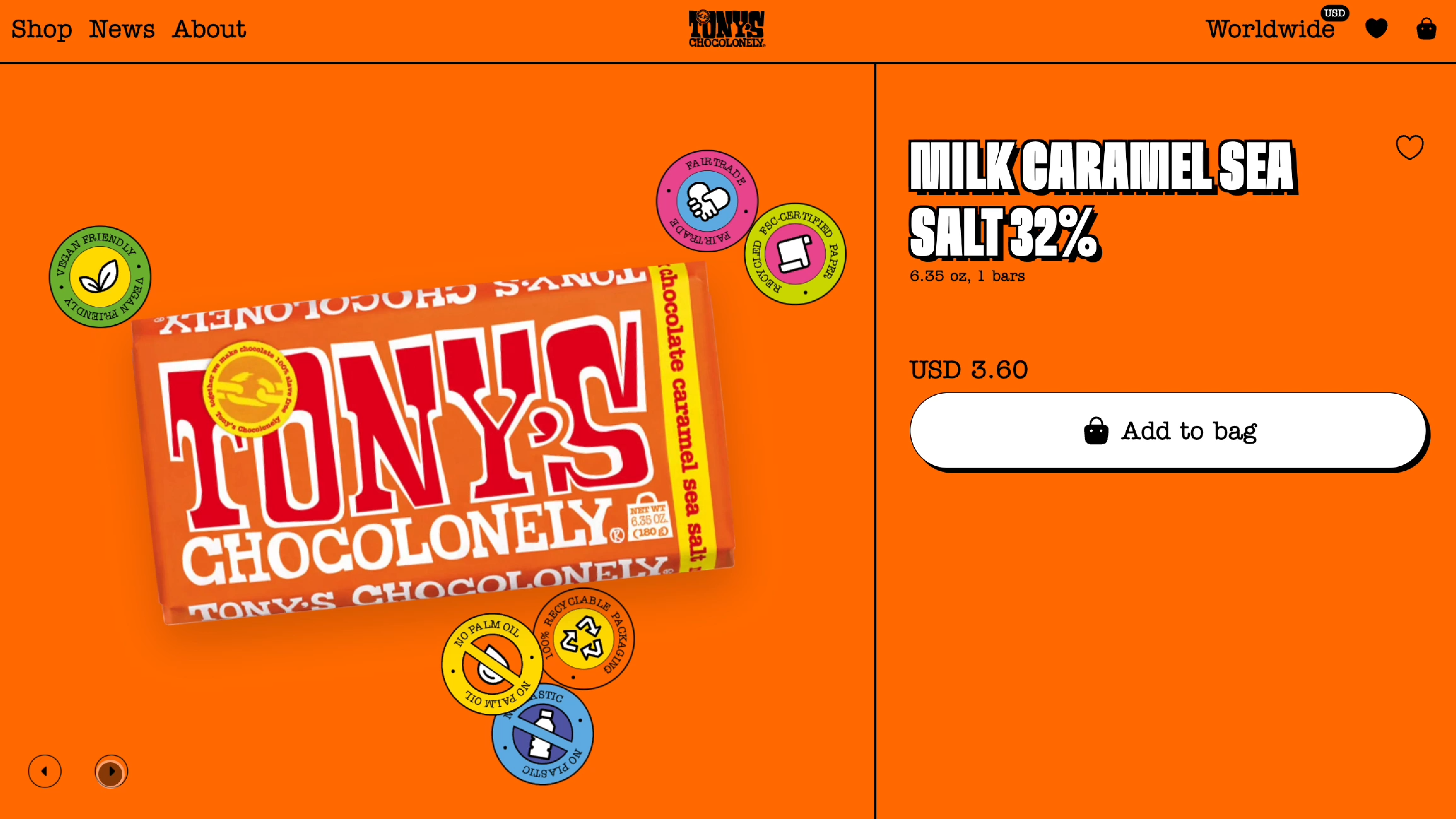
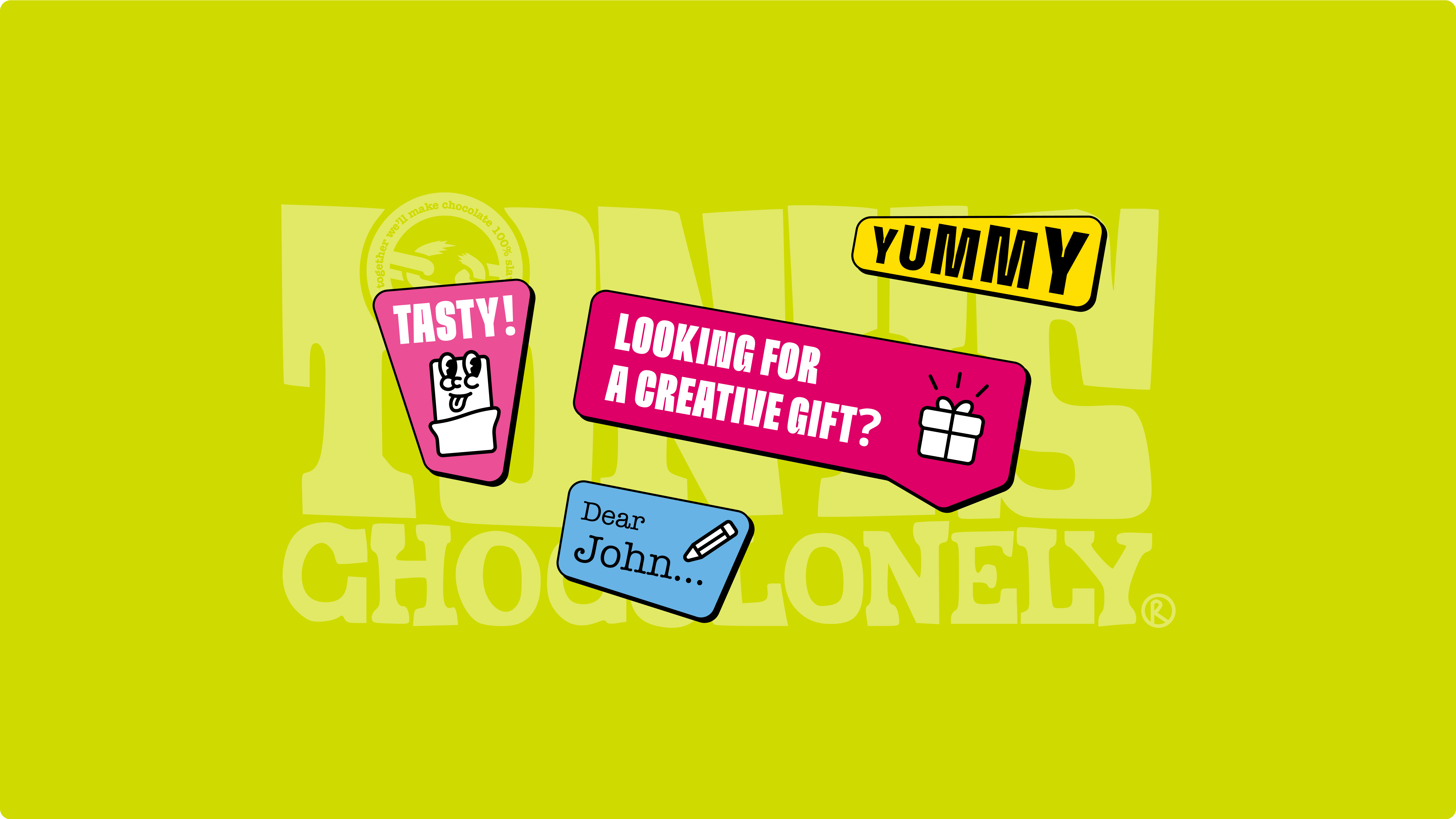
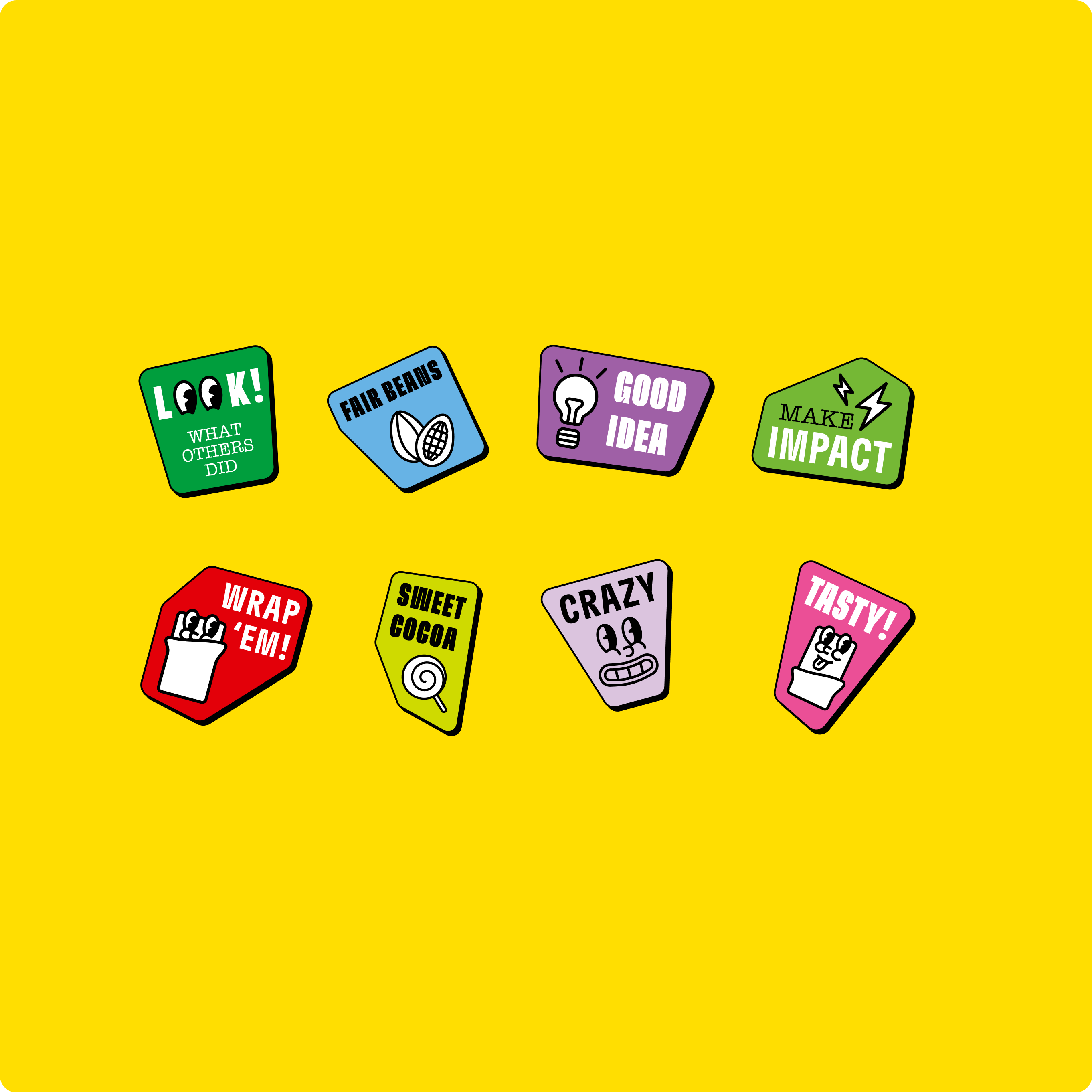
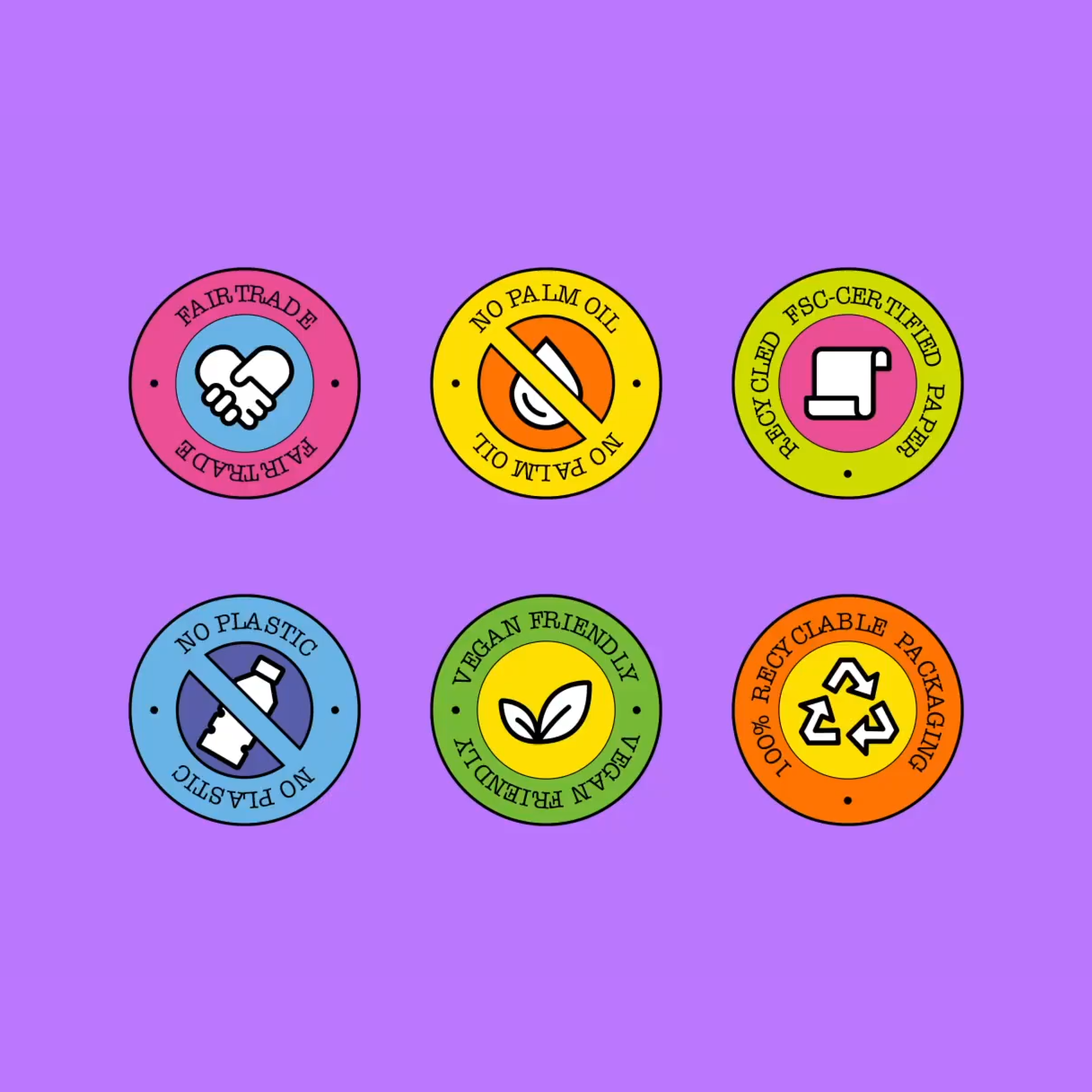
We created cartoon-style, illustrated stickers to add some fun and a little craziness to the overall design feel.
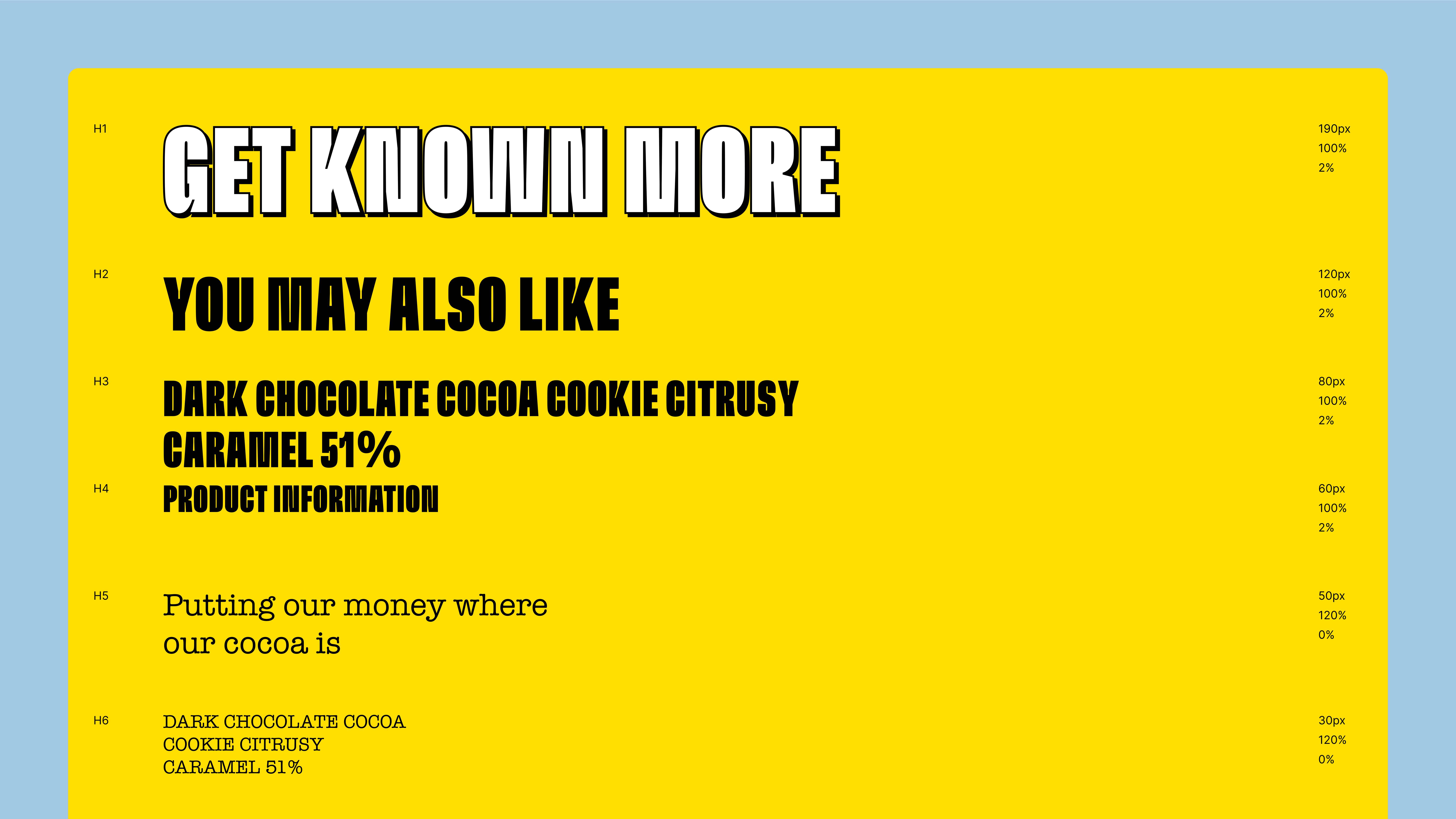
GT Flexa
American Typewriter
The GT Flexa typeface created the loud, playful tone we were looking for, while the American Typewriter added a more traditional, vintage feel.
We managed to recreate the entire website design and secure a more organised layout, better colour usage, and text hierarchy. We were pleased to have kept the original, playful tone of voice and ensure consistency with the product brand guidelines.
All components and modules were visually consistent and organised into a neat design system.
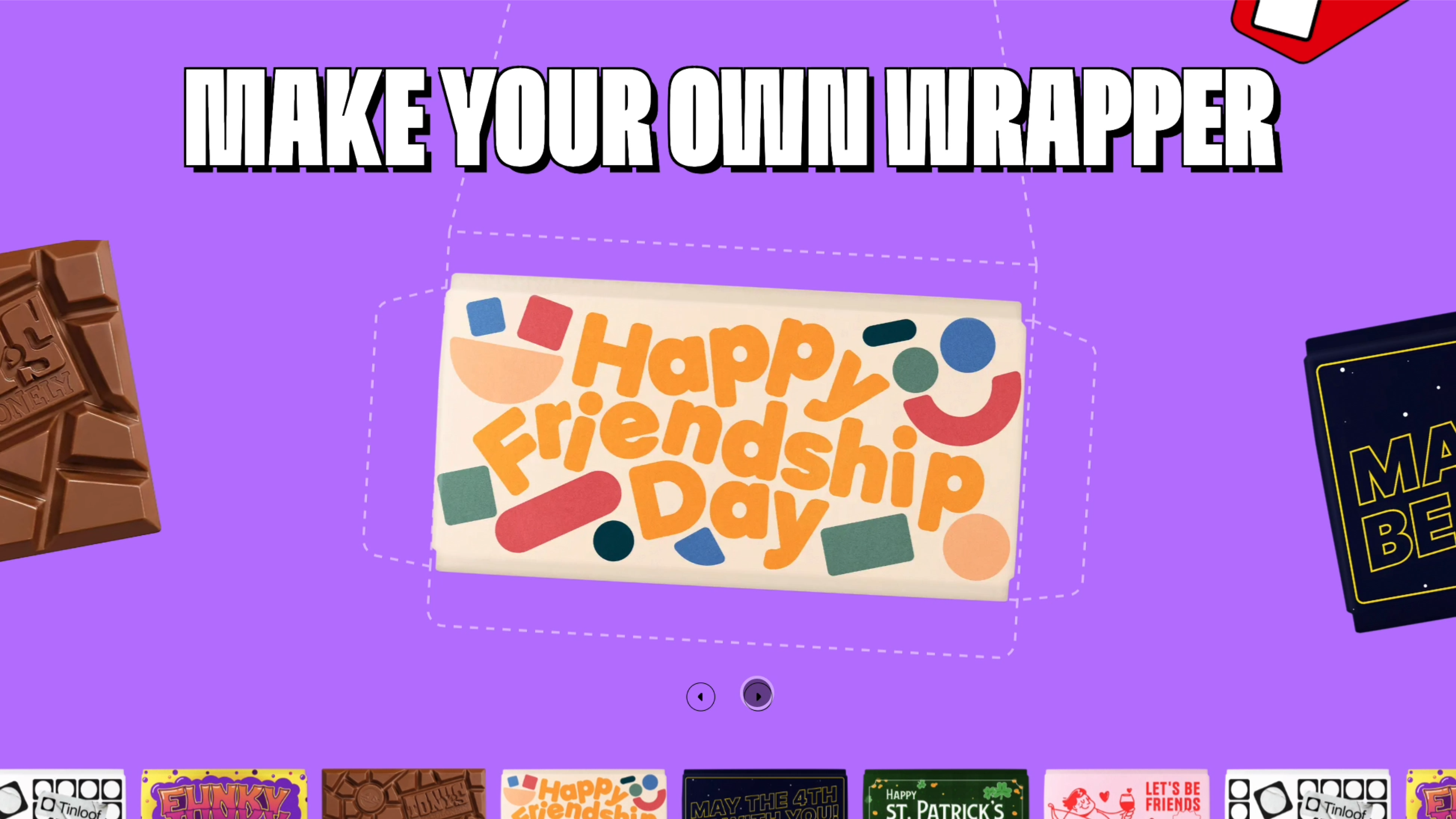
We also designed social media banner templates in Sanity to allow content managers easily create visually consistent banners for their marketing campaigns.